replacement (5 years and 3913 days ago)
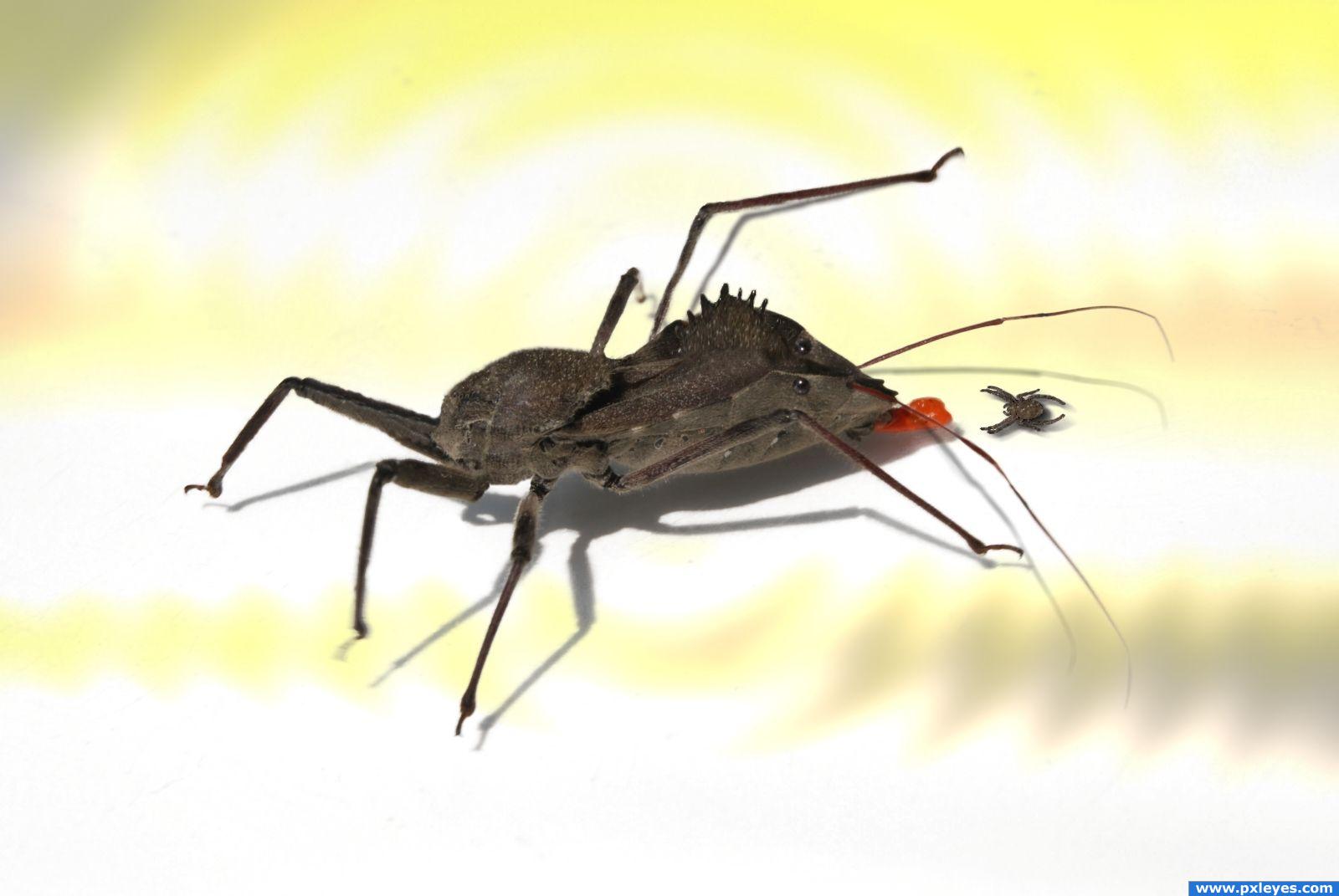
(5 years and 3953 days ago)
Haha. Funny. I like how you switched the head around.
Nice!
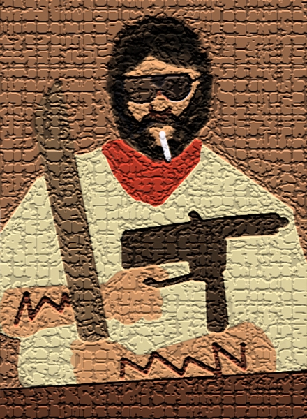
Thanks  Everytime I saw that red thing (whatever it is) it looked like a tongue to me.
Now as you mention it... it really looks like a tongue  Good job in recreating the bug Good luck!
Howdie stranger!
If you want to rate this picture or participate in this contest, just:
LOGIN HERE or REGISTER FOR FREE
a simple, very less , good-hearted populated place, where words have no power but silence speaks tons. its dedicated for all you guys who jus dont accept "sky is the limit".. for we have built castles with our thoughts beyond that.. (5 years and 3972 days ago)
author.. sbs? sources? Something... don't get this pulled over a stupid tech mistake... please include all what you used to create this (I'm on your side)
Ahh i agree an sbs would be extrmeely helpful.. i'll hold my vote for now
Ahh the step by step guide cleared up a few things. Well done - high marks from me!
superb....good imagination
Howdie stranger!
If you want to rate this picture or participate in this contest, just:
LOGIN HERE or REGISTER FOR FREE
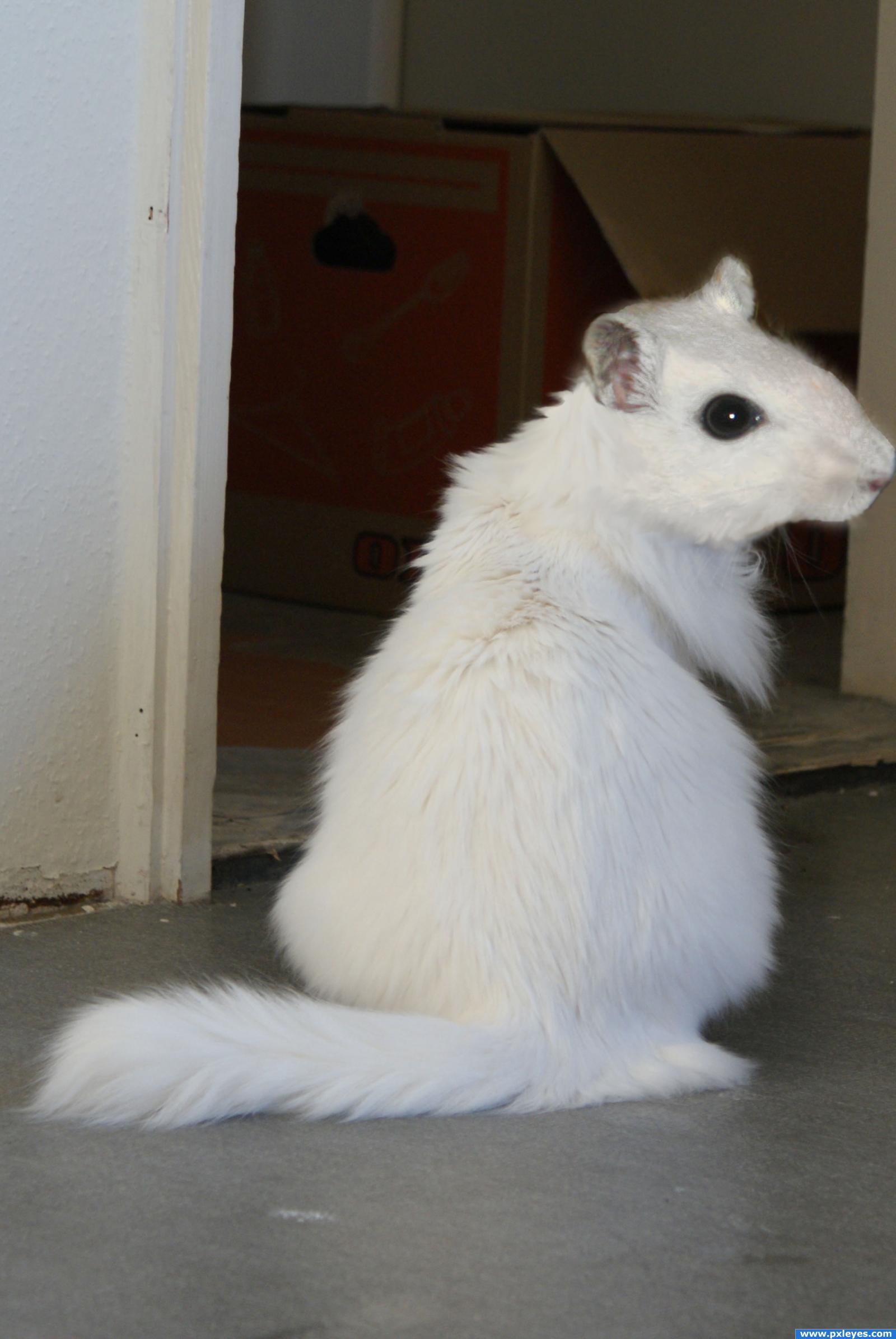
This is my resubmission to the mo(u)ose on the loose... It was removed from contest because i googled the image... it was my first entry... so this is the new one, or the same one, with legal source of the mouse that was created by carlohh... lol (5 years and 3995 days ago)
Looks great! This image looks better to me than your previous one. Extra marks for re-uploading, good luck!!
very much improved.. I agree with Ponti.. good job author.. extra points for correcting and learning.. excellent!!!!
Great idea, There is some tone difference between the head and body, for correcting it, add color adjustment layer with clipping above head and play with three slider ( try out on shadow, midtone and highlights) to match with cat body., color balance can also be used from image > adjustment menu but it will permanently change your layer, therefore using adjustment layer is safer .
Nice to see this back again...this version is even better. Good luck! 
glad to see it back!!!!!!!!!!!! the image was awesome to begin with and i am so sorry it was removed great work here author this ones just about as good as the other one!
I'll have to ditto the sentiments above this one looks even better than 1st one!
I haven't seen the first version, but I really like this one! Very nice job with the blending!
Nice work on this.... thay say that you can never do it better the second time round. Well you just proved that it can be done better the second time round super stuff!!
lol! cool. nice blending.
this takes the cake! i mean cheese! lol great work, nice to see it re upped looks better than the first
very simple and very cool! the head is slightly brighter than the body, you might want to fix that
EDIT: curves should do the trick
it's like a bad joke to the cat! haha the mouse has taken over:d great idea
A funny idea, looks like a new species. One basic point about the composition, the nose gets cut off and makes for a weak layout. I know you ran out of image on the right but the animal itself looks good and would have been worth the trouble of putting him on a new background or cloning more image on the right.IMHO
Congrats for being top 7 with this mouat or couse or whatever it is
congratulations!!
Howdie stranger!
If you want to rate this picture or participate in this contest, just:
LOGIN HERE or REGISTER FOR FREE
(Made completely from scratch...WAY harder than I thought it would be) All done with the pad on my laptop!
I know, I know, the texture is horrible but I was just messing around with filters I havent used...I am not redoing it because it took to long to paint out and I didnt save the PSD even though I should have. Sorry peeps. (5 years and 4025 days ago)
That title was exactly what I thought when I saw the original picture!  Too funny, good luck!
hello little friend..now give me some pepto.. I think my lunch is trying to revisit me .. giggle snort.. good job on this author
 MAO
MAO
Would be nice to see the SBS if you made it from scratch, and you might want to rethink the heavy texture. Hmmm...I think I know this guy...
Without the texture it seems just too flat. I will post screen captures from what I did. But I only used a brush and a filter or two.
That texture looks weird but it's nice! =)
I will post the side by side right now.
seriously.. one is enough.. for the love of god and all that is holy.. LOL.. giggle snort
very nice
great!!
good, but texture is too much, reduce it.
yeah first work on this contest! nice! gl
hehe really nice we're returning to dinosaurus's era
good
Unfortunately I didnt save it so I would have to redo it all. I did mine without using anything else. I just put the photo beside a new document as a reference.
Nice work but off-theme, no external sources used.
Theme says "Your task is to choose someone and create an exact replica of him/her using multiple photos!"
Contest Moderator: You can use someone's photo as reference, but need to use extra sources to make the entry
EDIT : As clearify by contest MOD now that, drawing from scratch is allowed, good luck with your entry
Yeah Nasir drawing was implicit ok I just didn't explained well...BTW author SBS = "step by step"
very nice
Good Luck
wow
Howdie stranger!
If you want to rate this picture or participate in this contest, just:
LOGIN HERE or REGISTER FOR FREE
Photography and photoshop contests
We are a community of people with
a passion for photography, graphics and art in general.
Every day new photoshop
and photography contests are posted to compete in. We also have one weekly drawing contest
and one weekly 3D contest!
Participation is 100% free!
Just
register and get
started!
Good luck!
© 2015 Pxleyes.com. All rights reserved.


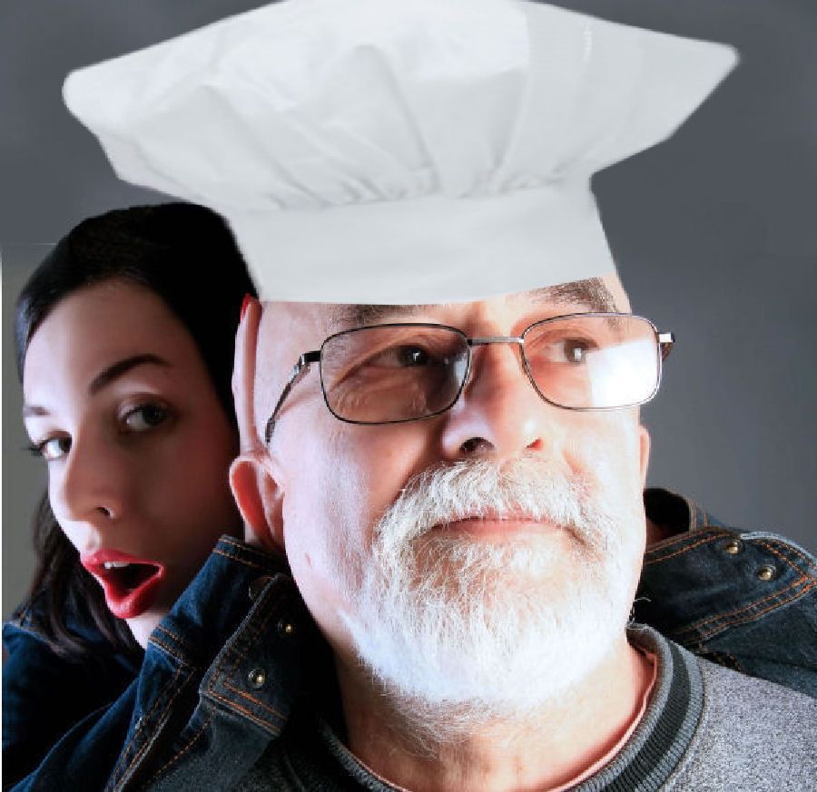
Not a bad idea, but the light source on the chef hat is opposite grandpa's light source...maybe you could flip it...and the drop shadow doesn't work, again it's opposite the light source, and there's nothing for the shadow to fall on anyway....
Oh, and sorry author, but I just don't believe you "drew" the chef's hat. It looks just like a photo...a low res photo at that.
if you drew it then why not draw it big enough so it looks real. It does look like a bad photo that you have tried to blow up and its bad. no offence.
Thanks for the info ....Yes I did do a sketch of chef hat and copied how it looked and was colored Bad idea so I got one from internet hope this is better again Thanks to both of ya
Actually, the first one looked real....so real that it looked like a photo. That is why CMYK said that he didn't believe you drew it. The hat you have now is not better because the edges are very blurry. I would go with the first one but resize it bigger. If you need help resizing, just ask and someone will help you.
Sharpen the hat overall, I would use the pen tool and recut it, curve it at the base a bit to match curve of head, add some shadow to head(as hat sits on it)... GL
Ok Guys does that work any better back to original made it a little whiter?And thanks for your suggestions
oh its so good!
Nicely Done!
Howdie stranger!
If you want to rate this picture or participate in this contest, just:
LOGIN HERE or REGISTER FOR FREE