(5 years and 1390 days ago)
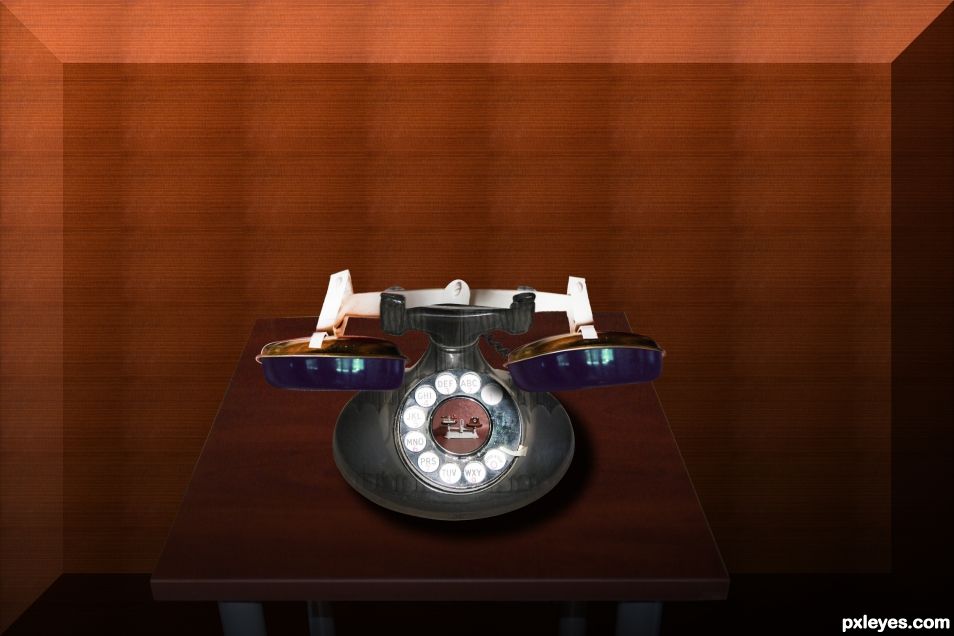
- 1: Telephone 1
- 2: Tel 2
- 3: Table
Many thanks to Mqtrf for the riot of fish pattern :)
source: http://www.pxleyes.com/images/users/m/mqtrf/3226/fullsize/4de65dc16c8ec.jpg (5 years and 3131 days ago)
Love green colors. Nicely done....!
Thank you very much, George 
Howdie stranger!
If you want to rate this picture or participate in this contest, just:
LOGIN HERE or REGISTER FOR FREE
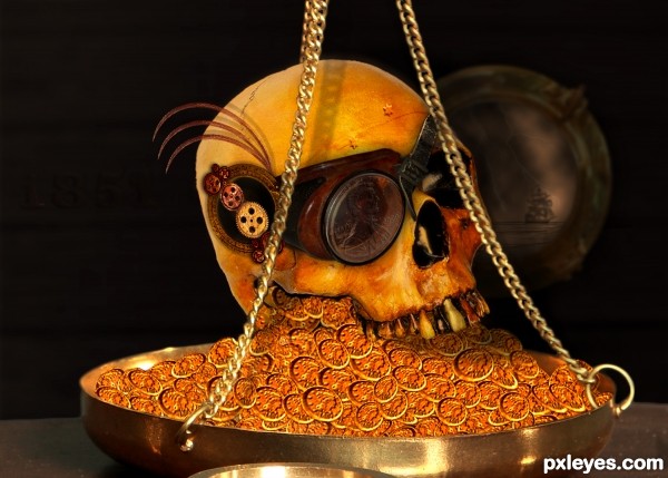
After some research I found that Jules Verne’s first novel came out in 1851 “A drama in Mexicoâ€. From there it didn’t take long to stumble on steampunk, time traveling and so on.
It turned out this poor fellow is a time traveler stuck in 1851, very dead and without his dental work done.. Part of a treasure on the HMS 1851..
Credits;
*http://mjranum-stock.deviantart.com/
*http://gothicbohemianstock.deviantart.com/
*www.obsediandawn.com
*http://angelus-knight.deviantart.com/
*http://jostock.deviantart.com/
*http://hyenacub-stock.deviantart.com/
*http://tink-ling.deviantart.com/
*http://crimestop.deviantart.com/
(5 years and 3375 days ago)
Author, check your links, 1-4 are not working. I'll come back. 
Aah, that's better! Some very cool steampunky finds!
Woops, sorry for that.. Fixed it!! Thanx!
Cool picture, love your idea!
Reminds me of Pirate of Carriebean. Nice work.
Thank you!
I like your idea greatly. The individual coins must have been tedious to do. Perhaps see if you can put some shadings on various coins to keep them from all looking the same. Also, maybe some shadows underneath various coins would help. Nice job, author!
Thank you @pixelkid for your comment! I think you are right about the coins, I tried to have somewhat of a shadow on the coins that are under the rest, but that seems to fade away to much. When I have the time I will try and fix that!
hehehe.. oy.. my teeth hurt.. good job
well done author...but the skull seems a bit flat to me...u shud have done a bit of shading... gud luck author
Howdie stranger!
If you want to rate this picture or participate in this contest, just:
LOGIN HERE or REGISTER FOR FREE
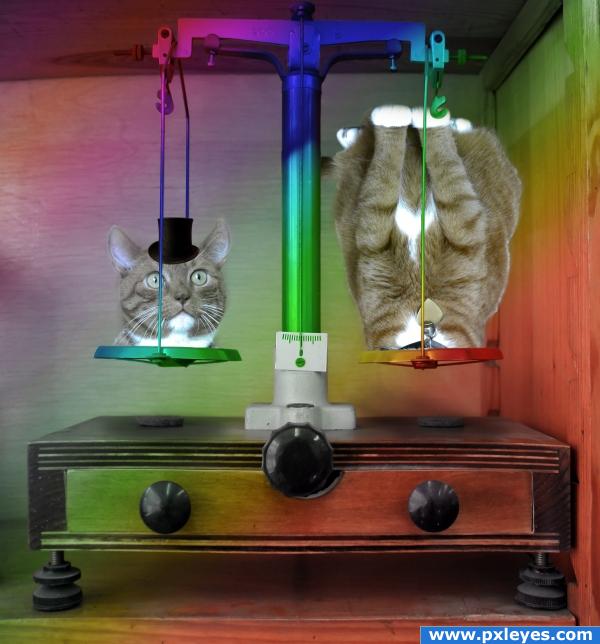
The rainbow ends in the scale.
The cat with the top hat is a magician. (5 years and 3940 days ago)
I like the idea of a magic balanced scale, but I feel like you could do better in the execution. A simple rainbow gradient overtop of the scale is a pretty basic design element and I'd love to see you expand on this. Sticking with the magic theme, maybe you could place a top hat on one of the scales or even turn the base of the unit into the classic "sawing a woman in half" illusion. There are endless possibilities with this one...you just need to let loose and go crazy with your imagination! Best of luck, and keep at it! 
Thank you. I spent more time on it and now I have a better result.
If I could revote and add points for humor I would. This new version made me laugh quite heartily. Good job! 
well Poop on a stick and call me Charlie chan.. this is TOTALLY different from the first piece I saw.. Much better author.. twisted and borderline on sick.. BUT I LOVE IT!!!!!.. LOL (THANK YOU so much for resisting a blood fest LOL)
good
50
He He He good
david catterfield? 
Howdie stranger!
If you want to rate this picture or participate in this contest, just:
LOGIN HERE or REGISTER FOR FREE
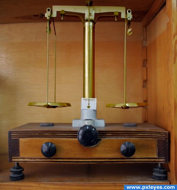
A balanced scale made of gold! It must be very expensive. (5 years and 3940 days ago)
looks pretty good. but i don't think that's enough to win the contest 
gl...
Put some more effort into your SBS (More descriptions and add more steps ) and this would make a great tutorial on isolating and changing color.. who knows.. you could make some GREEN with your GOLD ..  .. good work
You just need to select the clipping mask and paint with the colour you want
what elficho say! good luck!
just colors
simple


Howdie stranger!
If you want to rate this picture or participate in this contest, just:
LOGIN HERE or REGISTER FOR FREE
Good idea. Try to give it a surface to sit on instead of just a gradient background.
hehehe, good thinking, some one is going to get a whooping in the design department for non color matching LOL Good luck author
I fixes the gradient as well as color combination i hope its better.. Thanks for feedback
Looks much better!
agree, love the changes -looks much better.. creative .
Howdie stranger!
If you want to rate this picture or participate in this contest, just:
LOGIN HERE or REGISTER FOR FREE