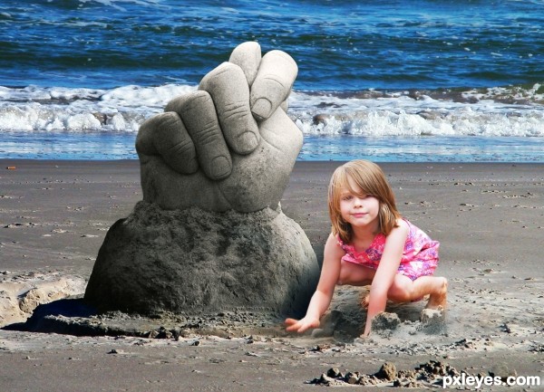
(5 years and 2762 days ago)
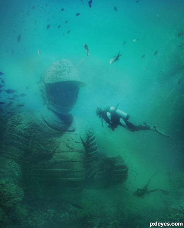
(5 years and 2884 days ago)
nice job -- quite real look to this
Thanks Alan
realy nice
Thanks!
Super believable!!! Now send the director of Avatar in his little submarine to investigate LOL
LOL LOL !!!thanks Ernest..
I've been here before! Haha. You don't believe me. In the Caribbean there are underwater museums like this. Statues that were commissioned specifically for sinking to create an artificial reef. When you go scuba diving you get to swim among them. I went scuba diving in Cancun last summer. This reminds me of that. You've captured it perfectly!
Nice to hear that..thanks 
Cool! Looks like it belongs there, like a lost city.
Many thanks!..
Very cool. Cute baby too.
execelent....good job....
Hey thanks!..
Good job, pretty realistic. 
Thanks pearlie!..
CONGRATS!!!
Thanks friend!..
Congrats  a very believable scene
Thank you 
Congrats!!
Congrats! 
Can't believe you didn't win
This is looks sooooooooo real!! No one can say that 's a manip!! Congrats!
Thanks Daniela!..I worked hard on that chop!..
it paid off.. 
Very Nice! Congrats! 
Thanks Chuck!..
Howdie stranger!
If you want to rate this picture or participate in this contest, just:
LOGIN HERE or REGISTER FOR FREE
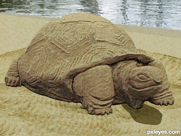
(5 years and 2892 days ago)
Howdie stranger!
If you want to rate this picture or participate in this contest, just:
LOGIN HERE or REGISTER FOR FREE
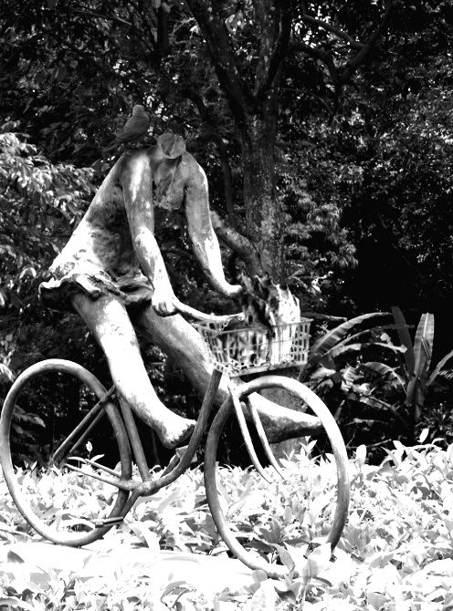
created using clone, path, brush, and hue-saturation/brightness-contrast. (5 years and 3179 days ago)
The basket is too sharp edged in comparison to the rounded edges of the rest of the sculpture.
By comparison, the "neck" of the sculpture where the head was removed is too soft and rounded, making it look lumpy and somewhat "melted." A bit sharper "break" edge would better convey the headlessness. You may also want to clone in some of the leaf pattern behind the neck to better blend the space with the background.
To get rid of the sharp edged basket, try to use a little bit Gaussian Blur. Or just use the Blur Tool. A little lighting to the "neck" should make an illusion to the headless stone. Btw, where's the so called Crow? It's too dark to see the crow standing by the "neck". Try to add a little highlights to the Crow's feathers that reflect the lights/sun rays.
Hope it helps. Awesome idea, Author.
Thanks for the tips!
The neck looks much better, but now you've increased the overall contrast too much, making the brights look "blown out" to almost pure white, which really makes the ground look bad, almost like a poor infra-red effect...
Also, although you've now softened the basket, it shows NO highlights to correspond to the rest of the statue. You may have to hand paint those in with either the Paintbrush, or the Dodge tool.
Perhaps you should add a bit of the green color of the foliage back into the image?
Howdie stranger!
If you want to rate this picture or participate in this contest, just:
LOGIN HERE or REGISTER FOR FREE
(5 years and 3210 days ago)
Howdie stranger!
If you want to rate this picture or participate in this contest, just:
LOGIN HERE or REGISTER FOR FREE
Good idea. Would be better if the hand matched the color of the sand.
Congrats for your third place, Rick!
Congrats Rick!!
Howdie stranger!
If you want to rate this picture or participate in this contest, just:
LOGIN HERE or REGISTER FOR FREE