(5 years and 3155 days ago)
(5 years and 3198 days ago)
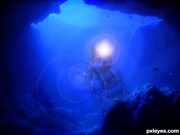
love the cave, nice water colour... personally, i find the bright light a little distracting.. maybe a sparkle instead...
NOTE: that your entry is great just the way it is ...and the light is just my opinion.
Thanks, appreciate your feedback.
Nice point of view, GL!
Howdie stranger!
If you want to rate this picture or participate in this contest, just:
LOGIN HERE or REGISTER FOR FREE
Thanks to the following for stock-
Redheadstock D'art
MJ Ranum D'art
Mqtrf Pxleyes Member.
(5 years and 3209 days ago)
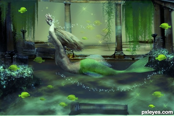
Her body looks too small and not proportional to the rest of it. Lovely concept and coloring.
suggestions:
1) underwater feel, should include glistening to the mermaid
2) make hair more "lighter" (now looks heavy, too thick) and free flowing
3) the dangling sea-plants should have different shades of green to create depth
4) trailing bubbles around arms and tail, to create sense of movement
5) lift up the abdomen of the mermaid to make her more shapely
6) add some fish near her, both infront and behind her
hope these suggestions are useful 
thank you both for the great feedback... I took note of what you said and made changes.
I hope you like them
Congrats!!
Congrats
ooh.... its perfect now, go frame it up  and CONGRATS!
Howdie stranger!
If you want to rate this picture or participate in this contest, just:
LOGIN HERE or REGISTER FOR FREE
All source with reference :)
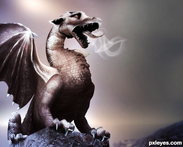
*Edit : Added eye, smoke, darker background and fixed the nostril. (5 years and 3211 days ago)
Very creative. Good luck. Nice SBS btw.
WOO HOO! (sbs has only one step?!?!) hehehe
Yup, one long SBS 
suggestions:
1) add nostrils
2) add eye's pupil
3) lift ears more upright (look more fierce)
4) some smoke coming out of mouth n nostrils
5) add a darker, gloom-doom background will enhance the atmosphere
Great DI work 
Thanks aheman I made some changes 
BWHAAA HAAAA HAAAA HAAAA..... lovely changes .. now he's all worried and sad.. hehehe.. LOVE IT... still as great as the original author.. WOO HOO HOO HOO
Hehe..he is worried cos he is trying to get some fire out and no luck! Either that or he needs a tick tack for his stinky breathe ahahhaha ,,,,awww my poor dragon :p
What else to say, looks amazing! His expression makes me feel it's scared, is it? xD
Akassa..he is like going : "cough, cough, cough...no fire" hence the lookon his face :p lol
Wow! Brilliantly done. Nice imagination to use various parts of the source the way you did for textures. Not sure I would ever have the patience to do such work. Really nice job!
Awsome work!!!! SImply Flawlessss...... hope he get's well soon :P hehe
Tons of patience doing this contest, nice work, good luck!
Nicely done.... I like the changes made to the first image.... good luck...for patience and creativity.....
the best part of the competition, is to have fun, express your ideas freely....
nice improvements from previous, congrats 
awesome
Incredible work on blending and choosing the parts! Great job!!!
very good , nice sbs
Great work!
He's got cough, I guess. Most of the dragon was done very well but somehow the skin on the chest is not fitted to the body. Nice job in overall, and it's interesting to see the battle of dragons in this contest. Best of luck to you 
Congratulations, Loopy 
Congrats
Thank you 
Congrats on the second place 
congrats.. knew this is Top 3 stuff 
Congrats !!!!
Howdie stranger!
If you want to rate this picture or participate in this contest, just:
LOGIN HERE or REGISTER FOR FREE
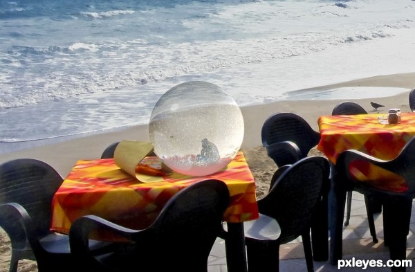
(5 years and 3224 days ago)
Is that someone holding someones hair while they puke in the background, while the bird is wondering whats going on?
Funny - I didn’t notice that
ïŠ
Yes author, chalty is correct. So better change the tittle..Anyway GL!
 Chalty ! Explicit description!
Author, you could clone those guys out!
Mossy left you a comment in the SBS. I think she's right, you should provide some additionnal information.
I removed those guys out - it is less funny now - yet i hope you like it
Thanks
Guy
No offence, but clonning could be improved. You could either spend some more time on repairing, using pen tool selections, patience & energy - or you could just crop the image, so that the ball ends up in the low-right part of the image, and that's it  .
.
made another try with the clonning
thanks greymval
Good job on the fix author. Best of luck
Howdie stranger!
If you want to rate this picture or participate in this contest, just:
LOGIN HERE or REGISTER FOR FREE
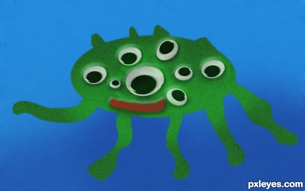
Add some shading to the body.
where
Add the shading on the opposite side of the light source as it is reflected in the eyes (pretend you are shining a flashlight on the eyes - the shading will go on the other side of where the flashlight lands on your subject.
You can also add some gradual shading to the legs to make them look more rounded. This might help some: http://artswork.asu.edu/arts/students/line/line4.htm
1) select the green body using "magic wand"
 to taste

2) use "dodge" for highlights (lighter part of the body towards the light source)
3) use "burn" for shadows (darker part of the body)
add simple bumpy texture to body:
1) add "noise" (not too much, need to experiment)
2) add "blur", "gaussian blur"
add depth for water background:
1) select the water area
2) choose a darker blue, use "paintbrush" paint at the bottom portion of the image
3) add alittle "noise" , then a little "motion blur", then add "ripple" or "wave" (under "distort"
Hope this helps, of course there are more methods that can be used... do some exploring online photoshop tutorials
now its better aheman?
Howdie stranger!
If you want to rate this picture or participate in this contest, just:
LOGIN HERE or REGISTER FOR FREE