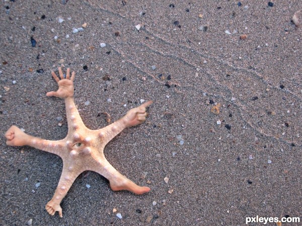
Nasty little buggar! Common in the South Pacific. (5 years and 3247 days ago)
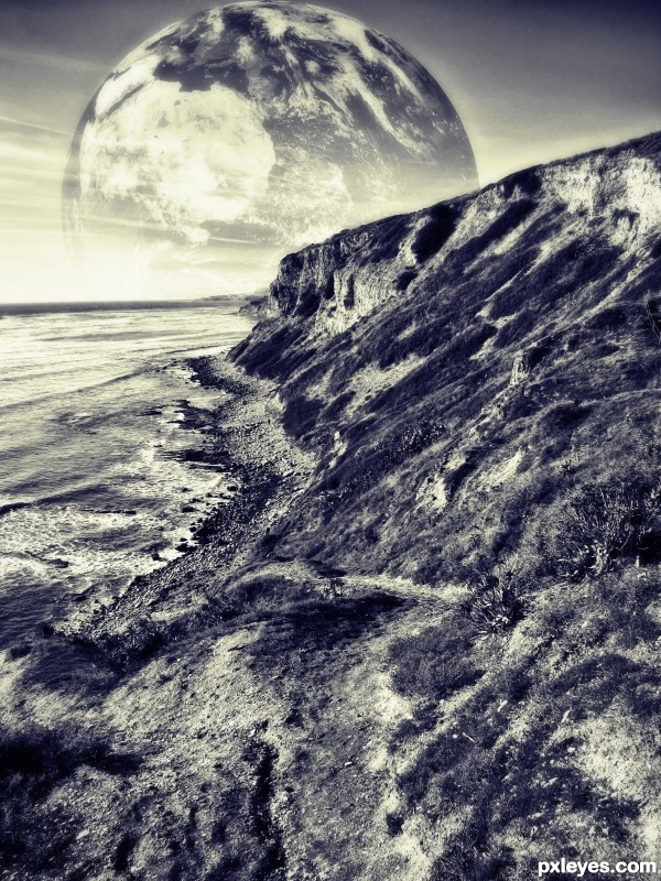
(5 years and 3259 days ago)
Would have been better in color...
I was going for a 50's bad science fiction movie look...but thanks!
I like the tone
I liked the shade!
good combination
Howdie stranger!
If you want to rate this picture or participate in this contest, just:
LOGIN HERE or REGISTER FOR FREE
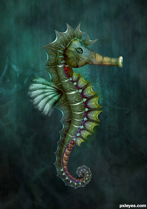
source image and Photoshop (5 years and 3305 days ago)
wow very nice work!! 

I love that you used all those intricate parts to create a completely different image. Wonderful color and feel to this. The nose area where it meets the face seems a bit too soft or blurry. That's my only observation. Really beautiful job, author!
This is awesome creative........Good Luck Author.
Wonderfully detailed very well made -- do agree with pixelkid the area where the "nose" and "face" join do seem a bit less sharp than the rest of this amazng work
its a super cool image!! GL
Pretty cool design ! I look forward to the day when your entries won't be so easily recognizable, but still looking awesome.
WOW... superb creative work!
Instant fave, love this = )
beautiful as usual
Top work author...Fav from me...GL
Beautiful - as always!!
Many thanks to all for the nice comments and support  Above all thanks a lot Pixelkid and Alan, I should really pay more attention to how my images look in high res
Congrats Cornelia  I do love seahorses, beautiful work
Congrats!!!
congrats Cornelia!!!!!!!!!!!! 

Congratulations!!! Have a cookie!
note: cookie is purely hypothetical.
Congrats!!
F A N T A S T I C!
Howdie stranger!
If you want to rate this picture or participate in this contest, just:
LOGIN HERE or REGISTER FOR FREE
Hi!
I hope you like my new entry! :D
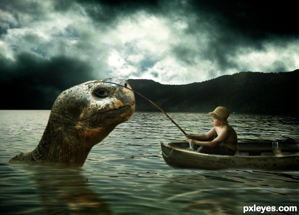
I always wanted to do something with a sea monster, in this case a sea tortoise but hey, they sure do look like sea monsters..
Well ALLOT of layers, cutting out using the pen tool, lighting and shading, masking sure came in handy :) and at the end some nice tweaks..
Please leave a comment saying what you think :) And I do appreciate critique so keep them coming! :)
Cheers. (5 years and 3324 days ago)
Very nice entry. Good work.
nice work .. but the boat is like on water not in it
Thanks for the comment andi! I tweaked the water and boat a bit, hope it's better now  Thanks again for the comment
omg this is wonderful! I Love the color palet and idea is just superb!
Very very nice image author...best of luck
wow! 
 great mood
wonderful.......1 vote from me........
Nice imagination and colors....not sure about the light source as its coming from behind them in the background between the clouds.
Nice image...agree with MnMCarta and freejay about great use of color over entire image. Perhaps you could bring the front end of reflection of boat to meet the boat edge. In fact, the reflection probably would butt up against the edge of the boat and not have any space of water without reflection. Does that make sense? Also, maybe have the fishing pole cast a shadow on the sea creature's head. I'm not nitpicking here...it's a great image. Just thought these things might help. Great job, author! 
I'm not interested in an argument...but I will say if the light source is from the back, then the boy's chest and viewer's side of the turtle's head wouldn't be so bright. What's creating such brightness on those parts? I think what you're going for is to be able to see everything. The way the light source is now...truthfully they would be more like silhouettes. 
Thank yo very much for the advice pixelkid! I'll see what i can do with it  One thing you said about the shadow of the rod on the turtles head, since the light source is coming from the back as you can see? I'm not sure about the shadow of the rod being formed on the turtle, but hey give me some argument as to why your statement is true
  Thanks again
Amazing to me!! Love the mood.
GOOD entry yaar...
It might be another winning entry from you pal! Best of luck


Excellent 
Lovely concept, great mood image!
Lighting is a tricky; I think it is possible to have 2 light sources and one of them can be out of the picture and therefore casting light on the boy, boat and turtle head (in that case there would be a slight shadow on the turtle head from the rod and the lighting could be a bit more consistent for the turtle and the boy). Just a thought as I know it is too late to change anything.
You have done a lovely job on the whole and as I said at the beginning, truly lovely concept and mood! 
Congrats man, great image
Thanks all for the votes favs and comments! 
Congrants....thought it would come first....surprised it came 3rd
Congrats
Congrats!!
Congrats on you win I 'd like to see you get him in the boat....lol
Howdie stranger!
If you want to rate this picture or participate in this contest, just:
LOGIN HERE or REGISTER FOR FREE
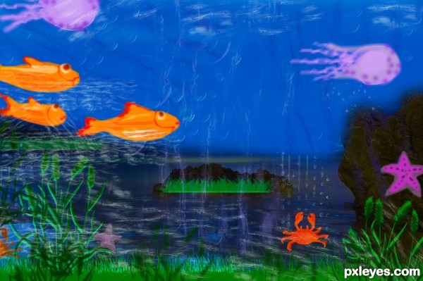
red lake turns under the sea. (5 years and 3342 days ago)
A different vision of the rocks. Good luck!
nice theme
I think this is very cute = )
Wow, my little girls fell in love with this picture 
Howdie stranger!
If you want to rate this picture or participate in this contest, just:
LOGIN HERE or REGISTER FOR FREE
Love it!
Nice idea, pretty funny result but 2 suggestions. First, imo the blending from the star fish to the hands and feet can be a bit more smoothly if you'd softly use some more of the star fish texture on the hands, etc. Second, the quality of the star fish image is soso around the edges (more blurry) that also affects the star fish itself. In case yu'd be able to find a sharper image, the added hands (which are all also sharp) ill fit better with the background (or if you want, make the hands as blurry as the background). Good luck!
Thanks for the advice Wazowski. I made the adjustments you recommended, i think it makes it look better.
LOL neat love the idea
Thank you!
Nice idea! GL
Howdie stranger!
If you want to rate this picture or participate in this contest, just:
LOGIN HERE or REGISTER FOR FREE