Photoshop Pictures: Sea (page 17)


results 81 - 85 of 149

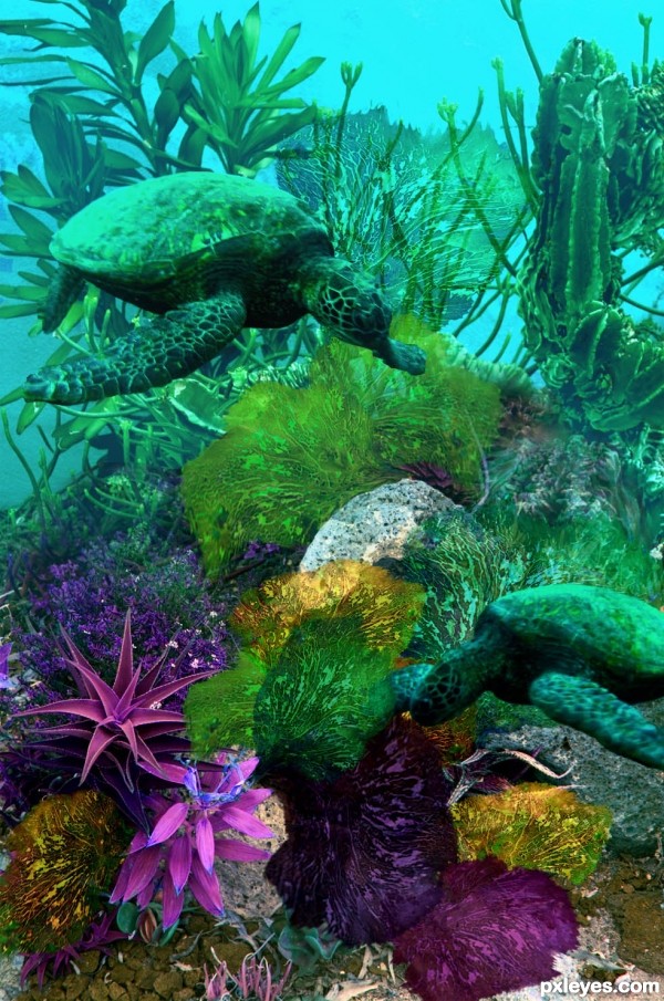
Swimming Amidst the Sea Fans - created by artgirl1935


Swimming Amidst the Sea Fans
Favs: 3SBS: 10Hi-resRank: 11/17Score: 55.6% (0)8465 views

Thanks to Nemo's great uncle at flickr for the turtle source photos; to abraxas3D for the under the sea source used to place the sea fans made from the bracket fungus source; heirbornstud at morguefile.com for the vortex source used behind the background scene when I began. (5 years and 3193 days ago)

4 Sources:

avatar Floortje1973

Nice work author! Just some little nitpicks, I think the front flipper of the lower turtle should be in front of the fan, and you can try and warp the fan's a bit more to give them some body, it seems a little flat. GL!

avatar arca
arca says:

Love the colour and the turtle is great!

avatar pixelkid
pixelkid says:

This is great stuff. Keep up the great work!!

avatar passionboy

luv this

avatar CorneliaMladenova

Happy and free turtle, beautiful image

Howdie stranger!
If you want to rate this picture or participate in this contest, just:

LOGIN HERE or REGISTER FOR FREE


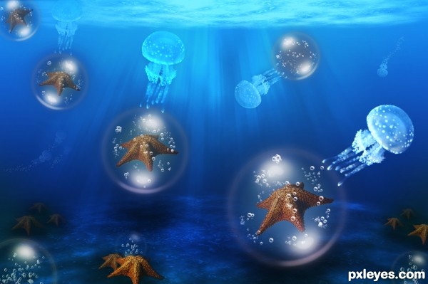
Jelly Cab of the Stars - created by Floortje1973


Jelly Cab of the Stars
Favs: 3SBS: 8Hi-resRank: 4/17Score: 57.3% (20)28292 views

I lack fantasy, or so I think so.. I pushed myself making something that in first (or last) glance does not make sence. I worked on it way to long and therefor I stare myself blind on it. I think it's missing something, mabye you guys can comment? (5 years and 3222 days ago)

1 Source:

no avatar
k2luvs says:

Great job, love it

avatar locale
locale says:

Nice result. Appreciate your imagination. I liked the bubbles and Jellies. I as a designer has met with the same staring and blindness problem. The solution what I found good is; Get away from PC, Do somthing else for sometime, Give a gap. Color perception get wavered as you keep stairing at the image for long. You end up giving lesser color than needed. Keep going..GL

avatar TwilightMuse

I think its beautiful!

no avatar
Keiley22 says:

I think its very nice author I would just leave it as it is

author says:

Thank you all for your nice comments!

avatar jawshoewhah
jawshoewhah [banned] says:

Nice one! My fav! GL!

avatar erathion
erathion says:

very cool work author...gl

author says:

Thanx for the nice comments and fav's offcourse

Howdie stranger!
If you want to rate this picture or participate in this contest, just:

LOGIN HERE or REGISTER FOR FREE


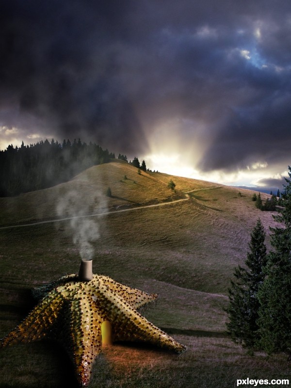
Sea Star Hut - created by ShiZa


Sea Star Hut
Favs: 1SBS: 5Hi-resRank: 6/17Score: 56.5% (10)11806 views

Many thanks to marcomaru and Leon Brooks! (5 years and 3226 days ago)

2 Sources:

avatar baumillerkyle

I love fantasy type pictures and movies, and i think this is great : )

avatar CMYK46
CMYK46 says:

Light on foreground (star hut) is from right, light on middle ground (landscape) is from left, and your light source (sky) doesn't match either. Good idea, though...

avatar jericho
jericho says:

Great design,really like it

avatar Chuck
Chuck says:

Nice idea gl.

avatar erathion
erathion says:

very nice concept and cool mood...with few adjustments this could be great entry...Bob is right about lighting's,try to guide by his advices...best of luck

avatar ponti55
ponti55 says:

Really nice artistic vision and nice composition. However, is it a door or is it light coming through an open doorway? If it's a door i wouldn't expect a trail of light to be flooding out onto the floor, and if it's light then i'd suggest working more on the colour.

avatar jawshoewhah
jawshoewhah [banned] says:

Nice blend! GL!

avatar jcfreak6363

Don't know how I missed this entry...It's AWESOME!!!

Howdie stranger!
If you want to rate this picture or participate in this contest, just:

LOGIN HERE or REGISTER FOR FREE


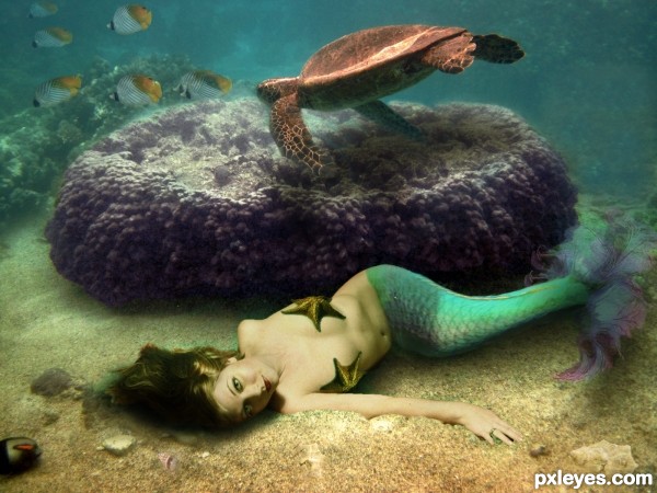
On The Ocean Floor - created by TwilightMuse


On The Ocean Floor
Favs: 4SBS: 19Hi-resRank: 3/17Score: 57.4% (25)46340 views

The only images I used that was not my own are the seashells which are credited to Emma-Frost-Stock and the Starfish provided by Pxleyes.
The other six images were mine. The end of her tail was a fractal I created in Apophysis.

*Update: I attempted to add adjustments offered by jawshoewah and greymval and Erathion.
I added several layers of colors to fix the overall feel of the image. Very curious to get more opinions. (5 years and 3226 days ago)

1 Source:

avatar jawshoewhah
jawshoewhah [banned] says:

Nice chop! And kudos to using your own stock photos! My only nitpick would be maybe the edges around the starfish you turned into a bra. They just seem a little hard. Other than that, well done!

avatar greymval
greymval says:

Make a blue overlay over the model, so it blends better. ( create new layer of solid color - blue- right click on it create clipping mask so it only affects the model, Mode: Overlay Opacity-20%- more or less) You could make 2 clipping layers one blue on green so that you have a turquaz overlaying your model.
Your background also has some noise that should be present on the model, so you could either lower her opacity -95-98% or add a noise over.
There's also a masking problem on her hip, use some clone stamp to cover over her human skin :P

author says:

Thank you very much for the suggestions I'll start working on them right away.

avatar Chuck
Chuck says:

Nice looks good ..gl.

avatar erathion
erathion says:

Water is always hard to work with...This image have a great concept author and u could turn it in fabulous entry...I would like to give u few advices because i had similar problems when i created my underwater entry's...For better blending,solid color layers with different blend modes are always good thing to do. Val gave u advice to use blue overlay layer,and that is good thing to do. I would gave u advice to use dark blue overlay layer,with opacity set between 20-40%. Also in this case u have to make whole scene a bit slighter and for that dark brown layer with color blend mode and goldish layer also in color mode will done the work. Play with opacity of course. And now magic stars,add on top of these layers,dark green soft light layer,play with opacity and u will get crazy blue-green water color,and goldish layer will gave some nice mood.And finally u could add on top of these,blue/gray layer,blend mode set to color,with a low opacity max10%. And thats it,great underwater scene. And u could create some bubbles behind the purple thing to achieve better depth...Sorry for this novel author...

avatar Drivenslush

erathion.. if you make us have to do a report on your comment.. you will receive a severe beating.... (oh.. very nice chop by the way author... giggle snort) smooches erathion.. just kidding!!!

author.. you should be very proud of all the work you have done... I'm exhausted after looking through your sbs ... GOOD LUCK

author says:

His comment was very helpful an I hope I was able to create the mood and feeling the were helping me achieve. I'm glad you appreciate the work because it was a very lengthy process. Either way I was very pleased with the end result

avatar greymval
greymval says:

Now, who wouldn't help a hot naked chick lying on the ocean's floor . Glad you like the end result.

author says:

You'd be a fool not to help

avatar jawshoewhah
jawshoewhah [banned] says:

Yes! that looks much better! One of the best entries! GL author!

avatar CorneliaMladenova

Congratulations!

avatar erathion
erathion says:

Congrats...

avatar RichieMB
RichieMB says:

Congrats for 3rd, cool

Howdie stranger!
If you want to rate this picture or participate in this contest, just:

LOGIN HERE or REGISTER FOR FREE


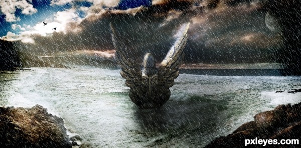
The Sea Guardian - created by Toothpick134


The Sea Guardian
Favs: 0SBS: 26Hi-resRank: 6/17Score: 55.9% (10)6604 views

Well I had to upload this one again.. Anyway please vote again if you have voted before and I'm sorry.. (5 years and 3237 days ago)

4 Sources:

avatar CMYK46
CMYK46 says:

Moon wouldn't be in front of the clouds.

author says:

You're right I've decreased the opacity down a little bit and also masked out some of the moon.. Hope this improves it. And thanks for the suggestion CMYK46 it's appreciated

avatar arca
arca says:

Love the concept here!

I know it is a little late (Christmas just takes too much time away from Pxleyes) but I do find that the rain is a little overpowering.

Also, when considering composition it is a good idea to check out some info on what is called the rule-of-thirds or the Golden Section (slightly different theories but same principles) ... here are some links with info on both - Golden Section http://www.youtube.com/watch?v=zyLjT8sodlw and Rule-of-Thirds http://www.youtube.com/watch?v=OiYHT-JvoqI). If you have any more questions feel free to PM me

author says:

Thanks arca I found this really usefull and learnt allot

Howdie stranger!
If you want to rate this picture or participate in this contest, just:

LOGIN HERE or REGISTER FOR FREE