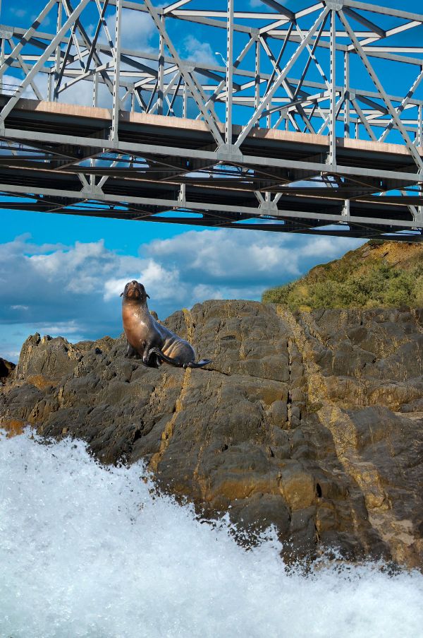
Sea Lion - credit cmykcba @ stock.xchng
Wave - credit emlyn @ MorgueFile
Bridge - credit marykbaird @ MorgueFile (5 years and 3690 days ago)
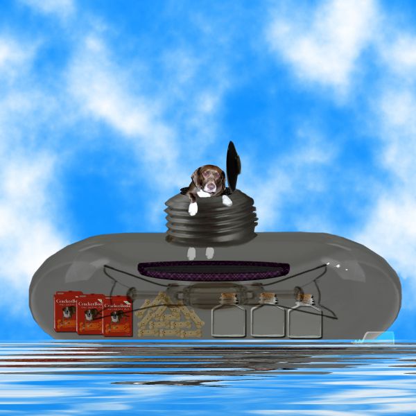
Thanks to my Daughter for use of her dog Coco in this project
Two filters used in this project I don't know where to get them now I got a long time ago sites closed nowThey are....
1. mura's meister filter for cloud effects
2. And..vm natural filter for water reflection effects sorry guys maybe someone may know where they are now..Thanks (5 years and 3696 days ago)
Poor Coco! Rescue, quickly!
Howdie stranger!
If you want to rate this picture or participate in this contest, just:
LOGIN HERE or REGISTER FOR FREE
(5 years and 3704 days ago)
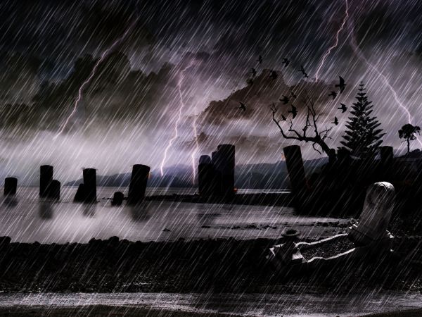
Dark...
very nice
Nicely done...
Not bad...rain is to define,and birds are to sharp...fix that and u gonna have very nice image...I will hold my vote
good lighting!
wow!it looks so reallistic.
Howdie stranger!
If you want to rate this picture or participate in this contest, just:
LOGIN HERE or REGISTER FOR FREE
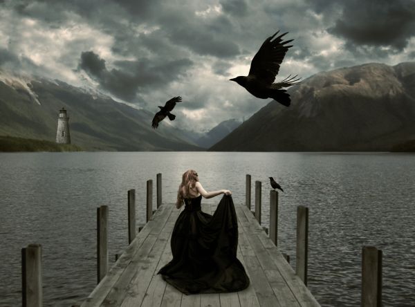
I used this quote as a guide line
"A woman knows the face of the man she loves as a sailor knows the open sea".
Honore de Balzac
Jessica-http://faestock.deviantart.com/
Alana Smith-http://www.sxc.hu/profile/Alana12
Julia Starr-http://www.sxc.hu/profile/night_fate
Andrew Conn-http://www.sxc.hu/profile/andrewconn
Lavica-http://lavica-photoshop.deviantart.com/
Thanks guys for the great images that i used for this project...
(5 years and 3715 days ago)
This girl looked quite small, I think. But it's a good job. GL, author
The girl is very small, and the smallest crow should be a bit smaller. The lighthouse doesn;t seem to fit in too well to the background, perhaps a colour overlay above your image for blending? Good luck!
I think you should make the girl bigger..she looks tiny weeeny 
Thanks guys,i made some corrections...girl is bigger not...or better to say taller....
Girl is too small, light is from the right, solighthouse should be flipped to match...
Thank u for the comment CMYK but i don't agree...girl is now regular size and light coming from both side and at right side of the lighthouse is big dark cloud who blocking the light....So i think that the lighting is ok...
this is pretty, in a creepy morbid way .. wives tale says 2 crows mean death....
This is pretty but dimensions are bit difficult to digest...
I think CMYK was right about the lighthouse.
Howdie stranger!
If you want to rate this picture or participate in this contest, just:
LOGIN HERE or REGISTER FOR FREE
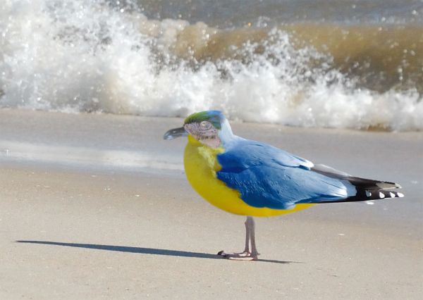
The parrot is partially used.
The author of source image is Turtlemom4bacon (see url) (5 years and 3719 days ago)
Creative!
Nice coloring ^^
lol...:P
nice idea 
cool
Cool colours.....
nice!
very good 
Howdie stranger!
If you want to rate this picture or participate in this contest, just:
LOGIN HERE or REGISTER FOR FREE
very nice and unusual...good luck author
I like it
That's one BIG Sea Lion, lol
Howdie stranger!
If you want to rate this picture or participate in this contest, just:
LOGIN HERE or REGISTER FOR FREE