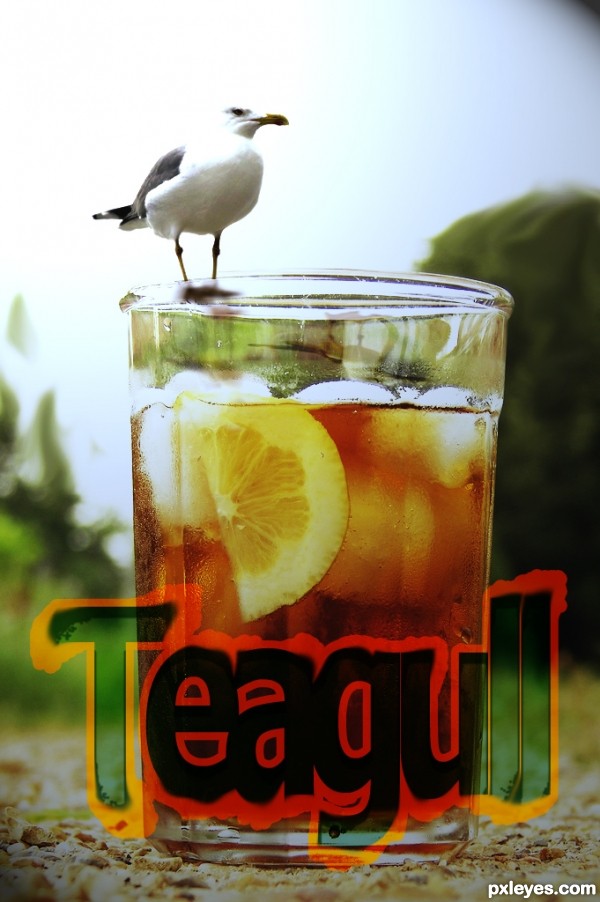
New Teagull. All our Flavors
Copy/Paste
Blend Layers
Shadows
Lighting Effects. (5 years and 2990 days ago)
- 1: source1
(5 years and 3149 days ago)
Nice colors, good effect.
Really really beautiful! I agree with MossyB! Peaceful...
Nice one and agree nice mood, colors, and cool effect.
i agree with you all friends
good luck author
high scoring entry
gl author
Love the sky... amazing scene.
Outstanding! Good luck author 
very nice shape and angling to keep focus within.. GREAT JOB!!!
Great job,good luck author ! 
Howdie stranger!
If you want to rate this picture or participate in this contest, just:
LOGIN HERE or REGISTER FOR FREE

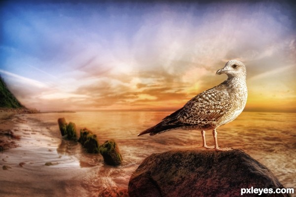
My impression of a seagull distorted by heat waves...or something like that...psychoactive substances may be involved here, at least I hope so. :) (5 years and 3160 days ago)
Very elegant, great job author . Love it, Good Luck !
Well done author,good luck ! 
Howdie stranger!
If you want to rate this picture or participate in this contest, just:
LOGIN HERE or REGISTER FOR FREE
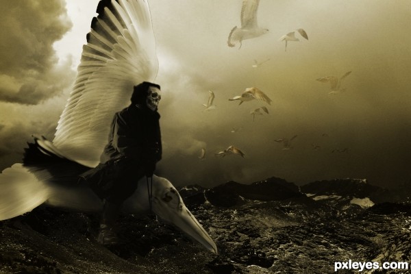
The straps are painted on...I really like this, i think it's the best i've done thus far. Welcome comments as it's with them i can develop further. Many thanks. (5 years and 3414 days ago)
This is very attractive!!! I'm not a big fan of skulls but they do make for awesome photography/photoshop and things and this is right up there with the best IMO 
I think its really good author, different lol, nice to see the gulls doing something useful 
Goodluck 
Some edges are too hard, others too blurry. Good idea, though. 
interesting idea.... kind of dark, but good.... good luck.
nice mood...gl
Congrats for our second place, Layerstack!
Congrats...
Congrats!!
Howdie stranger!
If you want to rate this picture or participate in this contest, just:
LOGIN HERE or REGISTER FOR FREE
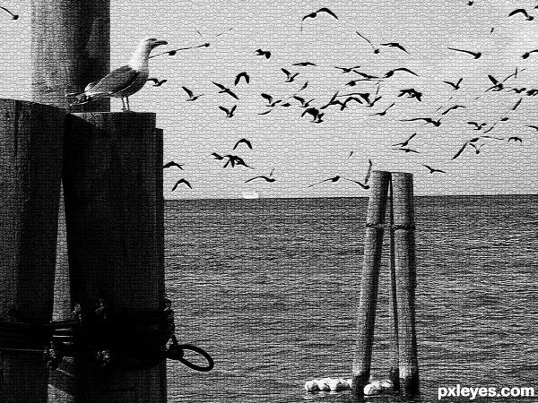
A peaceful dock scene. (5 years and 3470 days ago)
I think it can be better without the texture effect, and with playing with light. Good luck author !
Great concept. I do agree with Lolu though ...You can add very nice and easily editable textures by:
Add a 50 percent gray layer with the blend mode set on Soft Light (Overlay and Hard light work too ... just stronger); apply filters (you can combine them until you get a look that you like - e.g. stain glass, monochromatic noise ...you can do this in more than 1 layer). You can warp them or transform them; you can paint some out or back in (using gray); you can blur or sharpen.
Once you think you like what you have created. Voila! You now have a texture that you can work on, change opacity, lighten (use lighter grays to white), darken (use darker grays to black) and all without harming the main image.
Trick: the neutral gray layer is also a great way to play with the lighting almost like dodge and burn but non-destructive ... use white for highlights, black to darken and/or intensify and 50 percent gray to bring back to neutral (no change).
Arca gives a nice tip, you can try it. Beautiful image, though. 
nice
I like the treatment here, it really looks like one pic.
Howdie stranger!
If you want to rate this picture or participate in this contest, just:
LOGIN HERE or REGISTER FOR FREE
Gull is way too small & dies against the white background.
Thanx 4 comment i know it! Thats what i wanted
this image would fit very well in the shrunken animals contest nice concept author
Howdie stranger!
If you want to rate this picture or participate in this contest, just:
LOGIN HERE or REGISTER FOR FREE