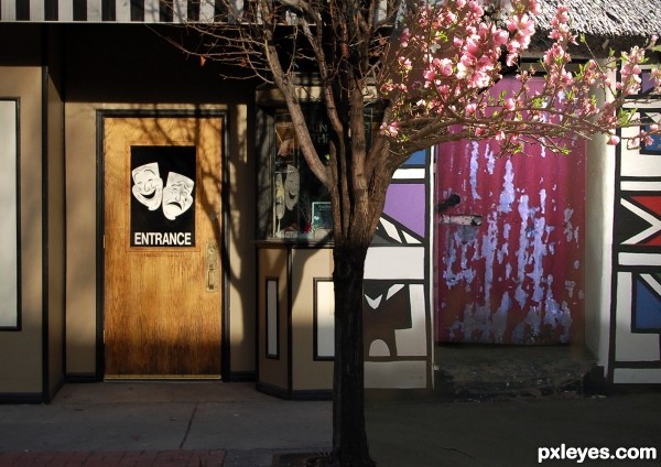
The difference between Europe and Africa on exactly the same day - autumn versus winter.... (5 years and 3697 days ago)
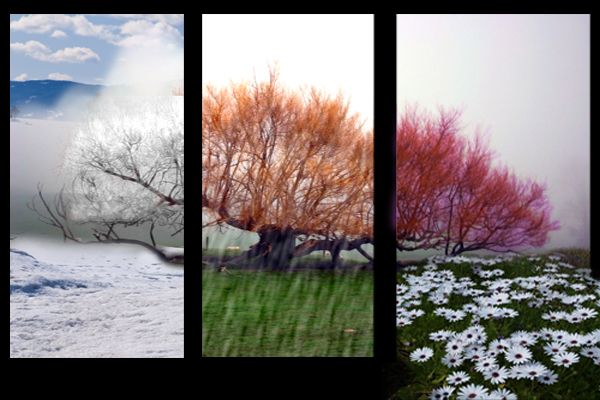
(5 years and 3728 days ago)
Beautiful....
Only 3 seasons? Why the blur in the center panel?
Very nice work author...best of luck
Nicely done
great idea- only one thing IMO ,the sky in the winter is clear and cloudy in the spring and on the whole image the mountains don't flow with the rest of the image. suggestion: loose the mountains in the winter or clear up the sky's in the spring 
woow, awesome trick
I suppose it's raining in center panel... but CMYK asked a good question: why only 3 seasons? It's a very good idea, and beautiful manipulations, so, you could complete it with all seasons... 
thank you for the comments , its good idea to try creating 4 seasons
gornats , i agree with you .
Very good! 
Howdie stranger!
If you want to rate this picture or participate in this contest, just:
LOGIN HERE or REGISTER FOR FREE
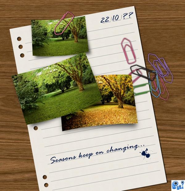
Grass: thanks to MQTRF
Paper clip: thanks to Divair
Wood texture from CG Textures (5 years and 3882 days ago)
Excellent work! Very clever!
Sorry, I forgot it. The loose leaf was create from scratch, it's not an external source. Thanks Ponti 
Very Good
Dead green leaves on the ground? You should have substituted grass...
CMYK, I used Mrtrf's grass texture on the ground... And what may look 'dead green leaves' may be creepers or something 
Ummm...sorry author, but I see the same leaves as in the source pic, but green...
Shame on me! You're right CMYK. I had placed the wrong summer picture. That's the right one... Thanks 
Good composition and the paper clips are a very nice addition. I also like, that you curved the pictures, that makes it even more alive and real  And of course you did a nice job with transforming the picture to a summer scene! But just a little thing... I think, that the tree in the summer picture could need a little shadow
  Good luck!
Thanks for your tip Lelaina! Changed using masked exposure... Hope it's better now 
Yes, it looks a lot better now  Oh and by the way: I also like the ink splatter. It's a very good addition. Good luck again!
Very nice...great image....gl
Creative and light hearted...nice curl to the photos. I think I would have liked the writing to be real and not a font...but good job author! Great change up from the original source!
nice image. I like the text and ink splats. good colour change from summer/autum (fall)
beautiful job 
Excellent work...G/L.
Howdie stranger!
If you want to rate this picture or participate in this contest, just:
LOGIN HERE or REGISTER FOR FREE

The abstract forms are made by me using the circle selection tool, the pen tool for the curved lines and a soft brush on different colors for the light beams. Couldn't decide which of the images I like the best, so I've chosen to show them both. So, you'll decide which one you like the best. Waiting for your feedback. Enjoy!
credits and thanks:
http://katanaz-stock.deviantart.com (5 years and 3940 days ago)
You need permission to use this stock, very nice entry, good luck.
awsome find with the photo, but must agree, you need permission to use it.
well done
Formula image but not bad...
great work
I like the color and use of the leaf...I think some shadows under the leaves would really add a nice touch. 
very nice good luck
nice
Wow! This is amazing! *favs it*
Great job. Favored it.
wow its soo pretty.i love the colours ,u have co-ordinated them so well
Nice pic.
thx, guys, for all the nice comments. GL 2u2
Great composition....
beautiful work author. great use of colour
good one
Your work is truly artistic and would make a lovely print to frame and enjoy in ones home. There is a website where you and others could have wonderful prints made. You would have to have permission from your source, but let me know if you want the address. Good Luck!!
Congratulations 
Howdie stranger!
If you want to rate this picture or participate in this contest, just:
LOGIN HERE or REGISTER FOR FREE
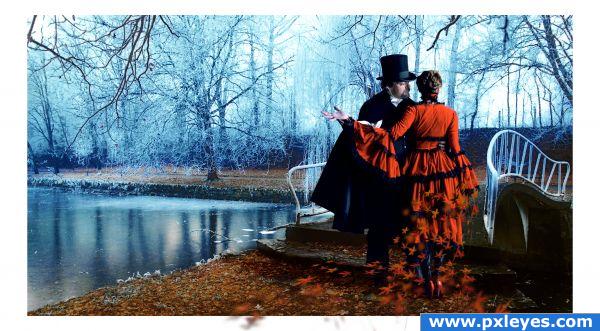
Wish I could come up with a better name.....
Special mention to Marcus Ranum (whose "hobby" has left many of us with obtainable quality stock.) and his model Sarah, as well as Marlin Grey for her leaves.... (5 years and 3940 days ago)
Very nice....I like it very much. For some reason this image reminds me of the song Epiphany by Stained. maybe because of the outfits.
Interesting use of the 'out of bounds style' i persoanlly think that the white around your image is distracting and not really necessary. The rest of the image looks good. Your models could be slightly smaller, they look out of proprtion. Good luck!
sooooo romantic......wow.....GL
if i were you, i would change the holding (not the whole edge, but just the holding part) of the bridge to more wood-like material it's not optional ofcourse
  it's great image anyhow!
Very nice job! High res. is amazing  Good Luck
I like the leaves, like falling off her dress and the way the fly out of the image. Well done author!
Howdie stranger!
If you want to rate this picture or participate in this contest, just:
LOGIN HERE or REGISTER FOR FREE
Wouldn't it be Autumn versus Spring?
....................
uhm... blush - sorry. It is autumn versus spring (don't know what i was thinking when I typed that!)
Howdie stranger!
If you want to rate this picture or participate in this contest, just:
LOGIN HERE or REGISTER FOR FREE