Thanks to Jerald Bernard (dsj) at sxc.hu (5 years and 3925 days ago)

Thanks to http://grace-stock.deviantart.com/art/Sky-Stock-XV-34543830 (5 years and 3935 days ago)
good entry
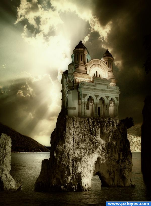
I like the idea. Work the blending between the castle and the rock and I think you'll have a very nice peice.
Great looking image!
The fuzzy edges of the rocks on the right should be hard like the left side. Over all I like it.
awesome
pingenvy thanks for nitpick, fuzzy edge on the right correct. 
the contrast doesnt match with the sources
This would be great if you made a bridge from the land at left to the cathedral. That would really make sense. As it is, how did the cathedral get there? If you want to make a realistic image, think it through! 
nice... my only suggestion(s) would be to colorize the house using a hue and saturation adjustment layer, colorizing it, bringing down the saturation a bit, so its a greyish brown, since there arent any green lights, and make the opacity 90% (hue and saturation) also, darken up the siloeut on the left... get rid of the lighting, it wouldnt show through with light blairing behind it. 
Congratulations!!!! 
Howdie stranger!
If you want to rate this picture or participate in this contest, just:
LOGIN HERE or REGISTER FOR FREE
Very nice look, really awesome. I don't personally understand the significance of the rock there, but i suppose it's what you saw. Good luck here, high marks from me!
very pretty! good job
Nice.........gl
nice place 2 vacation
nice job
nice job! gl!
great job the placement of the rocks works because you want it to look like the ocean i understand also like the slight bloom effect makes it look like the picture was taken on a sunny day, the only thing that i would change is the walkway on the right because the perspective doesn't match and it's distracting
slayyou, thanks for suggestion, I have cropped image from right.
good work
very nice
skyview cheers!
nice one., Good Luck.
Howdie stranger!
If you want to rate this picture or participate in this contest, just:
LOGIN HERE or REGISTER FOR FREE