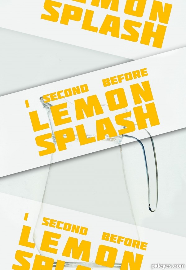
typo poster
eraser tools
no sense ...
in french: Pas d'idée, ni de message en particulier, juste une image ou j'ai travailler la gomme ...
(5 years and 3431 days ago)

Thanks to Night Fate, Jascha400d, and Spyros Tav from SXC...
(5 years and 3612 days ago)
excellent mood .... The only suggestion is The shadow under the torto head is a little bigger... other wise fine job... good luck.
I agree, this is very nicely done, beautiful colour combinations and textures.
nice work man!
Very dramatic entry. Only suggestion would be to make the turtles shell round at the top. Good luck!
awesome mood, well done 
as thye say it is very nice work ,good luck
nice job
Nice mood. Really get the feel that he needs to go a long way!
very nice
good luck
Howdie stranger!
If you want to rate this picture or participate in this contest, just:
LOGIN HERE or REGISTER FOR FREE

(5 years and 3647 days ago)
duck and teeth are missing...
Yes, where is the duck? And teeth?
And there are several mistakes in your work... The shadow shows the wrong side of that hammer, it should be blurred too, the hammer looks like it's hitting the edge of those plates and again, before-time hammers should be blurred (motion blur)
I think it's preety good! 
Liar!!! There is no duck and no teeth...
read the theme again author 
is this a hammer duck plate contest???come on people random objects that's everything
Lol!!! Better...  I knew I shouldn't vote yet and wait for you to make this picture better.
  Like many people.
 looks way better ! great idea !
nice work 
interesting....GL
good luck
Howdie stranger!
If you want to rate this picture or participate in this contest, just:
LOGIN HERE or REGISTER FOR FREE

please vote again because the original was taken off from copyright issues.
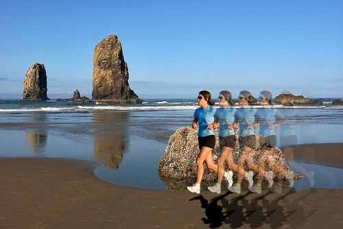
This picture was put together with a picture of a beach, and a jogger. I used layers of the jogger and opacity to create the effect.
the lady was from markbierd on flickr.com and the background was from paraflier, don't copy this image as it has partial copyrights from the original. just make your own. thanks. (5 years and 3665 days ago)
Picture of the beach is copyrighted so i dont think u can keep it as is..aside from that, the jogger needs some kind of shadow..but good idea!
The idea is not good, because author misunderstood the concept of high speed motion photography. With this technique, the camera can take photo with the speed of 128 frames/s and even much higher. Presume we use this speed, so this photo was captured within 1/128s. Calculate from the first image of this person to the last image on the left, he "joggled"around 2m --> his speed is around 2m per 1/128s or 256m/s or 921km/h, that means 0.7 sound speed  . Just the funny demonstration, hope that author will understand this concept correctly. For that matter, you should capture the image of only one person in this photo, so no different between the normal photo and high speed motion photo can be observed, this is why the target of high speed motion photo is always the object moving with the ultra high speed such as the bullet.
EIDT: Oops, this is a lady 
Sorry, langstrum is right (I should have read the contest goal)..hopefully u have time to change it though..
If you can replace the copyrighted background, keep in mind that someone going that fast would kick up a heck of a wake! 
Only Cyborg or Bionic Woman could do it... 
The Flash could do it at the speed of sound... ;]
the duplicated jogger takes away from the image... basically you would get that repeated image look with a long exposure camera not a highspeed.
think of it this way, you are catching a split second of a moment... view a few of the other entries in he contest to get a good idea of what the contest is looking for...
also the shadow of the jogger does not match the light source for the background... and the lighting of the jogger is opposite of both the background light source and the shadow added...
GL!!
Agrees with bjaockx. And for future reference , try to upload something a lot higher resolution.
Howdie stranger!
If you want to rate this picture or participate in this contest, just:
LOGIN HERE or REGISTER FOR FREE

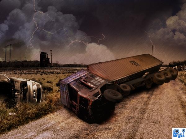
Thanks to morgue file,com.here i have used the layer techniques and some blend mode option..i need ur valuable comments and im just a beginner in these type of work. (5 years and 3806 days ago)
your main problem is the size of the truck, the length is probably ok but the front of the truck looks no higher than the grass, and we all know that the cabins are huge  goodluck.
Edit: much better 
thank u keiley for ur valuable comment ..i have reworked on that part..
nice concept. like the changes you made, looks better. GL.
Nice work here,maybe u gave to delere clio type,dont match with the colors.gl....
very nice 
Howdie stranger!
If you want to rate this picture or participate in this contest, just:
LOGIN HERE or REGISTER FOR FREE
What font pack is that?
typo source = font pack = http://www.fontsquirrel.com/fonts/Molot
THANKS!!!
I like it.
Can barely see the image with the posters going down in front of it. Next time just leave the wording in the title or description so we can see what you created.
Howdie stranger!
If you want to rate this picture or participate in this contest, just:
LOGIN HERE or REGISTER FOR FREE