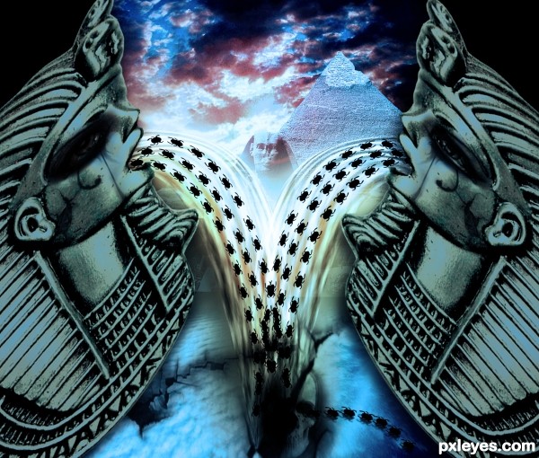
I am inspired by the movie The Mummy (5 years and 3490 days ago)

Thanx to barefootliam from DA (5 years and 3581 days ago)
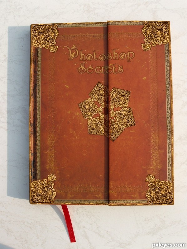
Need a clear break in the letters where the two covers meet -- as was done with the snowflake-thingy in the center (but with a recognition that the left-side-cover portion needs a shadow from the right-side-cover portion).
ya.. thank u now i did..
Howdie stranger!
If you want to rate this picture or participate in this contest, just:
LOGIN HERE or REGISTER FOR FREE

Hope you like it
I used my own sources (see sbs) (5 years and 3607 days ago)
Great mood! I would like a small story though about your idea behind it. Only suggestion I can give is; create some beds out of the clouds for the cages to rest on, they are just blurred into the clouds now. Hope you know what I mean  Good luck!
love the fact you used all your own work and photos.. awesome!!!!
Very surrealistic image.. and a great demonstration of talent, both photographic and photo-manipulating. Terrific.
It's a mystery... 
great
very very nice...good luck
Great mood 
nice ..............
Great usage of source image. Love what you did, gl
Great mood ........G/L Author.
congrats!!!!
congrats .............. nice entry
Congrats!! 
good execution... congrats...
Howdie stranger!
If you want to rate this picture or participate in this contest, just:
LOGIN HERE or REGISTER FOR FREE

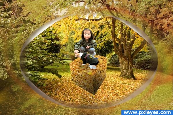
in autumn you always know, that something can changing (5 years and 3816 days ago)
Interesting, looks a bit like a jumble, but i kind of like it. Good luck.
Looks like you get better drugs than me...
Great idea,fix cube little bit its tto blury....gl
Thanks all for the comments)) i'll thinking about bluring the next time 
Beautiful!
fun image. great use of source.. very different entry. Well done
very nice 
This is a quite unique view, I like it, and the idea of the "eye" also
Howdie stranger!
If you want to rate this picture or participate in this contest, just:
LOGIN HERE or REGISTER FOR FREE
Great movie.... the symmetry works pretty well for me but I think it may have worked a little better had the heads been facing each other....just looks a little distorted. Very good concept though GL
GL
Howdie stranger!
If you want to rate this picture or participate in this contest, just:
LOGIN HERE or REGISTER FOR FREE