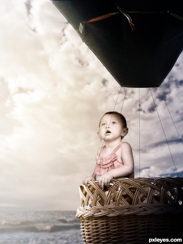
Thanks to NightFateStock (5 years and 3277 days ago)
- 1: Balloon
- 2: Basket
- 3: Waterscape
- 4: Sky
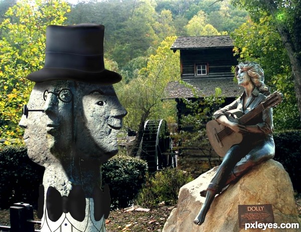
Thanks to Hillike at pxleyes.com for the hat source. Dollywood statue is by stephenconn at flickr.com Background is my own Dollywood photo. (5 years and 3342 days ago)
Entertaining but the light sources don't match well.
Very cute, great that the background shot is YOURS, and also from Dollywood. Looks like a mutual admiration society! 
Howdie stranger!
If you want to rate this picture or participate in this contest, just:
LOGIN HERE or REGISTER FOR FREE
(5 years and 3352 days ago)
Howdie stranger!
If you want to rate this picture or participate in this contest, just:
LOGIN HERE or REGISTER FOR FREE
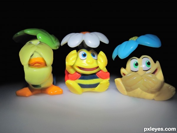
Sbs coming soon... (5 years and 3359 days ago)
so cute 
Wowwwwwwwwww!................great idea
wow! this is so cool! the blending is awesome!
Yada yada yada...blending is good...yada...well it IS good. So I add to the admirers. Great job!
Thanks for all your comments guys!! Means a lot...
Great idea and execution. 
interesting work author
Howdie stranger!
If you want to rate this picture or participate in this contest, just:
LOGIN HERE or REGISTER FOR FREE
(5 years and 3389 days ago)
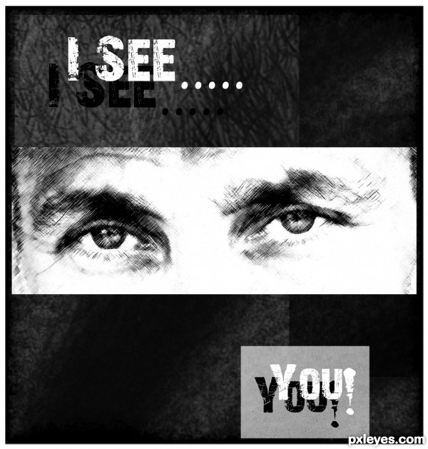
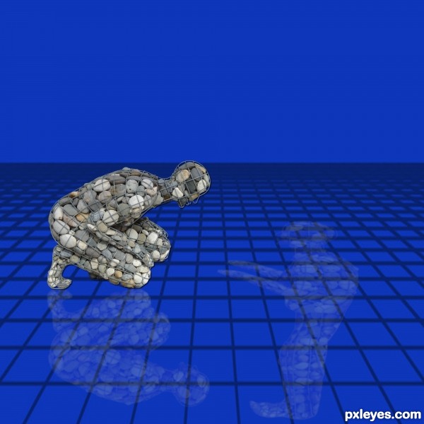
This would be cool if you deformed it so the head is in front of him to the right so that he is looking at himself.
Thanks K5683 I redid is this what you ment ?
I can't talk for k56, but :
You could explore that opposition theme: with the guys looking at each other, only remove the grid and use (maybe) some ice- something like frozen water but which is transparent at some points so that we can recognize his reflection.
You could also use contrasting colors orange/blue and some fog in the horizon.
Damn, I miss photoshop!
that's not really what I meant, well sort of but not really. I'm not really sure what tool it would be in photoshop because I use paint shop pro. In paint shop pro, it is called the deform tool and you can pull one angle. So, his feet would still be reflecting at his feet (feet touching), but his head would be in front of him, not below him.
Transform + rotate ? Ctrl T and mouse. Or distort.. hmm.
ahhh, no sorry author, this isn't what I mean either, but this one looks creative  Okay, so if you duplicate him, flip him underneath and lower the opacity you will have a reflection like you first had. Okay, now what you want to do is click on the deformation tool, and put your cursor over the nodes (the tiny squares on the corners and middle of the lines you see) Now, if you hold the Shift button or Ctrl button when pulling these nodes, you will be able to deform them in different ways than with just pulling the nodes. You may have to play around with it a little to get it the way you want it.
Like I said though, this new reflection is quite creative, I would just move it over so the feet touch still.
Thanks so much k5683 I played with it a while ended going back to original so his reflection would look same shape as him But like tile says I see you putting another reflection would give it another demenion where there is a reflection by its self and while he sees his he sees the other..lol Thanks again
Howdie stranger!
If you want to rate this picture or participate in this contest, just:
LOGIN HERE or REGISTER FOR FREE
Ballon & basket are out of proportion. Too many white edges on child & balloon.
The white edges were done using the Glowing Edges filter set to screen, they were intentional. As for the proportion i'm very aware of it but it would've made for a boring image if they were.
Might have been easier to make a SBS explaining that, then...??
The lighting is too inconsistent and wonky, from the intentional glow edges, which just look like a bad extraction, to the totally black balloon, showing no light refraction/reflection from the strong light source of the sun.
The "shadows" from the totally black balloon lines also look very unrealistic, and not in a good fantasy way.
While an SBS would help the view recognize which poor chopping effects are deliberate, this is still an image that needs work, either to look more realistic, or more fantasy. At present, it just looks very novice, especially for a photoshop competition, IMHO.
Glowing edges overlay removed, black lines made thinner, more light added to the balloon and scaled down the child slightly. Thank you.
Maybe it's just me but the balloon feels a little low compared to the water... I can foresee an imminent and dramatic crash on the horizon...
Oh and on the subject of the balloon and basket being 'out of proportion' I think it probably looks better this way than if they were not scaled down to the baby. Now do feel free to ignore this if it becomes pretentious but a full size basket would give the idea that it was being seen by an adult and that the baby was out of place or intruding for comic effect. Whereas a smaller basket kind of gives the impression that it is being seen by the child, in its own world, and that the basket is specifically for it, not adults. I warned you it would become pretentious...
balloon color to change to match overall color scheme

strings not strong enough to hold balloon, change to ropes?
nice idea
Howdie stranger!
If you want to rate this picture or participate in this contest, just:
LOGIN HERE or REGISTER FOR FREE