thanks Mike Licht, NotionsCapital.com (5 years and 3833 days ago)
- 1: source1
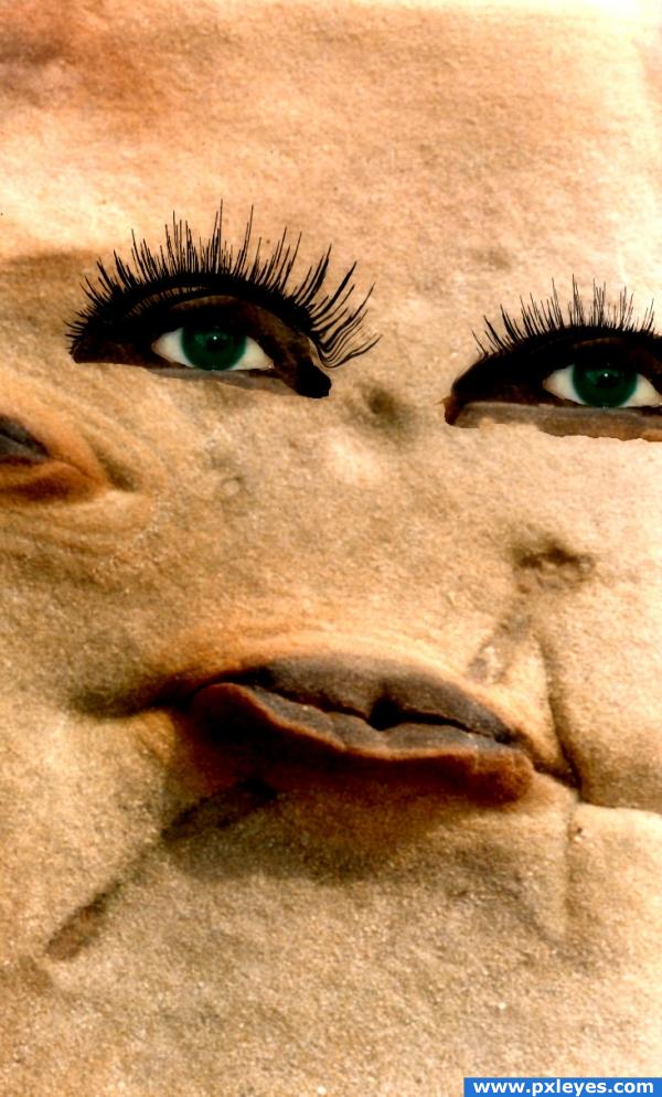
http://www.obsidiandawn.com/eyelashes-photoshop-gimp-brushes these are brushes used
thanks to marcos_bh (5 years and 3868 days ago)
strange use of source, i have to say, but it shows creativity. Good luck.
I also saw the face oppertunity because of the "lips" as soon as i saw the source. lol good luck
shes beautiful, like the elephant man... sexy!!!
gl
Howdie stranger!
If you want to rate this picture or participate in this contest, just:
LOGIN HERE or REGISTER FOR FREE
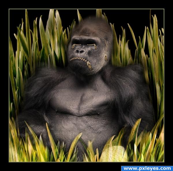
This entry has participated in the "Zipper contest" on the old PST site.
It was tough to gather around all sources used since it happened some time ago...but I nailed it and this taught me an important lesson: it's always good to save your work on the computer, you never know when you have to get back to it!
I have also saved the SBS.
I roughly selected the gorilla using the quick selection tool, added black backround, blended edges using layer's mask, added zippers, added grass.
The only thing that I did now was to blur some of the grass in the backround.
Credits to "Macinate" on Flickr for a great gorilla image. Main account at: http://www.flickr.com/photos/macinate/
Hope you like it this time as well! (5 years and 3878 days ago)
good idea!
Good image. If you can fix the transparent grass, it'll be better...
hehehe.. you forgot the fourth evil.. hehehe.. but the grass is covering it up.. LOL.. great job on this one 
really awesome!
Howdie stranger!
If you want to rate this picture or participate in this contest, just:
LOGIN HERE or REGISTER FOR FREE
(5 years and 3885 days ago)
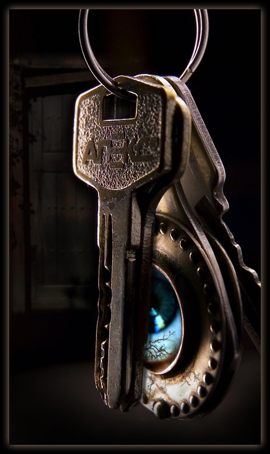
Good use of source, very nice!
interesting! and yes, the usage of the source image is great!
Very nice visual
Howdie stranger!
If you want to rate this picture or participate in this contest, just:
LOGIN HERE or REGISTER FOR FREE
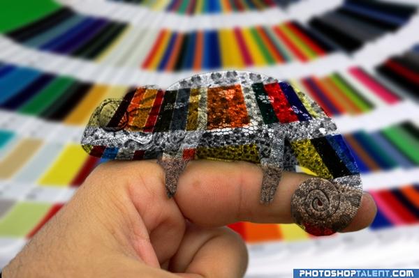
Thought this would make an interesting picture.
EDIT: Tried to change to color to skin tone where he is in front of the finger.
Comments and criticisms very welcome! (5 years and 3936 days ago)
excellent idea! You pulled it off very well. The SBS is great too.
How very clever!!! Awesome Job and Good Luck 
WOW WOW WOW WOW WOW WOW... happy dance.. SUPER HIGH MARK FOR THE IDEA ALONE.. really is a clever clever piece
Good idea, but he'd look like skin where he's against your finger...
good job
very original
Cool idea still needs work tho on the little guys legs "edges"
wow that poor camealon must need some prosac.. good job
CMYK: I have been trying to get the finger color like you said but so far it just looks cheesy. Will continue to work it and hopefully have it worked out before the contest ends.
good idea.
WOW!! i love this image!! excellent idea!! god job author!! 
brilliant idea it also required alot a time and paitience well done author u have the rare idea which no one had from along time
That's an adorable idea!
coool blending love it!!!
Nice idea.
Great idea 
nice job....
Wonderfull idea! I guess some blur and light effects could be added to the iguana to make it look colorful. not transparent) good job anyway!
you did very well
Howdie stranger!
If you want to rate this picture or participate in this contest, just:
LOGIN HERE or REGISTER FOR FREE
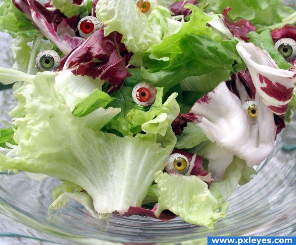
This is a great idea, but the masking on the eyeballs is terrible. Try getting the edges better and you'll have something!
yuck! Oddly, those goes so well in that picture
Howdie stranger!
If you want to rate this picture or participate in this contest, just:
LOGIN HERE or REGISTER FOR FREE