No sources were used. I drew everything in illustrator. (5 years and 2801 days ago)
LOL, good concept. Hope she shuts up when she gets a caller! 
(5 years and 2801 days ago)
LOL, good concept. Hope she shuts up when she gets a caller! 
Howdie stranger!
If you want to rate this picture or participate in this contest, just:
LOGIN HERE or REGISTER FOR FREE

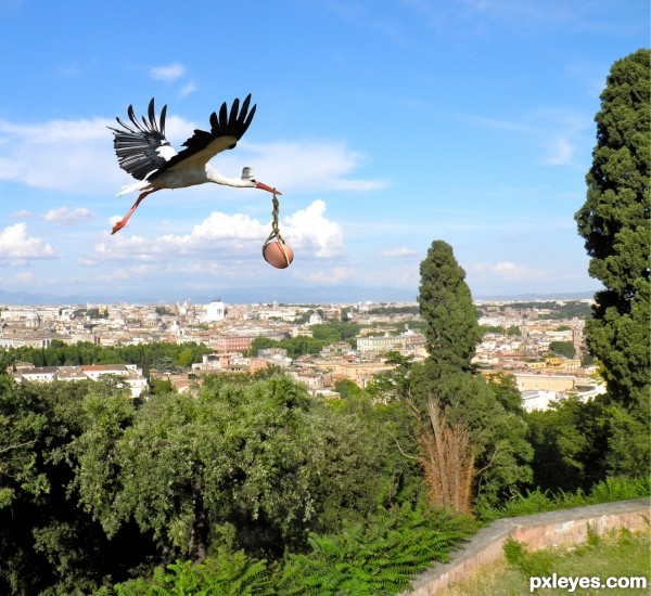
The "chicken" delivery service ! (5 years and 3028 days ago)
looks good on high res , i think it would have more impact if the stork is closer
good luck 
As gornats said the image would pop more if it was closer by but this is a great take on the source image, i think its funny and altho a cliche its still original i think. Another few things that wll improve it is the edge of the stork, theres a darkline on the stork on top of the neck towards the wings. the back of the wings doesnt look so nice this way perhaps you can draw/smudge with a fine brush the feathers a little back, to make it look more natural. i know it looks on the original the same but with the original background it doesnt pop so much and blends in well.
I was in Vocational Agriculture in high school. We had about 50 laying hens and when they layed, it was very noisy and sounded especially painful. I bet that they wished that it would happen this way! Well, upon further consideration, it would be nice if it worked this way for everyone!
ill sign for that downoffthedragon!
Thanks for all the comments, and i realy appreciate the time you have taken to leave the comment; So i can improve the image quality overall. Also thanks for telling and sharing the story it calls upon you. It means alot to me.
For the image, I totaly agree with the (lazy) cutout of the stork. When making the image i was tired ( but no excuse ). At the moment i can not find any time to improve on the image. I am sorry for this, but thats the way things are.
I just had to reply and give you people a big thank you.
So once again, Thanks for the great comments.
Howdie stranger!
If you want to rate this picture or participate in this contest, just:
LOGIN HERE or REGISTER FOR FREE

(5 years and 3084 days ago)
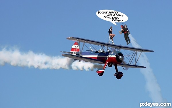
Funny! Try to fix the rocket man's smoke trail. The edges are too hard. Type is skewed, and not the greatest font for a word balloon, which is also skewed. Type and balloon should be parallel to the horizon. 
lol.  well done
Lol, great humor author, Love it. 
Very funny, good work author!! 
Idea is Ok . but you should have had the man with jetpack coming from behind, the way it is the plane would be long gone by the time he got out the first word.
He's got a jetpack, for goodness sake! He can keep up EASILY with that plane... That's why he shot straight up, instead of chasing it from behind...Sheesh!
Howdie stranger!
If you want to rate this picture or participate in this contest, just:
LOGIN HERE or REGISTER FOR FREE

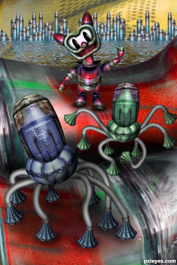
Used only Dyson Photo (no other images)
Please see SBS and Hi Res (5 years and 3105 days ago)
Absolutely fantastic 
Very good.
Nice 'bot' work, kitty, too. Great idea for the skyline. 
Super job!..

Congratulations
Congrats 
Congrats, nice work 
Congrats! Guess who is my favorite... the cat like creature, of course 
Howdie stranger!
If you want to rate this picture or participate in this contest, just:
LOGIN HERE or REGISTER FOR FREE
NU NU Dum Dum so cute
Howdie stranger!
If you want to rate this picture or participate in this contest, just:
LOGIN HERE or REGISTER FOR FREE