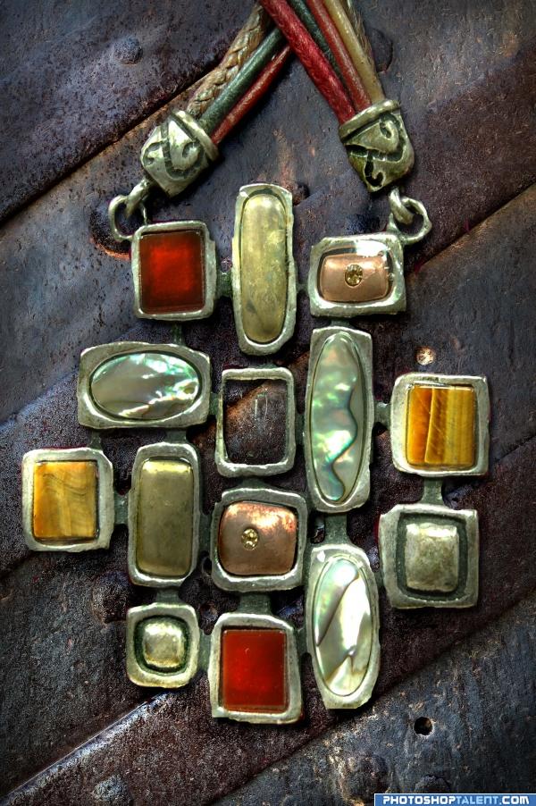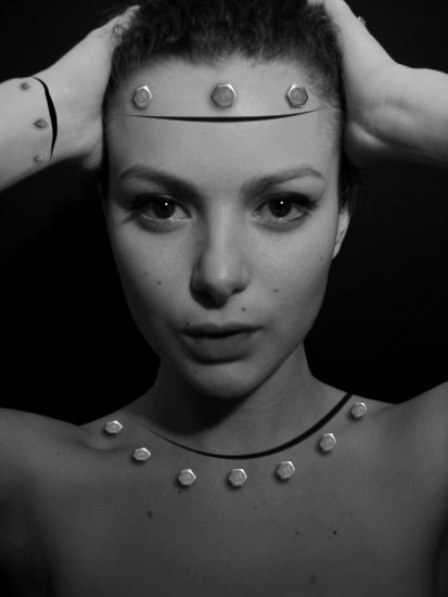
just layered over my photo of a necklace pendent...dodge and burn (5 years and 3932 days ago)

(5 years and 3952 days ago)
ouch ouch ouch ouch.. great concept ouch ouch ouch.. hard to look at.. ouch ouch ouch  high res would be nice.. ouch ouch ouch
OOhhh a sexy bride of frankenstein.. Nice idea - but they look too flat on the skin, they should be more like the one on the right on the forehead. It looks good. See if you can make the others like that.. Also are you missing one from the neck?? GL.
i know that girl! artificial, but still nice...  good luck!
Very cool chop good luck!
Great idea, good luck 
interesting idea  GL
GL
nice work 
good luck and very unique idea =)
You're missing a bolt on her right shoulder, but good idea! 
the bolt is not missing, honest i saw results after bolt & i think it stays better like this, but thks any way
so, after figth with myself i decide put missing bolt. thks
Good Idea!!! 

This is so awesome!
I think that the body parts should be moved away from eachother, rather than just blacked out  nice idea tho
very good
nice job 
good job and good luck
Really nice idea! B&W fits perfectly to the image!
Great concept! Well executed as well 
Howdie stranger!
If you want to rate this picture or participate in this contest, just:
LOGIN HERE or REGISTER FOR FREE
for such a simple idea it really came out well, you really can't see if anything was done at all and that is very skillfull.. under high res I see lots of cuts.. but they could be the actual jewelry textures.. LOL.. very good job.. fun to look at
You're supposed to USE the source pic, not just slap stuff on top of it...
True - this is lazy in a way, but at least it's my own image..even my own necklace - I didn't go to Deviant for it..Hee Hee! ANd I have used the source in a couple of other entries, about to post one here.
cool
nice image very realistic work.....But CMYK46 is right....
This IS using the source. It may be a 'simple' use, but overall it is a really nice composition. The different textures and colors are what make this interesting. It's visually very pleasing. I personally like when I can see a thought process when looking at an entry. You know the saying..."If it fits...wear it." Nice job, author.
nice one, but don't use source image only as a background
nice
looks nice
Howdie stranger!
If you want to rate this picture or participate in this contest, just:
LOGIN HERE or REGISTER FOR FREE