So many places to hide! :-) (5 years and 3835 days ago)

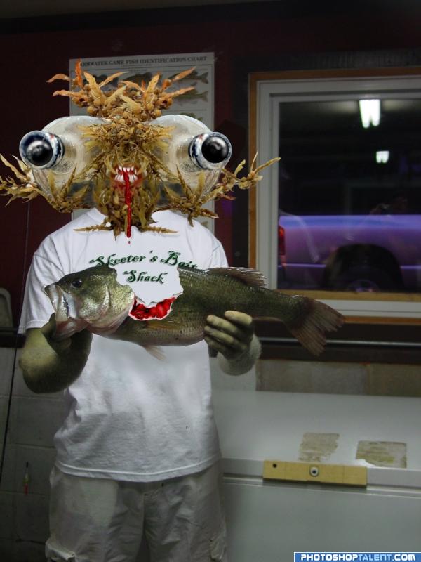
The vision of this face hit me immediately when I saw this source pic(last time the contest ran).PXLeyes pic and my own pic only ones used, with assistance from the tutorial>>>
http://www.n-sane.net/effects/organic-raw-flesh/index.php (5 years and 3940 days ago)
LOL...I love how twisted this is/was....

Ewwww! But 10 points for freaking me right out ! Good Luck 
Very creative! I like how the new you seems to have lost the soul patch.  Good job on changing the T-shirt message (although it seems to be floating above the shirt because of the drop shadow), but something needs to be done about the hat remnants. The arms and hands should match the head 'skin,' IMO.
ewwwwww........but nice thought....
Freaky, but most of all funny  . I might have feathered the edges from the seaweed ( I guess it's that, right?) so it fits more with your own image. Another nitpick, I'd remove the dropshadow and emboss from the text on the tshirt. The text is funny, but the way it is now a bit distracting. And well, a dropshadow in a print is of course possible, but it looks a bit like it's floating in front of the tshirt. But well done for the rest! Good luck!
Cool...very cool. I love how you used the bottle.
good work
Thanks for the comments! As far as the hat goes, Dan, I don't remeber if it was intended to be left originally or not, but I removed it because it bothered me since you brought it up. As for the soul patch...not mine. I wish I was still 20-something. As for the drop shadow on the tee, I intended to give it some depth for better or worse. Thanks again for the comments . Positive critique is always welcome!
You made me smile. Good luck!
now that is cool
lool , , , nice job
hahaha cool!! gl
imagination is key here, wonderful image
This one cracked me up the first time, and still does!!
hehe creepy
Congratulations for 3rd
Congras!
congrats
Congratulations.
Howdie stranger!
If you want to rate this picture or participate in this contest, just:
LOGIN HERE or REGISTER FOR FREE
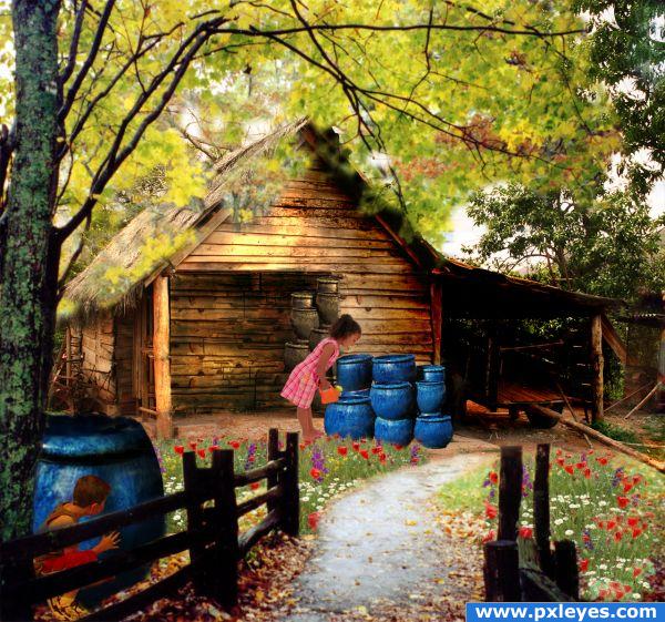
Really good work! The masking on the leaves is kinda blurry and I don't get why you chose to obliterate the front door on the shack, but that's just nitpicking...you've told a great story here!

Wonderful idea and great execution! Reminds me of my childhood
  And like CMYK said: you told a great story!
awe what a playful image
Very nice blending and color
Congrats for your second place, Marianne!

Congratulations for 2nd
Congrats, Great picture
Congrats!
congrats
Congrats!!
Howdie stranger!
If you want to rate this picture or participate in this contest, just:
LOGIN HERE or REGISTER FOR FREE