There you go Lelaina! (5 years and 3894 days ago)
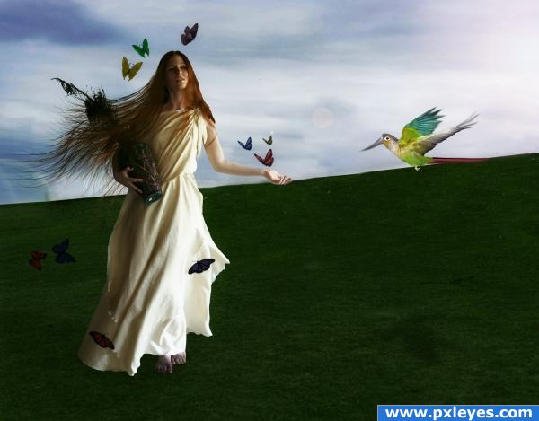
- 1: woman
- 2: bird
- 3: Hair brushes
- 4: Butterfly brushes

There you go Lelaina! (5 years and 3894 days ago)

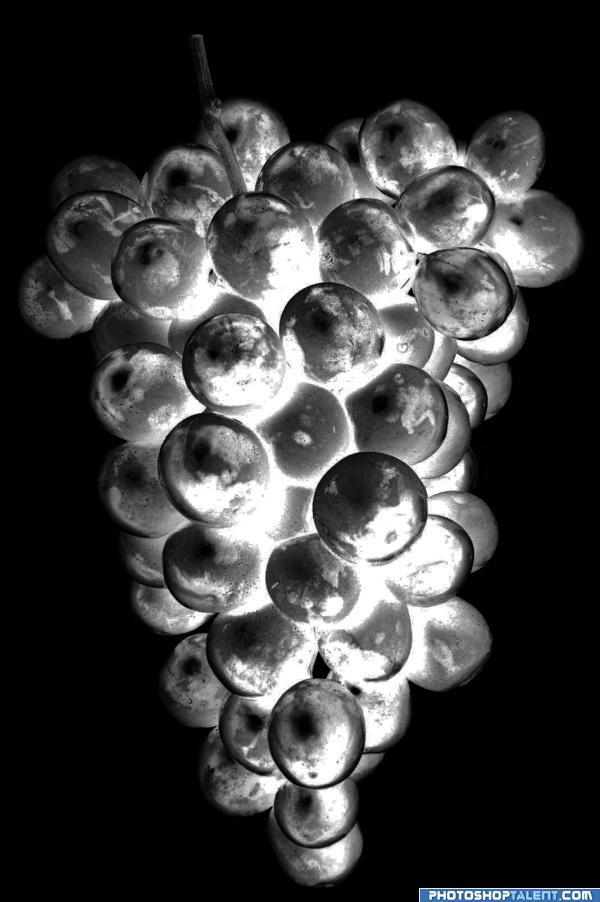
Chrome Grape that look lit from the inside. They just glow! :)
NOTE:
Sorry for the inconvenience but, I submitted the half-way-done photo by mistake...considering they look similar, it hopefully is understandable. Also, the source for this picture was missing the prefix...the http://www...sorry bout that too. (5 years and 3934 days ago)
good work
good work
good
very glowy good luck
The light looks like it's inside the chrome grapes themselves and radiating outward, which does not compute. Cool, but not chrome which only reflects its exterior. (Source link does not work.)
I don't mean to make sour grapes but this is just a negative of a photo! Not really much work. Just bring the image into photoshop and invert. 
cool
Would be a really good entry if it was more chromy 
gl
Howdie stranger!
If you want to rate this picture or participate in this contest, just:
LOGIN HERE or REGISTER FOR FREE
*lol* Damn... That was a pretty short no-ideas-phase... Uh, I'm under pressure
Now I need an idea...
Good luck!
I'd raise the bird up a bit. It looks like it's perching on the horizon line...
Beautiful image but i think the grass is a little empty, maybe add some flowers
the girl doesn't look like she is part of the image... i am just learning about feathering give that a go. nice idea though and good cloning. i will hold my vote for the moment.
Sorry OliviasArts, i don;t understand what you mean.. i use the pen tool to select my images, and then i feather the selection by one pixel to smooth it out. If it still doesn;t look right i normally go back and add a selection border around the entire figure of about 3 or 4 pixels and then blur it. What you're seeing i think is a bit of pixelation, unfortunately i have to work in medium resolution because my computer is extremely slow and very full, so i can't go adding ultra high-res images, and i apologise for that. Thank you for the comment.
purdy purdy like the Sixties only with soap
i think the girl and the bird need more shading on the shadows
Shading on the shadows?
for me, the background just seems a little bit too empty, perhaps add an old tree with a swing??? or some other object that will fit in with the image??? But nice work here! Well done!!!
I wanted to create simplicty, and then everything gathering around the model to create a sense of control, which is really what i was trying to achieve
You could add one of the rocks back to the background, as it is now using the grass is minimal use of source.
Golem: you're so funny! I like this image.......minus the bird. Good luck
Howdie stranger!
If you want to rate this picture or participate in this contest, just:
LOGIN HERE or REGISTER FOR FREE