please go for high resolution and SBS before voting friends (5 years and 2888 days ago)

(5 years and 2890 days ago)
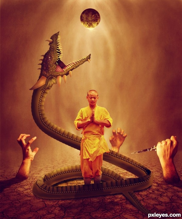
Would be better if the figure wasn't distorted, and he seems a bit small.
Right ive not notice it. I over use the sharp tool on it. Good critique thanks cmyk
Howdie stranger!
If you want to rate this picture or participate in this contest, just:
LOGIN HERE or REGISTER FOR FREE
Do you think if the monk was bigger it would balance the image more? (Like double in size so he's more center) The worm/dragon is beautifully drawn but he is SO MUCH bigger then the monk, that his figure seems lost in the image. (I just keep seeing him rising into the middle of the image to be the focus and not an after thought.) IMHO of course, high marks and beautiful chop. Lovely color and textures... Good Luck!!!
I think now its looking better. thanks to you Drivenslush
Much improved, the monk is now the focus in my eyes, good luck author and great job
At about the level of the monk's knees, the dragon's belly scales should be beneath it, not on top. Otherwise not bad.
nice colors!
Great drawing and concept, author!
congrats!
Congrats!!
Howdie stranger!
If you want to rate this picture or participate in this contest, just:
LOGIN HERE or REGISTER FOR FREE