All source... with Reference
:) (5 years and 3812 days ago)
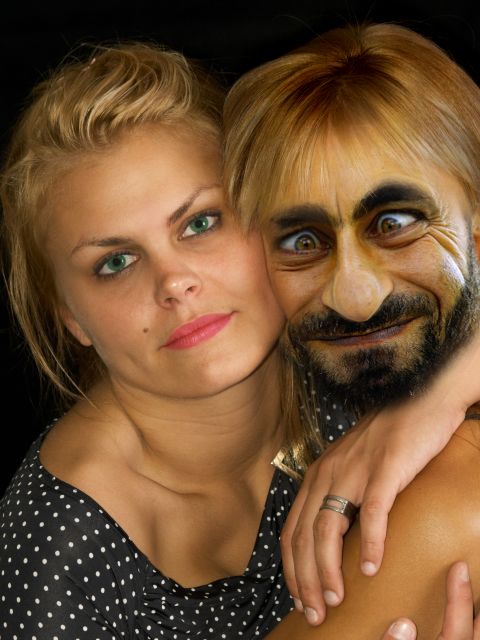
we have seen a lot of this guy in the contest. but take my girl away from me. that I cant take it.
thanks to
biqevil600 for his image fuuy man
thanks to willsun for the untitled image. (5 years and 3819 days ago)
very good super creative,congrats and good luck
thank you mario
Nice, i'd add some hair to the arm and change the hair colour (or at least give him some dark roots) to make it more realistic though.
OK RayTedwell. thanks for your advice, darkened the hair a little bit, not to much, because the idea is that he looks ugly. thanks again.
great job 
Hehe.. well blended!
Howdie stranger!
If you want to rate this picture or participate in this contest, just:
LOGIN HERE or REGISTER FOR FREE
(5 years and 3821 days ago)
?? dont get it??
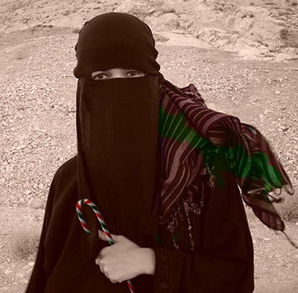
Kid is anywhere is kid and always loves candy.....
its hard to understand when you can't see any kind of expression in a picture, Just looks like someone holding a candy cane...
Minimal source used and the title needsw work...
"Just looks like someone holding a candy cane...... " it depends how you look.... "Minimal source used " it is the story not the source... But I've changed the title....
i see where youre going with this but the eyes dont look like the kid is smiling, if you could cut another image in there it would help. Also you need to change the colours on the scarf, have a play with blending modes til you get one that looks right.
Thank you ray... I'll try....
Do not see too simple?
Thank you so much.....
Howdie stranger!
If you want to rate this picture or participate in this contest, just:
LOGIN HERE or REGISTER FOR FREE
(5 years and 3823 days ago)
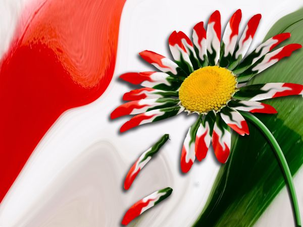
it'ws a really unique chop, I am just wondering why you did not change the color of the center from yellow to say white instead? Not a suggestion, just curious. Don't get me wrong I'm impressed with your use of the surce and how you have put it together so well so good luck to you! 
This image is beautiful. The yellow in the middle is perfect. It makes the image more interesting than if the hole thingwas red, white and green.
Thank you both for your nice comments  . jawshoewhah, I actually thought of doing it white and tried it but it didn't look as good as yellow, that is why I just left it yellow.
nice chop, very unique use of the source
lol....funny entrie.....i like
beautiful.
Howdie stranger!
If you want to rate this picture or participate in this contest, just:
LOGIN HERE or REGISTER FOR FREE
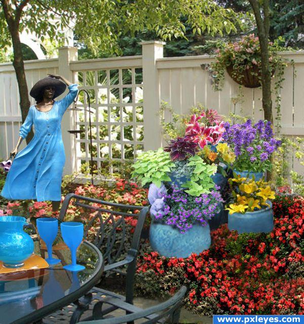
She turned to bronze after picking flowers in this garden!!! Source photos are all my own except for the contest source of the pots. (5 years and 3936 days ago)
Oh poor lady! But she's still beautiful  Good job in blending everything together. It's a sweet composition
  Good luck!
the woman seems really small compared to the other stuff in the picture. there are things too blurry and things too sharp
Howdie stranger!
If you want to rate this picture or participate in this contest, just:
LOGIN HERE or REGISTER FOR FREE
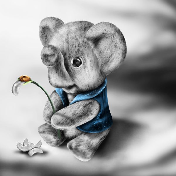
Amazing draw and shop, looks really sweet! Good job author.
little fuzzy wooble foo foo burger
(err ummm.. there's a very interesting shape in your sbs step 2... ahem) (great job)
good job author !...I think we have a winner
...perfect
Well done GL
GL
beautiful job
good job well done
sweet,very good
Nice blend and good idea. I'm still not sure if I'm looking at an elephant or a koala but still very well executed. GL!
so cute =)
A very creative and a cute work.....Good job...
great work, gl.
This is really really cute. one of my favorites
a clear winner...early congrats
I want one lol
lol
Really good stuff here
 ditto Mr LaMesa
congrats
I should just copy and paste that Another first place!
 Congrats!
Congrats!
Congratulations for 1st, another great one, looks familiar.
Congrats!

Congrats!
Howdie stranger!
If you want to rate this picture or participate in this contest, just:
LOGIN HERE or REGISTER FOR FREE