(5 years and 2873 days ago)

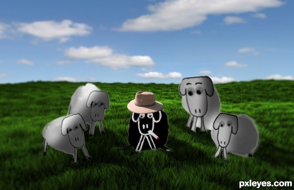
i used image adjustments, lighting, selection and a 3d program called blender for the background (5 years and 3219 days ago)
Love the hat, nice touch!
You need to adjust the lighting on the other sheep's faces. You have the ones in the sun shaded, and visa versa.
There are a couple areas for improvement on this one. I'm not sure what you used to cut out the sheep but it looks like they have an outer glow to them. I would suggest looking up masking with the pen tool. Also the depth of field is really shallow on the original source, so I would suggest using lens blur with a gradient channel to make your background match the DOF of the original source. Lastly if the sheep are in the grass, then some of the grass should be in front of them. Just use a mask on them and with a really small brush paint out some grass sticking up. Good luck!
Howdie stranger!
If you want to rate this picture or participate in this contest, just:
LOGIN HERE or REGISTER FOR FREE

(5 years and 3905 days ago)
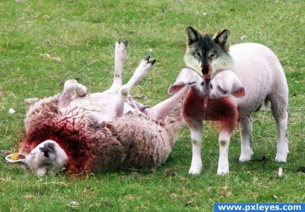
Oh that ones good... Only one thing blood are not pinkish... make em a bit darker... Unless they aren't diluted or mixed with salvia or water, they are black red... And become very dark when they dry up...
Edit: But of course if you had different idea about the blood, it's okay...
lol ... this is classicQ
Zippered head should be bigger...
Howdie stranger!
If you want to rate this picture or participate in this contest, just:
LOGIN HERE or REGISTER FOR FREE

(5 years and 3907 days ago)
nice no hi res?
My whole family had a good giggle out of this. Well, those of us in the house.
Sorry....there is high res now.
Great image, fantastic blending! Good work!
i have a deja vu feeling here looking at this :p nice work 
Still looks good! 

funny and nice
good one
LOVE IT!
perfect!!
LMAO very good blending
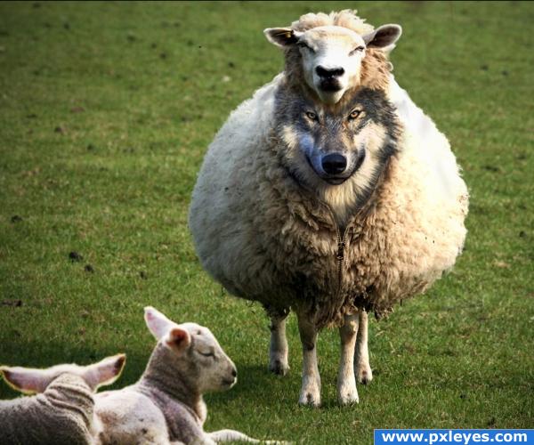
lol thats one fat sheep
that's a very fat sheep with some very skimpy legs :P but in general, a very nice image it all fits together very well
In the source pic, the sheep is actually that fat....probablly thick coat of wool.
this is very good..
Thanks Cawd for the pic of the zipper........http://www.flickr.com/photos/cawd/3189698692//sizes/l/
Congrats for your second place, Freejay!
Congrats!
congrats
great work !!! congrats
Congratulations for 2nd
Congrats!
congrats 
Howdie stranger!
If you want to rate this picture or participate in this contest, just:
LOGIN HERE or REGISTER FOR FREE
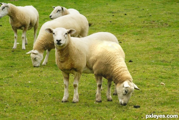
The forelegs of the twin are in a wrong position. They should be at the same height of the front legs of the other sheep, otherwise when you look at the image you have the feeling that there is something wrong in it.
Now look much better
I think it is a nice image, and the blending looks good.... good luck author.
Howdie stranger!
If you want to rate this picture or participate in this contest, just:
LOGIN HERE or REGISTER FOR FREE