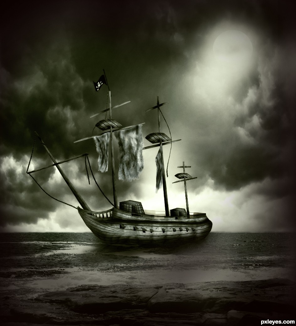
Ship and moon created with source
Sky and sea are external.
Thanks to maerocks and De_Lima
Inspired by movie "Ghost Ship"
(5 years and 3647 days ago)
2 Sources:
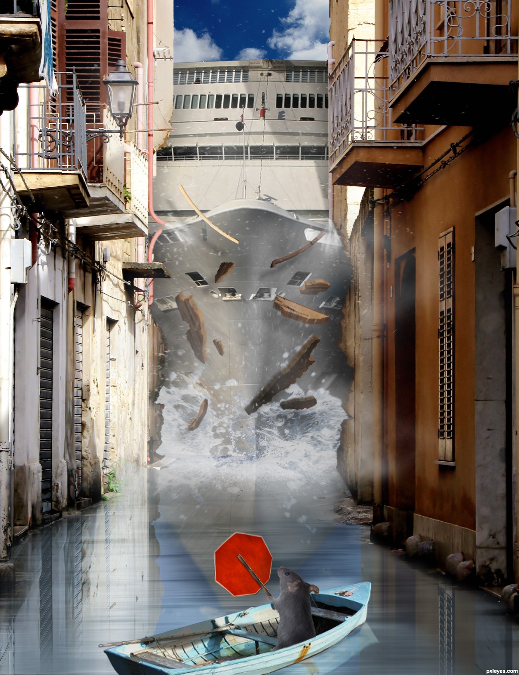
A cruise liner makes a wrong turn...poor little rodent. (5 years and 3659 days ago)
Excellent image! Very creative.. great job with the debris and the subtle details like the broken pipe... very, very good!!
The water area in front of the ship should be a bit darker (because of the ship) and the waves should be stronger (by looking at the debris, I can imagine how fast and strong the collision is). Also, these debris seems to be big (I feel like the houses are made of ... wood or they are going to be collapsed before the collision). What I like the most is the water splash from the broken tube (high marks in this, because you have to think about the detail very well). Just some suggestions to make it more realistic, IMO. Aside from that, you did a nice job with creative, funny idea, good luck 
Thank you very much ponti, and thank you langstrum.  Both your opinions are much appreciated. Langstrum, good call with darkening the water. As for the waves, I wasn't quite sure to begin with...do you think a splash would work better? As for the debris chunks, are you saying they're too big? Sorry, I didn't quite get what you said there. Thank you.
Great job on the debris. That was my first response. Lighting, etc. Impressive. I do agree that the waves in front of the ship should be a bit bigger...If it can push buildings, it can push water. Great work, and very creative idea.
Alrighty now...BIG SPLASH!! I also darkened it a bit as per Langstrum's request. I tried to do darker but it destroyed the boat's reflection. Any better now, everyone? Thanks!
I really like this one. There are a couple things I would change, but overall you have the WOW! factor.
Really cute and funny idea! I think the wave still needs some work IMHO. Thanks for the laugh!
What a pity that you can't edit it anymore. The wave needs more works (it's darker but in the top of the splash, it's always brighter ). Anyhow, it's better, stronger than the first one
I know, Langstrum.  I just managed to get the wave uploaded around 2:30 yesterday before having to run, and I only later saw some things that could have used a little work. Still, I'm glad it looks better than before. Thank you for all your feedback.
This is Great work! well done
Good work and best of luck!
is sandra bulloks driving this
It reminds me that movie... Speed 2! Great work and effects!
Poor residents, too!
Howdie stranger!
If you want to rate this picture or participate in this contest, just:
LOGIN HERE or REGISTER FOR FREE
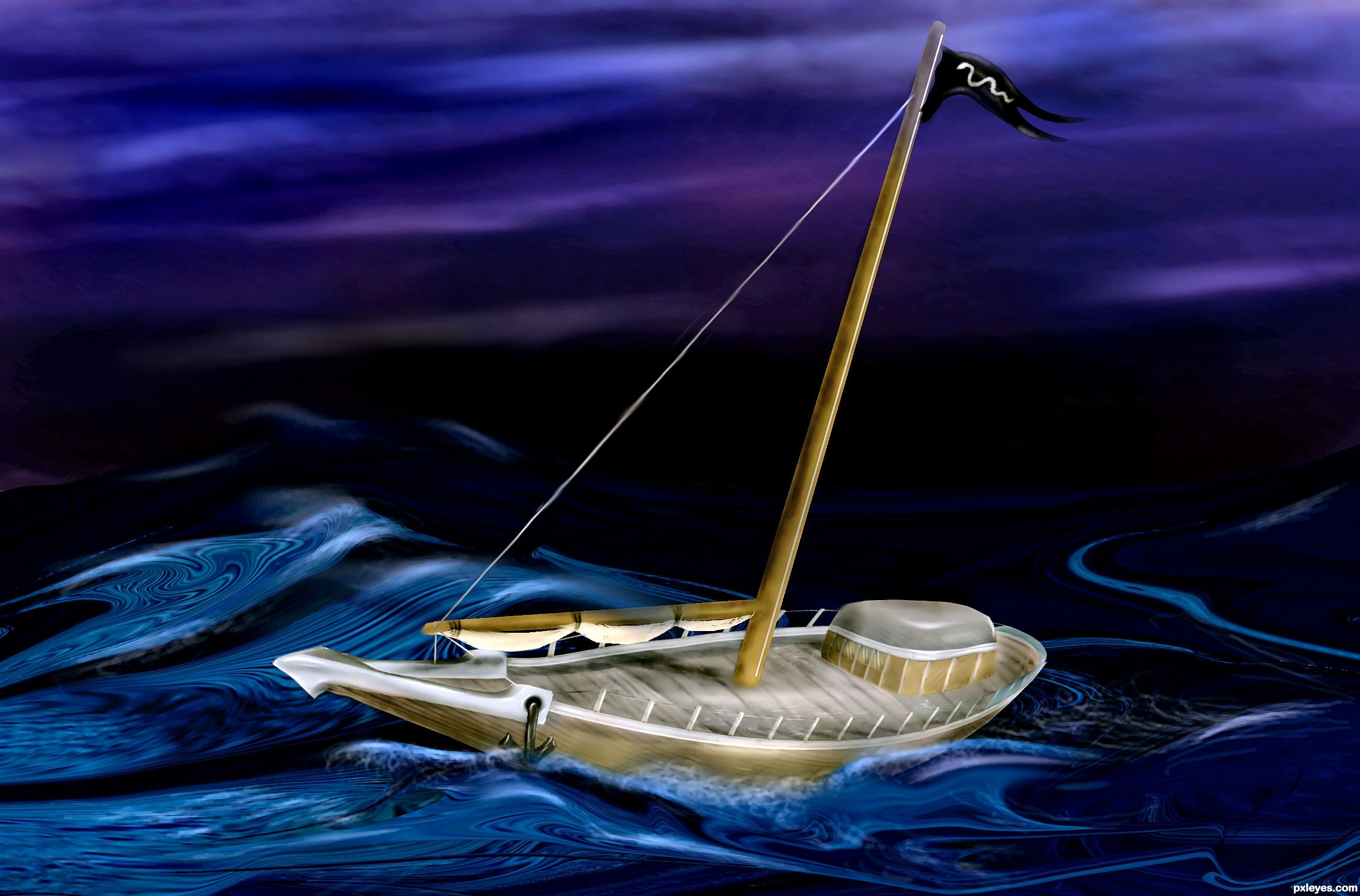
mostly used burn/dodge (5 years and 3664 days ago)
WOOOOOO HOOOOOOOOOOOOOOOOOOOOOO
just FANTASTIC.. great Great GREAT WORK!!!
very nice
Simply wonderful the way you used the source!
Excellent use of the source.. very realistic transformation, and very moody... very, VERY Good!!
Wonderful work author
thanks 4 the feedback
i like the idea...great work!☺
Fabulous work...well done author and gl
nice work. well done.
For originality it gets my vote!
Nice chop and good luck Author
Good Luck to you with this beautiful entry
Howdie stranger!
If you want to rate this picture or participate in this contest, just:
LOGIN HERE or REGISTER FOR FREE
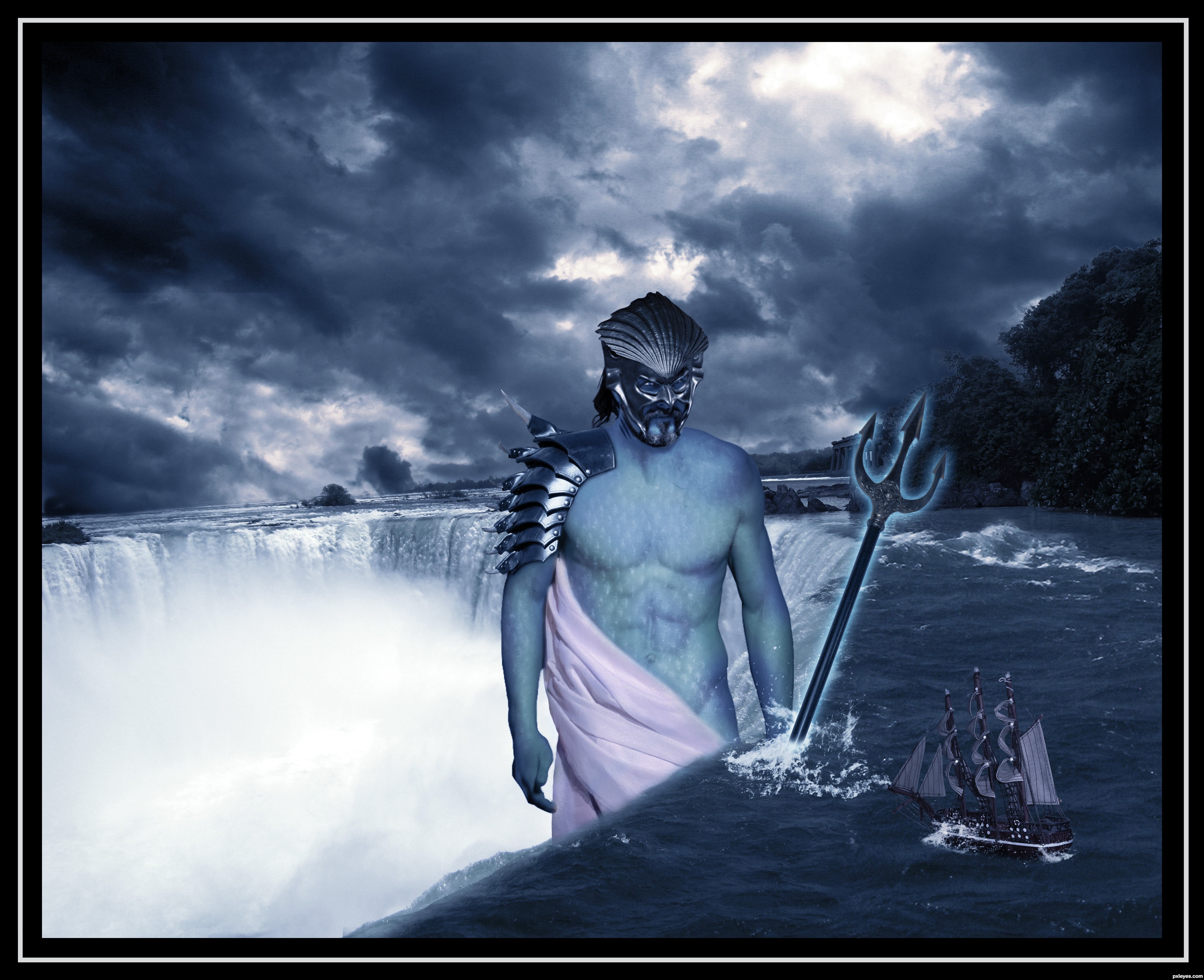
Jennifer-http://cypherstock.deviantart.com/
Derrick M./Gregory L.-http://sadistik-stock.deviantart.com/
Jenny-http://decemburr-days.deviantart.com/
Andrei-http://vishstudio.deviantart.com/
Aximili-http://deaths-stock.deviantart.com/
Str8-http://str8flush.deviantart.com/
Julia Starr-http://www.sxc.hu/profile/night_fate
Kriss Szkurlatowski-http://www.sxc.hu/profile/hisks
White Wild Flower -http://rinymph-stock.deviantart.com/
Name pending...-http://jaqx-textures.deviantart.com/
Thanks guys for the great resources...
Happy B-day Mario,best wishes...This Poseidon is made in honor of your day... (5 years and 3667 days ago)
Awesome ...I'm speechless...good luck author
very very pretty..I'm always amazed when some one can blend SO MANY sources and make it work.. GREAT JOB (a very hard thing to do)
wonderful but it doesn't looks like he is holding it, the weapon's angle is the cause for that kind of feeling. but I like this very much.
Simply superb... 
Howdie stranger!
If you want to rate this picture or participate in this contest, just:
LOGIN HERE or REGISTER FOR FREE
Thanks to arrsistablestock, angelmoon17 and obliteratedstock of deviantart.com for the use of their images. (5 years and 3679 days ago)
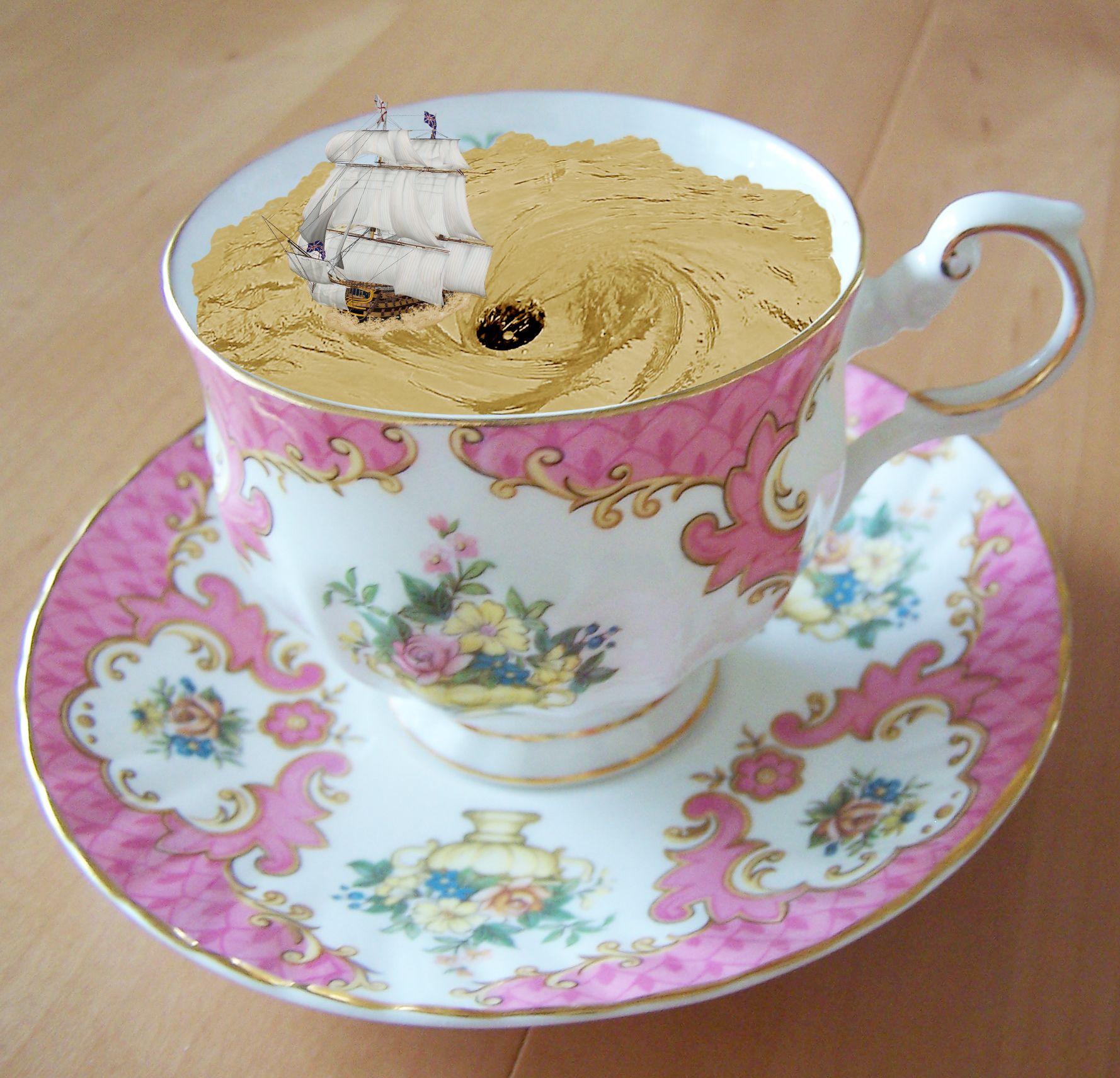
nice idea -- the edges of the water (tea) are too smooth the waves and ripples should disrupt the edge -- the colour of the tea seem a bit off (Maybe because it don't take cream) IMHO it would be a better effect if the colour was more tea like
great
Nice agree with alan about the color, it could use some contrast. Cool so far good luck author.
Thanks for your comments and tips guys. Much appreciated. Hope this looks better.
edges are good improvement colour of the tea is still a bit odd. I found playing with this image that using comibination of Curves & Hue and saturation layer set to a hard light mode I was able to get a more tea like appearnce to the water
Or change it into a hot chocolate cup!
Well, thanks again Alan. I really appreciate you taking the time and effort to help me out on this one. I played around with the light modes and this is about as close as I can get it. I think it looks more like the correct colour now.
P.s lol at erikuri. That would have probably been easier
Unique idea! GL!
Howdie stranger!
If you want to rate this picture or participate in this contest, just:
LOGIN HERE or REGISTER FOR FREE
Photography and photoshop contests
We are a community of people with
a passion for photography, graphics and art in general.
Every day new photoshop
and photography contests are posted to compete in. We also have one weekly drawing contest
and one weekly 3D contest!
Participation is 100% free!
Just
register and get
started!
Good luck!
© 2015 Pxleyes.com. All rights reserved.


like the spooky ghosty feel.. good luck author
I've watched that movie... It hasn't been as creepy as I've expected, but...
Nice work; creepier mood than the movie!
good entry
nice entry and the mood is excellent , I suggest to make the ropes "thinner" (let see the rope in this ship: http://tiago82.deviantart.com/art/Ship-103154794) and how it connects the pillars seem not correct (maybe you can add many of them, tightened to one pillar but not the other one, because that's the ghost ship, most of the ropes are supposed to be cut and loose). Good luck!
Thanks for suggesstion langstrum. Now you have another gold thump up from me. Fixed and updated.
great job... looks fantastic
Awesome!
its great image, my only suggestion is that its too dark. I think you should have submited like in step 17 or step 18. However its your choice, maybe you like it better this way Good luck author, very nice effort
Good work author one of my Fav.
Very cool job...good luck
nice
nice work author
Another nice entry....gl, author.
nice job author
excellent work author ! good luck !
fantastic entry..........
Very good.
Stunning work!
awesome
Excellent work Author.
Howdie stranger!
If you want to rate this picture or participate in this contest, just:
LOGIN HERE or REGISTER FOR FREE