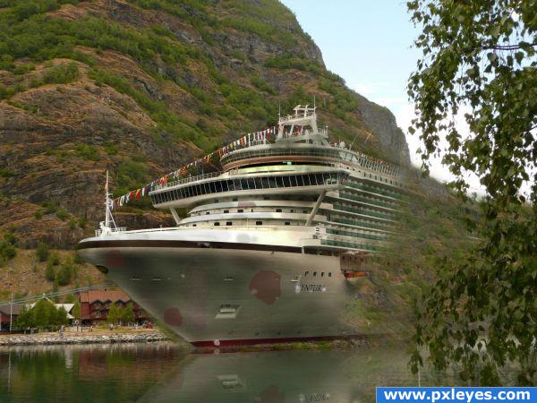
I have used only the source image. (5 years and 3857 days ago)
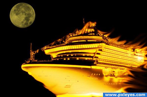
I have made by own resources and knowledges (5 years and 3861 days ago)
The fire is good, but remove the text...
Lovely effect, great job.
great effect, does it flying in the space??
Wow, beautiful.
Great fire effect! but I have questions... as earlier is it flying in outerspace? Maybe add some type of background?
this is neat--maybe if the fire was brought out a bit more and dispersed more....
Howdie stranger!
If you want to rate this picture or participate in this contest, just:
LOGIN HERE or REGISTER FOR FREE
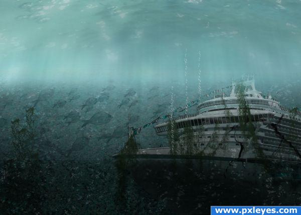
one of my old entries
http://cgarena%20%20creating%20soap%20bubblespart1.mht/
bubbles created using the above tutorial....
http://alfoart.com/the_sunken_ship_1.html
above tutorial followed....
moss brushes and crack brushes from www.obsidiandawn.com
(5 years and 3862 days ago)
pretty cool, but the bubbles are too large!
Great idea and result, i agree the bubbles are too large and the top of the water should be more bright, not in the middle of it.
To make the top of the water you have to use Image>Transform>Perspective. Drag a corner of the perspective box so that the top is wider and extends outside of the image. Then the transition between the top and bottom needs to be better, but I can't help you with that. It's really a nice image. It just needs some tweaking here or there.
have made changes...thank you for the comments!!!!
maybe remove the flags, add some broken windows and a bit of barnacles to the body of the ship? There seems to be no reason for the ship to have sunk. Very nice idea though, good luck!
One more thing, on the side of the ship, you still have people on the outside balconies, you may want to remove them. It is looking really great 
This is a wonderful idea. Very creative. I like it.
Brilliant idea and execution... maybe add a layer for the ship with cracks and decay, the ship just looks toooo nice in the sunken stage... Great job though!
added cracks brushes...thank you for the help Tapiona and woodztockr!!!
nice idea but the fish are too big
Great job!  Looks really great with the "green stuff" (I don't know the English word for it) Good luck!
lelaina, the "green stuff" in English would be seaweed or foliage. the underwater stuff is usually seaweed
In one word: beautiful!! 
Howdie stranger!
If you want to rate this picture or participate in this contest, just:
LOGIN HERE or REGISTER FOR FREE
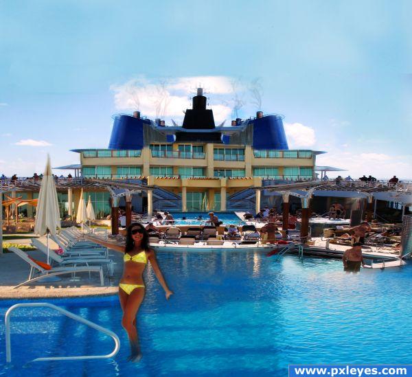
Thanks:
http://www.sxc.hu/photo/1199990
boat chimney
sundstrom
http://www.sxc.hu/photo/726350
cruise ship
linder6580
http://www.sxc.hu/photo/819266
yellow polka dot bikini
joanie (5 years and 3872 days ago)
I like the idea, but there is so much going on its hard to look at it and see individual elements. Good luck!
nice gl 
Great, GREAT job! but some of your sources seem a tad compressed, could you upload high resolution?
Lots of distortion in background...the girl needs a real shadow, not a drop shadow.
Ahh yes high resolution confirmed the distortion, you did a great job creating the cruise ship, don't let a simple error like that hold you back.
Howdie stranger!
If you want to rate this picture or participate in this contest, just:
LOGIN HERE or REGISTER FOR FREE
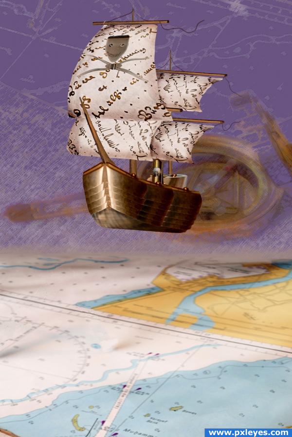
A high-tech pirate ship just escaped papers and maps. (5 years and 3895 days ago)
OUTSTANDING!
Looks really good! Maybe intensify the ship's shadow, great great the way u built the ship!
good work ...!  cheers
sweet.. whoops.. not sweet like SUGAR..sweet like a conquering hero returning to Camelot 
Good job, very, very nice!
maybe you shuld have placed it on the map, in the blue area (sea).
I gotta split hairs. Because that's what I do. It's not a map. It's a chart. Haha! I love this though. That ship is spectacular!
A flying ship, I wonder where did Sparrow go? Good luck author.
Nicely done! Everything but the out of focus compass in the background works for me...it's kinda distracting.
Looks great, very creative and skilled.
artistic work. i like the ship in the air, i think it brings creativity to the image. good structure on the ship
Thank you all, guys and girls!
I like this a lot, but may I suggest a soft shadow being cast from the ship onto the map? Nice job!
amazing! I think it would be even better without the map under it because the colors of the top look awesome together like they are. GREAT!
great use of source! good job!
Very creative
Very creative use of source. 
I think i would have liked it better if you had placed the boat in a real sea. however the boat you build looks real nice, except the stuff you made on the sail.. but i guess opinions differ  nice clean chop
wow
Very nice job, building the ship!  Good luck
Howdie stranger!
If you want to rate this picture or participate in this contest, just:
LOGIN HERE or REGISTER FOR FREE
i dont get why it fades off? You should try to be more careful around the edges
Nice effect but look more like a ghost ship, can look better if you fade the water reflection too, try to put the ship in the water (the background is visible through the bottom of the ship) and the dirt/rust added is not necessary IMHO
It seems a bit simple to me, but good luck.
you blurred the stuff around the ship--why?
thank you all for your comments
Howdie stranger!
If you want to rate this picture or participate in this contest, just:
LOGIN HERE or REGISTER FOR FREE