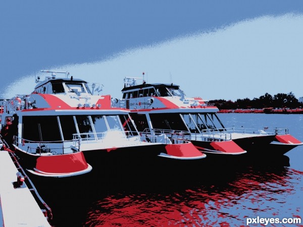
reduced to 6 colors (5 years and 3195 days ago)
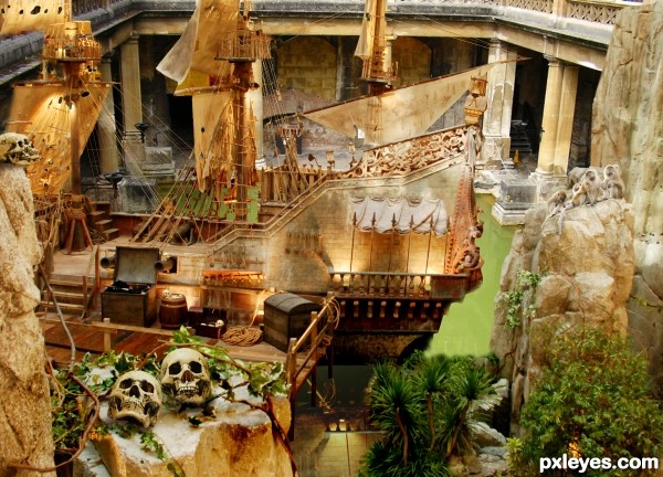
all image shoot by me, thanks! (5 years and 3203 days ago)
Wow. Nice idea!
thanks! hayato......
It's a good idea but I think that the ship needs a reflexion on the water, or a shadow or some waves on the water. Something so it looks that it is really inside the water. Same for the dock.
The ship is too big, the left side of the gallery would make it crash when it cames in. You could just clone out that part of the gallery, make it an entry...
I comment this because I like the image. Good luck author!! 

suggestions:
1) make the ship smaller
2) make the entire picture in the "night" scene
3) add fire pits or fire coming out of the skull eyes sockets or smoke
4) add snakes sparingly
these add some pizzazz to your compostion 
Howdie stranger!
If you want to rate this picture or participate in this contest, just:
LOGIN HERE or REGISTER FOR FREE
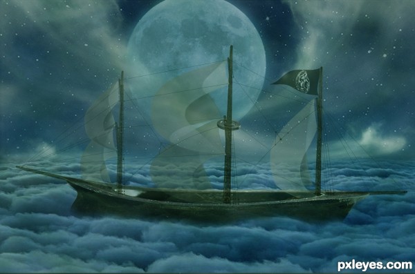
(5 years and 3210 days ago)
The sea of clouds is cool!
The faded oversized moon is problematic. It is too dark to work as a light source for the clouds, much less the image. If you want it that large, yes it will dominate the scene, but you need to have it at least as bright as the brightest clouds in your image for visual consistency.
Lovely work on the boat ...and the clouds sea is a great concept.
I do agree with Mossy ... the moon takes away from the wonderful work you have done on the boat.
Fixed
Howdie stranger!
If you want to rate this picture or participate in this contest, just:
LOGIN HERE or REGISTER FOR FREE
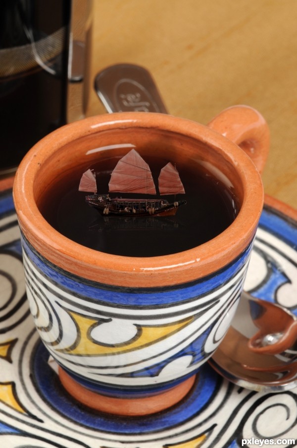
In this image i just added the ship and adjusted some tones and make some shadows. (5 years and 3236 days ago)
Chinese Junk!!! (love those boats, favorite one ever was in the 5th Element because it could fly) great job author 
Howdie stranger!
If you want to rate this picture or participate in this contest, just:
LOGIN HERE or REGISTER FOR FREE
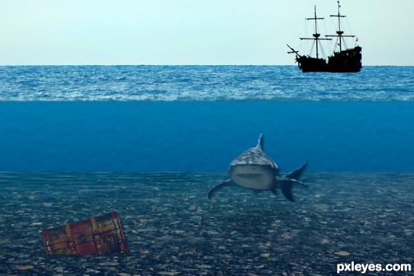
thanks to natashaw, mattox, and ohzara for use of photos (5 years and 3240 days ago)
Howdie stranger!
If you want to rate this picture or participate in this contest, just:
LOGIN HERE or REGISTER FOR FREE
Nice result...GL author.
Nice effect...GL author.
Cool, but again you had a compelling start pic. Have you experimented with boosting the saturation to add more punch?
Howdie stranger!
If you want to rate this picture or participate in this contest, just:
LOGIN HERE or REGISTER FOR FREE