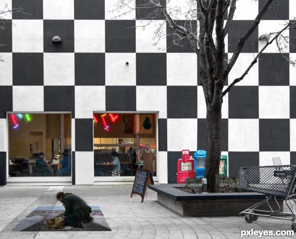
Thank you to Donald Judge for image of pavement artist
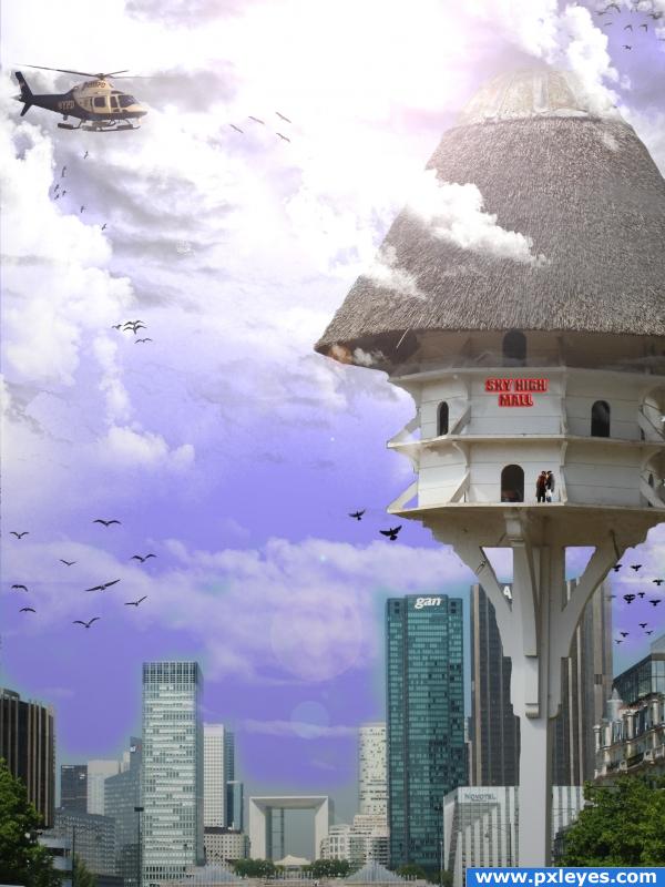
Thank you to Robert Couse-Baker for image of shoppng mall (5 years and 3331 days ago)
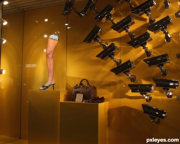
Sorry not hi-res. I found this pick of a shop window and thought thats the one...Got excited (newbie to photoshop) :-) x (5 years and 3423 days ago)
Interesting idea. The contributions of sources 3 and 4 are hard to discern without a hi-res version. I think the leg/foot/shoe should be parallel to the back wall like everything else in this retail display.
Howdie stranger!
If you want to rate this picture or participate in this contest, just:
LOGIN HERE or REGISTER FOR FREE
(5 years and 3443 days ago)
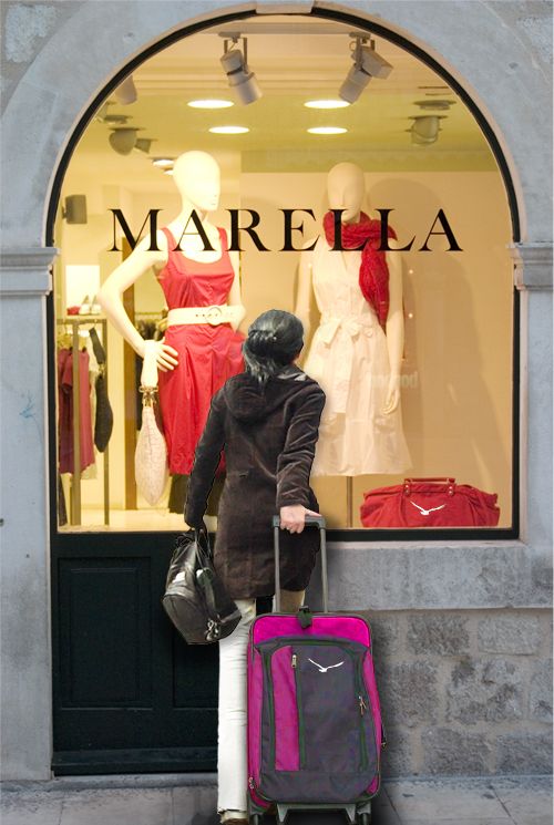
Looks like she wants to pass through that glass... 
Creative and clever use of her trailing arm, plus her luggage neatly hides the fact that she is walking. The repositioned handbag is appropriate given that she has halted her forward movement, but a hint of shadow on her pant leg (and possibly coattail) might seem more realistic.
DanLundberg, Thank you for your nice words - good eyes for noticeing the repositioning of the arm  and great suggestion on adding the shadow, followed your advice and added some shadow on the leg and it made it much better
I like this one. I see that you used the birds on the luggage. I like it when people dont neglect detail points.
Thank you 
Very good work author...100% realistic...high resolution would be nice...best of luck
Thanks erathion for your nice comment. Actually I have tried to upload the image few times and have checked the high resolution box every tine, but for some reason it doesn't save the high res  I have done it with my entries and never had this problem , any ideas how to correct this problem?
Great image ... it would be nice to see it in Hi res but I think you have done a great job anyway!
Too late now but for future reference ... the Hi Res problem ... I had the same thing happen with a photo contest image. I opened my original PSD file and resaved it as a slightly large file and then uploaded the new one. That seemed to work ... it is worth a try at least.
Great idea to make the girl window shopping 
Howdie stranger!
If you want to rate this picture or participate in this contest, just:
LOGIN HERE or REGISTER FOR FREE
(5 years and 3867 days ago)
It's a nice idea, but i think you should work on the masking of your buildings. Good luck though!
Thanks for comment, i am very new to this and i will be honest have no idea what masking means. stupid huh! If anyone can enlighten me i would appreciate it
it just means you need to get closer to your source image, notice the blue around the buildings in some places and then in other places the building seem to fade out in corners..nice idea for your image though, one thing is the lens flares, they arent so flashy and i wouldn't get stuck into using them... I find these light ray brushes more effective just go to this link to download  http://redheadstock.deviantart.com/art/Light-Beams-Rays-Brushes-72493128
thankyou for the feedback. I will see if i can improve it.
Funny, but the edges of the birdhouse structure are way too sharp in comparrison to everything else.
wow those must be very large birds!  cheers!
Uh, yeah, the birds are large. Look at the bird house! Great image. Work on the masking. Google masking techniques, maybe.
terrorism?
ooooops.....good!
Howdie stranger!
If you want to rate this picture or participate in this contest, just:
LOGIN HERE or REGISTER FOR FREE
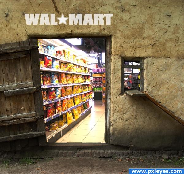
SIMPLE IMAGE FOR MY SIMPLE MIND :-) (5 years and 3875 days ago)
not simple at all.. but could you direct me to the Laxative section .. giggle snort
haha thanks! Not sure this Branch is that well stocked where laxatives are concerned.
lmao i think is a great imagination but wouldnt it be better if there was a cashregister there too o.o; lol :P that would cost them a lot of money now adays :P
if you had switched the chippies for chocolate at the front door , you would have been on a winner.  nice entry author.
I go to an Amish store that looks almost like this!
Good luck, but it seems like the perspective is off a bit.
Howdie stranger!
If you want to rate this picture or participate in this contest, just:
LOGIN HERE or REGISTER FOR FREE
fun Idea author.. YOU MUST PUT ALL YOUR OUTER SOURCES into an sbs to prevent the image from being canceled.. (easy as pie under the MY STUFF BUTTON).. wonderful hurdy gurdy image.. good luck (work on perspective on some of the objects.. distort and perspective works great.. good Luck!!!)
Wow, I love the idea of the man painting one of the images, superb
Howdie stranger!
If you want to rate this picture or participate in this contest, just:
LOGIN HERE or REGISTER FOR FREE