Careful!!!
(5 years and 3654 days ago)
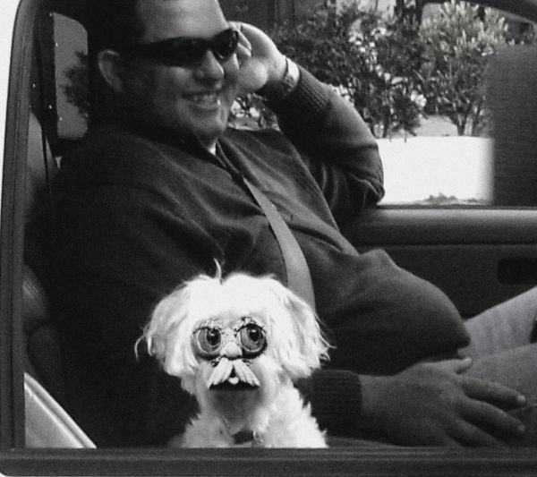
low res only, not much to work with, but Liked the antique Idea
Kept brightness of dog to be focus (5 years and 3734 days ago)
Seems a little simple. Not expected from you author.
actually jawshoewhah, getting the whole thing to match in low res took forever, but the result was cute, and that was my goal (the dog wouldn't sit still in the car and I stood behind a tree through a bush to get the picture, every time I stood in front to get a solid shot he'd duck and cover to his master LOL) so I couldn't get close enough for a high RES)
Well I know how frustrating it is to get a good shot of an animal. My brother has a hairless cat that I really wanted to get pictures of and the damn thing would NOT STAY STILL!!!
I would use a staple gun, but I don't think the owners would have liked that LOL
very nice 
Howdie stranger!
If you want to rate this picture or participate in this contest, just:
LOGIN HERE or REGISTER FOR FREE
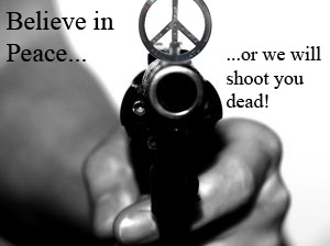
Thanks to:
Peace Necklace
http://www.sxc.hu/photo/853700
phre3a
Revolver
http://www.sxc.hu/photo/704729
blary54 (5 years and 3877 days ago)
Love this! Would have been even better if the peace sign was the gun sight! (Not too late to change...).
brilliant idea......thanks!
Ironic.
Howdie stranger!
If you want to rate this picture or participate in this contest, just:
LOGIN HERE or REGISTER FOR FREE
my pics and source (5 years and 3907 days ago)
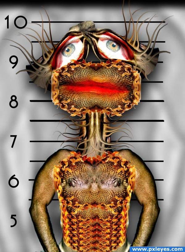
Nice idea, i don;t like the box surrounding the lower body, maybe just have that as the background for the entire image? Other than that it's very nice and very detailed, good luck!
very good perspective..
I prefer the background like this, good change and good luck!
Okay Ponti, removed the inner frame
hey now this background making complete sence ...
good luck.... and a very nice idea
funny 
lo cool cool perspec.
Author your pic, you look so cute... 
 nasir!!!
 goober
hehehe...
great job
Howdie stranger!
If you want to rate this picture or participate in this contest, just:
LOGIN HERE or REGISTER FOR FREE

source and my photos (5 years and 3932 days ago)
i like the colors.....good work.....
Good work author!  Good luck!
good idea. The bewel effect is actually not adding any value to it. nice colors.
colorful. nice. good idea. 
nice idea! yeah very colorful  gl
gl
nice image i just dont like the colors
Great colors!
it's really nice, i think it just pops a little too much, you might want to tone it down a bit
Howdie stranger!
If you want to rate this picture or participate in this contest, just:
LOGIN HERE or REGISTER FOR FREE
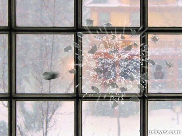
Try putting a motion blur in the flying glass. It will give it more of a moving fast effect and give it more depth, like the bullet but less blurred. GL!
on the broken peices try and place a reflection on them they look a little bit too solid ATM aswell but this is looking very cool ! g/l Author
Agreed, perhaps some transparancy on the shattered pieces too
The sense of motion and the reflectivity of the glass is looking better. I like it!
Looks quite ok. If you see the boy in the background and then the hole in the glass and connect these 2 with an imaginary line, I'd expect the bullit going up instead of down. A possible nice thing about moving the bullit more higher is that you look against it which gives it a more impressive angle (you may want to make it a bit bigger too for an exaggerated perspective effect, is up to you). Good luck!
nice work ....
Good work. I agree with Waz about the trajectory, and the others about a reflection of the broken pieces. Not mandatory, but a nice little touch. Good luck.
like it
Howdie stranger!
If you want to rate this picture or participate in this contest, just:
LOGIN HERE or REGISTER FOR FREE