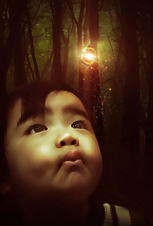
The brightness of the butterfly were made with lens flare, layer styles and various blends. (5 years and 2942 days ago)
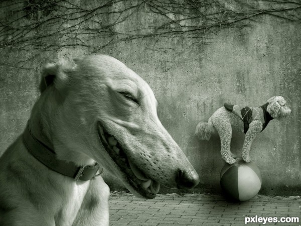
(5 years and 2978 days ago)
nice work 
giggle doggie!
This is way too funny...the foreground dog laughing at the dopey sweater wearing dog doing tricks on the ball...GL author! 
to good author  well done.
Wow great entry...perfect execution, great idea and neat execution...best of luck author
great source pics, nice detail.
very well done! good luck author. ! 
Great source finds and concept, I like the green tint for final image. 
congrats Nator, this is really cool 
Congrats Nator  very cute and funny, well done
Congrats Man!
Congrats!
Congratulations! 
Congrats Nator!
just perfect
Howdie stranger!
If you want to rate this picture or participate in this contest, just:
LOGIN HERE or REGISTER FOR FREE
(5 years and 3042 days ago)
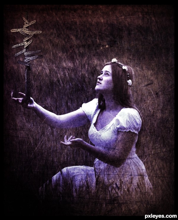
This would be really cool if the post was a sharp stake going through her hand. 
Howdie stranger!
If you want to rate this picture or participate in this contest, just:
LOGIN HERE or REGISTER FOR FREE
(5 years and 3076 days ago)
Howdie stranger!
If you want to rate this picture or participate in this contest, just:
LOGIN HERE or REGISTER FOR FREE
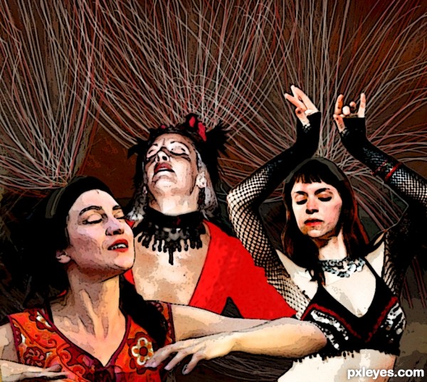
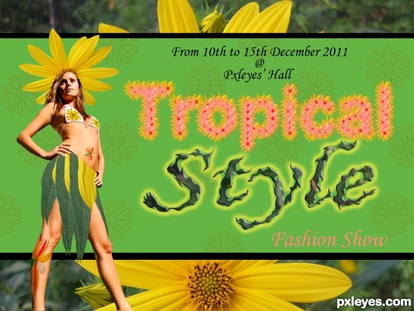
Poster Edge filer
Watercolor filter
Basic round fan paintbrush
Match color
Blur
etc. (5 years and 3113 days ago)
Great concept, but a bit too heavy on the filter effects, especially the poster edges. You might try painting the dark artifacts out a bit more.
I really like it! At first glance I though it was from one source because it blends so well. nice job
Yeah I definitely overdid it with filter effects haha.
I spent too much time on trying to get the different levels of photo quality to match up and used filters as a way out. But hey, not bad for a first entry.
And thanks, Bryonics!
When images like this are taken to a printer (with proper resolution) a giant banner comes out super great.. good luck author.. nice image (looks like a History Channel Episode)
Howdie stranger!
If you want to rate this picture or participate in this contest, just:
LOGIN HERE or REGISTER FOR FREE
This is wonderful. Small suggestion...perhaps take a bit of that green hue out of the brightest point of the face...more yellow. Just a thought...it might help look connected to the light above the face. Great job, author!


EDIT: Looks
Thank you for your constructive comment, Rob!
It really makes sense, and I made the appropriate changes.
I hope is better now! Thank you!
This is a really good image..... blending is perfect and the idea is magical.... good luck!
Howdie stranger!
If you want to rate this picture or participate in this contest, just:
LOGIN HERE or REGISTER FOR FREE