i prefer them twins and i hope shadows are good now (5 years and 3848 days ago)
2 Sources:

(5 years and 3855 days ago)
author.. you can't use Bugs.. he's copyright.. check your guidelines under the help button (even on a free sight.. he's also considered a photo manipulation because he is drawn)
ops sorry about that, i really forgot. will change it in a bit
Looks much like this tutorial http://www.planetphotoshop.com/its-curtains-for-you.html on plantephtoshop
When u deal with the rabbit hehe pay attention to the light spot: it cannot be of this shape - the part that is on the floor will be .. dunno how to explain: "flipped" slightly to the right and up.. Just look at some scene with such light, u'll see what i'm talking about 
i didn't realise that, but you are right, will fix that,and yes it is inspired from that tutorial  you've got me
It looks good, but you definatley need something there, not necessarily bugs, but anything.. if not make your won little character! Good luck!!
great job with the floor the floor needs something on it like a person or something but i really do like the image you did awesome with the floor cool overall image!
i realy waited for somebody to come on that very realistic stage...
Great use of the source, realistic result.
Howdie stranger!
If you want to rate this picture or participate in this contest, just:
LOGIN HERE or REGISTER FOR FREE
NO OUTSIDE SOURCES USED.... (5 years and 3855 days ago)
Looks pretty cool! Good job!
Why aren't the little guy's hands the same color as his face? What's the rectangular thing in the background?
EDIT: Looks better...good luck! 

I'm sorry, i hadn't seen the sbs when i uploaded the comment! Great job!! A lot of hard work went into this.. very, very nice!! I love the expression on the person's face... really good job!! Good luck!!!
Thanks ponti and CMYK Thanks i didnt notice it...fixed the brown thing is the mountain LOL i removed the brown thing.....somehow i did not like it...so i removed it
Just SOOOOO sweet..
cool image i like this one author!!!!!! real cool
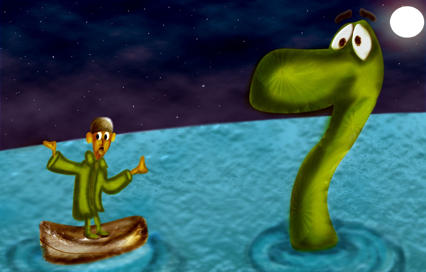
The only thing that looks out of place to me is the little guy in the boat his legs look as if they are out side the boat...maybe you meant it to look this way, nice work however
good use of source..lucky nessy does not say which way? in my tummy . yummy yummy. i agree legs look out of boat. GL
Thanks for the nice comments Lchappell Thanks have fixed his feet
Congratulations, my dear friend! It was high time to put your drawing skills into action 

Oh congrats Nisha!  Here comes a late fav
congrats
Congrats!! well done great stuff
congrats!
Thank you very much for the votes and comments
Congrats!!
Congratulations for 3rd
congrats on 3rd
Congratulations!
Howdie stranger!
If you want to rate this picture or participate in this contest, just:
LOGIN HERE or REGISTER FOR FREE

(5 years and 3895 days ago)
nice source image, but I don't see much difference (except her nails). To be honest her skin looked better before...
Same what FairyGardens said.
Howdie stranger!
If you want to rate this picture or participate in this contest, just:
LOGIN HERE or REGISTER FOR FREE
nothing but source and alot of cut and paste and patching and blending etc. (5 years and 3897 days ago)
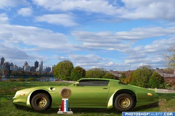
Great job on removing the car!
cars kinda leaning in a ditch.. no big whoop, but I think it is a perspective problem.. but the tech work is very nice.. good luck
Love the work on the car body. The tires are too high(the body would scrape). If this was placed on top of something it wouldn't look sunken into the ground on the far side.
The tires do look better now. If you could find a photo with a close hill to put it on, perspective would virtually take care of itself. Good luck.
nice but car needs more work; the wheels are not touching the ground and car appears to be leaning on one side
I know the perspective is off due to the trophie pic showing the bottom of the car this was the best I could do to fix it..
I lowered the tires..hope this helps
Great work, nice entry
Try the skew tool on the car
Should have just found another Camaro pic to stick there...
good work
nice
Slip slidin' away...slip slidin' away....do, de, do, do....nice work!
Howdie stranger!
If you want to rate this picture or participate in this contest, just:
LOGIN HERE or REGISTER FOR FREE
Photography and photoshop contests
We are a community of people with
a passion for photography, graphics and art in general.
Every day new photoshop
and photography contests are posted to compete in. We also have one weekly drawing contest
and one weekly 3D contest!
Participation is 100% free!
Just
register and get
started!
Good luck!
© 2015 Pxleyes.com. All rights reserved.


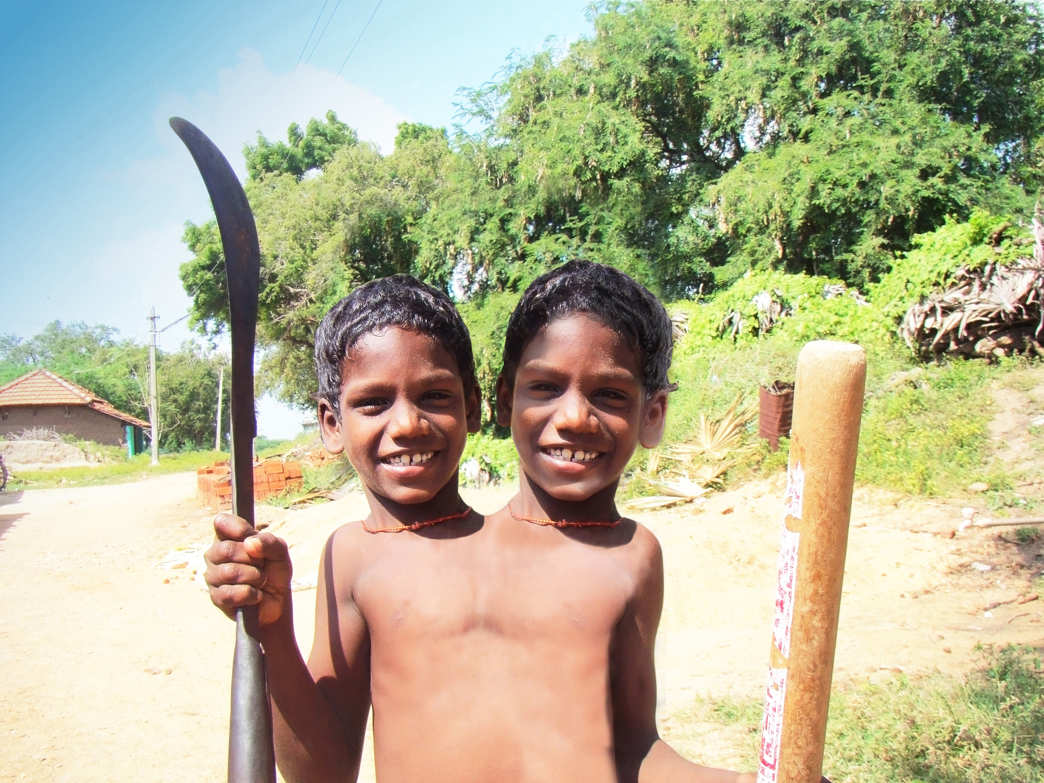
this looks quite good, but what i suggest is getting two different pictures of the same person then joining them together, because your face are the same, and repetition doesn't sell too well. Good luck though, the blending is great!
my eyes were playing tricks on me when I first looked at it. It looked like the necks have scars on them and it looked as if there was a crack (sort of like a ceramic crack) down between them---then I looked at the high resolution and realized those were necklaces. lol
Flip the head on our right...the light sources are opposite.
this image has great potential, the one on the right looks almost see-thru. and the light sources don't match if you would just make them the same person, this entry would be awesome! the other head also looks too big imo but more work, same person and matching light sources, and you got yourself a fine looking entry!
Fun idea but the shadows and colouring on the second head need to be the same as the first...
ah and the right head bigger is mention,(i wanted like that) thanks for comments and tips
@ vampyriccadence: Yes, the light is from upper left, which means the head on our right would have a shadow on the right side, not on the left.
Oh my!
hmm the necklace with the tooth on kinda looks oddly cutout... it would also requier a shadown and not a halo :p just remove the necklace nice picture
dang i just figured out why the tooth ecklace looks odd.. you flipped it and therefor the shadows on he necklace are flipped too XD it looked better on the other boy
thanks Eladine this i haven´t notest i did this image in work without time, this suppose to be an image only for joke and become serious, i will fix it soon as possible
I think the whole body should be widened a bit more, there's no room for the shoulders.
two heads are better then one... is it so?
image is quite fun
Howdie stranger!
If you want to rate this picture or participate in this contest, just:
LOGIN HERE or REGISTER FOR FREE