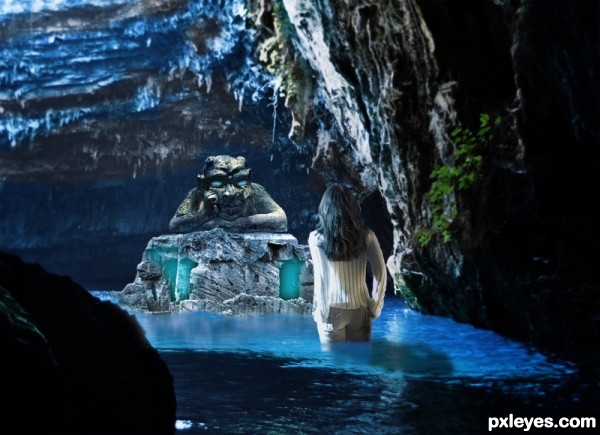
I wouldn't Go near that shrine even if someone told me to go there for $50,000.
Legend has it that as long as the tomb glows the spirit is still alive.
Thanks to Babykrul & elvisfan76 for photos. (5 years and 2777 days ago)
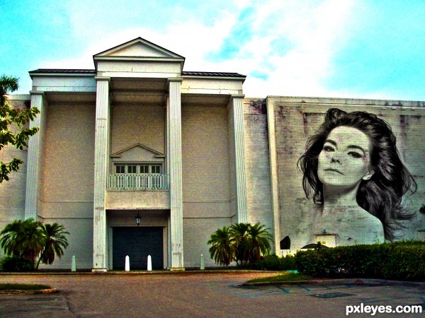
Bjork Quote~
"Everyone is bisexual’: “I’ve always had as many powerful, creative ladies in my life as I have men, and you could probably describe some of those relationships as romantic. I think everyone’s bisexual to some degree or another; it’s just a question of whether or not you choose to recognize it and embrace it. Personally, I think choosing between men and women is like choosing between cake and ice cream. You’d be daft not to try both when there are so many different flavors.†(5 years and 3447 days ago)
The so-called "graffiti" should conform to the surface of the building.
Cool ! Concept is great. I think, graffiti's are usually noisy. Body looks perfect for me, the hair could been noisier (IMHO). I like the color and subtle hues on subject, overall nice effort. GL 
nice thinking author...Bjork is amazing...Nice work too...well done
I never knew about the "everything is bicurious" quote until now.
I guess slapping one image on top of another (badly) is your idea of creating a shrine. (YAWN). At least you could have tried adding an effect to make it resemble graffitti.
lay off the sauce "blob" you're repeating yourself... LOLOLOLOLOL


(and if you forget my name... you will go astray.. like a killer whale... trapped in a BAY!!)
hehehe
Howdie stranger!
If you want to rate this picture or participate in this contest, just:
LOGIN HERE or REGISTER FOR FREE
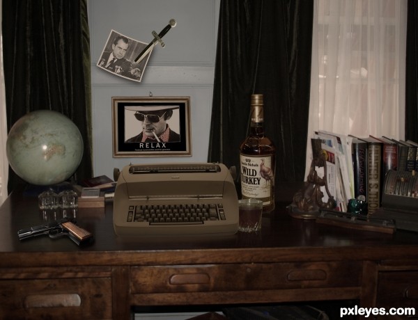
What better shrine to the great writer Hunter S. Thompson than his own desk. I tried to include as many elements of his life as possible. He always preferred working on an IBM Selectric, usually with a glass of Wild Turkey close by. (See the memorable opening scene of WHERE THE BUFFALO ROAM, with Bill Murray as Hunter). He loved weapons of all kinds, so including the Gonzo dagger and a gun was a must. I debated including his poignant suicide note in this scene, but decided to remember him at a time when he was still living large as the nemesis of Tricky Dick Nixon. (5 years and 3448 days ago)
Nice montage, maybe you might want too check the levels on your pistol grip, the glare is not consistant with that of the typewriter. Other than that little nit pik nice work.
Thanks, but typewriter has a matte finish. Glad you like the rest. 
Hmm, a couple of issues with this one, author. There's a good reflection from the glass, but not so much with the bottle, there is no front edge, compare the two, they're very different. Also, you've got a shadow from the photo, but none from the dagger, and even though it's further from the wall, I'd think there would be a slight shadow, especially against the photo, don't see any on the white edge at all. The shadow from the framed image is not the same as that of the photo, which is as close to the wall as the frame. You've got a shadow under the gun that was added, but the one under the typewriter is more of a highlight, not a shadow OR a reflection. Also, you allude to the fact that the desk was Thompson's but you say it's your photo - just curious if it's your photo of his desk - ? Otherwise, interesting shrine.
Pearlie, that's just too many nitpicks for me, but to respond to a few: the dagger has a shadow, especially on the photo. It's faint because there are 2 light sources (both windows). And the photo is curled out from the wall, not as close to the wall as the frame below, so no...the shadows aren't the same. As to the gun, it's dark, hence the dark reflection/shadow...the typewriter is a light color, hence the reflection. And this is a photo of a desk used as a prop, it is not in fact Thompson's desk. The image is what I imagine his desk would have looked like. It's a visual metaphor. Get it? Anything else you don't get? I'd be happy to enlighten you.
Overall good composition. A very complex compilation. Lots of work. I like it. Was wondering about the light on globe.
Locale, the highlight on the globe is an unfortunate result of the flash when I shot the desk. It was a funny lighting situation, and the shot was taken on the spur of the moment as I was leaving my friend's house. If you notice, I removed the flash highlights from the desk. Thanks for your feedback. 
Can You share a little of "step 2" with us??? 

Good montage though.
great shrine, created with no focus in mind... at all (discounting sad brown) so glad the dagger has no shadow, good thing the gun does (windex or pledge wouldn't hurt)
Mr. Thompson would be proud. Nice job!
the placement of the dagger is wierd......not so bad overall ....
Author, when I saw your pm just now, it baffled me, as I've been away from the site for a couple of days. Then once I did some research, and voted on some entries, I realized it was my earlier comment on this entry to which you referred. At the time of my observations and comment, I had not voted on it, so had no idea whose it was, but felt that since there were so many blatant errors, I'd mention them in order to give the author a chance to improve the entry.
Unfortunately, now I see that it is you, I'm surprised considering your rank on this site, that you have chosen not to fix the errors (including the reflection of the bottle and removing the glare on the globe), or maybe just don't know how, OR, are simply unable to accept some constructive critique, hence your very defensive comments.
I know how easy it is for you to critique the entries of others, and often, quite rudely, as is evidenced by your last couple of comments to me above, as well as a few of your PMs. Actually, I AM enlightened and realize that that is just your style - and considering the subject of your entry here, that also explains a lot. But hey, good luck to ya. 
Pearlie, thank you so much for your lovely note. I kinda like the glare on the globe. 
"We had two bags of grass
Seventy-five pellets of mescaline
Five sheets of high power blotter acid
A salt shaker half full of cocaine
A whole galaxy of multi-colored uppers, downers, screamers, laughers
Also a quart of tequila
A quart of rum
A case of beer
A pint of raw either
and two-dozen amyls
Not that we needed all that for the trip, but once you get locked into a serious drug collection, the tendency is to push it as far as you can."


Yeah! 
Oh Sh** I forgot about the beer. Would you like one? How about some either????!!!!!!


Inconsistent lighting. The dagger/photo show lighting from the top, while the desk and globe show the strong flash from in front. Matte finish or not, the typewriter should show more light refraction on it than it does - It looks "dull" in the image.
Metaphor or no, consistency and believability is what a good chop is all about. That's why they made the Burn and Dodge tool...
That said, I think this was one of the best "tributes" I've seen, in that it is identifiable with the idol.
"One of the things you learn, after years of dealing with drug people, is you can turn your back on a person, but NEVER turn your back on a drug....
...especially when it's waving a razor sharp hunting knife in your eye!!"


Congrats!
Howdie stranger!
If you want to rate this picture or participate in this contest, just:
LOGIN HERE or REGISTER FOR FREE
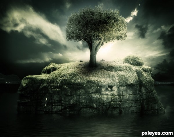
I created the reflections myself.. and then after all that ended up using Flaming Pear Flood... (5 years and 3672 days ago)
I like this, great job auther
two thumbs up,.....OMG I wish I could be this good,....
There are two horizons right now 
Picked the author of this one in 2 seconds  , nice work as always.
wonderful image ......... wish u high marks .......... 
fantasy look.... nicely done! GL
Except for the shadow under the tree, everything else looks good.
like something out of lord of the rings.. add an elf jk. high marks
Very pretty scene 
Not so great as everyone says. The light source is from behind, but lighting on the tree says light source from the right. The shadow of the tree should be behind and slightly to our left to conform to the light source. Please pay attention, author!
ohhh
cmyk46 is right
it has got some errors
i dont have such a keen observation..... great work cmyk46
Thank you all for your excellent comments, and while i appreciate the criticism, i don't appreciate the comment "Not so great as everyone says"... either way i've made quite a few changes. Thanks.
Best one I've seen.
Nonetheless you still have two horizons... There's one at thw lowest part of the rock where the rippling water ends and there's one a lot higher where the mountains are with their reflections.
Great lighting and blending
And congrats for another great second place!
Congratulations again! 
congrats 
Howdie stranger!
If you want to rate this picture or participate in this contest, just:
LOGIN HERE or REGISTER FOR FREE
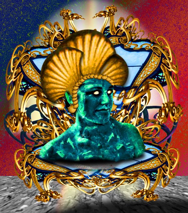
Homage to the Dune Series
The coils represent the Great Sand Worms and the exposure of the neck is for the power of the Voice...
My Photo and Source (5 years and 3788 days ago)


very nice work..SBS is good,and i like final result very much.Good luck author.
nice  maybe you could make the gold shine more
I like the hollow eyed look
Nice work  GL
GL
good work! like a lot...
Hahaha ehhehe :P:P
There you go again author, giving me another flashback.  Nice work. GL!
Psycodelic work,very nice! 
Nice work and good luck author  !!
!!
Howdie stranger!
If you want to rate this picture or participate in this contest, just:
LOGIN HERE or REGISTER FOR FREE
Howdie stranger!
If you want to rate this picture or participate in this contest, just:
LOGIN HERE or REGISTER FOR FREE