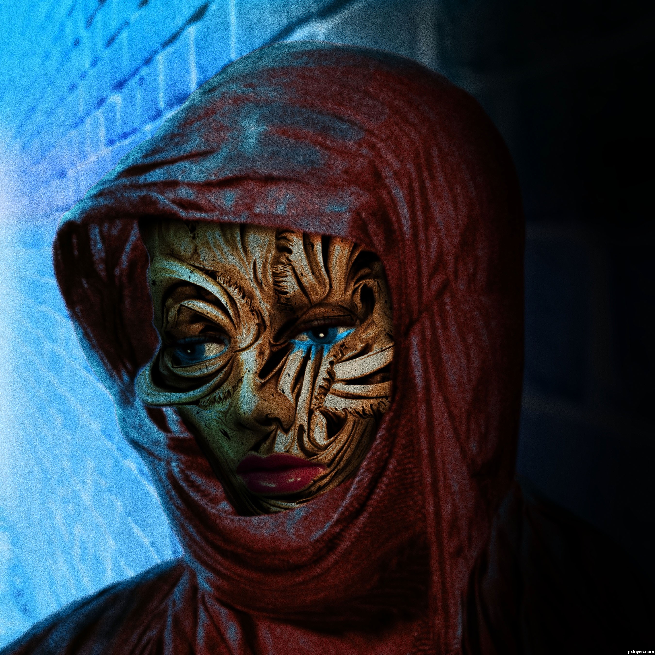
The Unseen Inner Beauty Of Ania (5 years and 2957 days ago)
Photography and photoshop contests
We are a community of people with
a passion for photography, graphics and art in general.
Every day new photoshop
and photography contests are posted to compete in. We also have one weekly drawing contest
and one weekly 3D contest!
Participation is 100% free!
Just
register and get
started!
Good luck!
© 2015 Pxleyes.com. All rights reserved.


Very interesting concept! I especially like the blue highlights...they add a lot.
like the idea a lot. her mouth looks very pasted on compared t the rest of the work... i am sure that you selected the mouth out and only effected the rest of her face, but this gives it a different look, that almost takes your attention away from the rest of the great work on lighting such a disfigured face. On a personal note, i am not a fan of the added noise. it looks sharp and very unnatural under any circumstances. Great work, good luck!
Oh yeah! Glad to see your work again, author! Excellent color and lighting! The care you took with the details like edges and highlights are simply awesome. You portray true emotion here in a clean, concise and dramatic way. Top notch as usual!
I must say thank you to RBut for the photo used in this chop.
Creative construction of the face, gl!
Howdie stranger!
If you want to rate this picture or participate in this contest, just:
LOGIN HERE or REGISTER FOR FREE