(5 years and 1471 days ago)
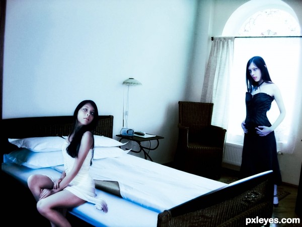
In my opinion, the girl in white should blend better with the bed, I think that adding a shadow on the right side of the dress could make it feel more realistic.
Thanks your right, i add a shadow. i had to work in the room picture it was to grainy im working on it.


err.. umm.. well.. umm... oh hell, I'm just going to say it.. the perspective is driving me CRAZY!!! It seems the Vader Vase is tilting back while the land is tilting forward. awe poop, I've become a critic.. OMG THE HUMANITY. Maybe I'm suffering from Star Wars overload hehehehe.. great talent no matter what. love the squiggly disruptive work good luck
(the HiRes is amazing, especially the debris at the base of the helmet vase)
Thanks, I took your advice and retried a different helmet planter angle.
Much better, not a big thing but it was annoying... super great fix
Howdie stranger!
If you want to rate this picture or participate in this contest, just:
LOGIN HERE or REGISTER FOR FREE