(5 years and 3693 days ago)
The author of source image is: Bods (5 years and 3729 days ago)
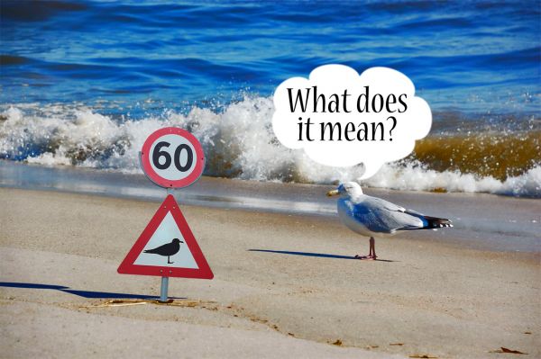
Funny idea, but a little bit too simple really. I feel if the picture isn't cartoonish, those speech bubbles ruin it every time. Better choice would be to put the text on the lower part of the image, if at all. The shadow isn't very accurate, but It would be almost a straight line like with the bird really, because of the sign orientation.. don't know if it really matters here.
lol...
you could change the one on the sign to a flying seagull
If the bird is smart enough to look at a sign and think.. "what does that mean ?"... It's gonna know what 60 means. 
Also, it appears to be looking at the back of the sign at a pole.
I agree with elficho about the sign....or else you can also make the sign of no stading like we have no parking sort of thing....Would be better...But a nice try....
LOL ,funny!
nice 
Howdie stranger!
If you want to rate this picture or participate in this contest, just:
LOGIN HERE or REGISTER FOR FREE
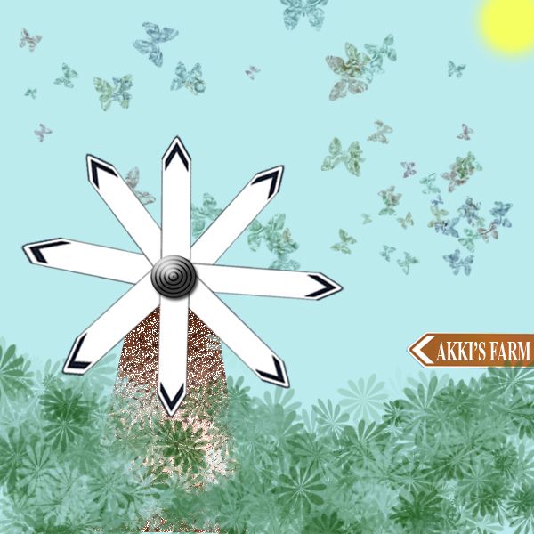
i have taken the image given and from that ive created a windmill surrounded by a farm.
*note-no external source used for this project. (5 years and 3749 days ago)
You windmill blades are a little off. Try copy and pasting each plade after rotating each 45 degrees.
This is a different way of looking at the source, nice imagination
thnx dollmommy..this is what i really intended to do sumthing different from the sign board
Howdie stranger!
If you want to rate this picture or participate in this contest, just:
LOGIN HERE or REGISTER FOR FREE
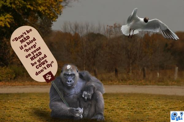
Hope you enjoy.... :-).
Thanks to Glenn Pebley for the ape image.
Thanks to http://www.trick17.ch for the bird image.
Thanks to Patrick Nijhuis for the grass image.
(5 years and 3797 days ago)
Shouldn't it say, "If a bird poops on your head?"
 didn't know how far i can go... I think they get the message...
Nice one...but the appe looks very pissed...
nice concept, nice humuor.
Cute image! And erathion...wouldn't you be pisssed if a bird beeped on YOUR head? LOL Good job Author and good luck!
cute entry.... it is true. ...good luck
I can see your point but IT'S JUST POOP! 
congrats
Congrats!
Congrats!!
Howdie stranger!
If you want to rate this picture or participate in this contest, just:
LOGIN HERE or REGISTER FOR FREE
(5 years and 3807 days ago)
Nice job, good humor! 

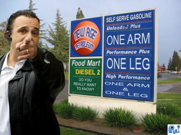
I had an idea simular to this. nice job using PS. Just not sure what the guy to the left is representing.
nice humour author. 
Howdie stranger!
If you want to rate this picture or participate in this contest, just:
LOGIN HERE or REGISTER FOR FREE
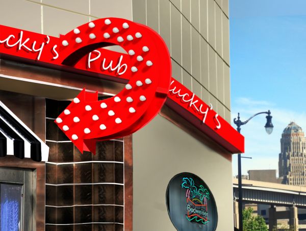
Outside edge should be lighter, beer sign rotated a bit counterclockwise...the rest is good.

great job... not sure if you have used a web safe color as there seem to be quite a bit of pixelation even in the high res... may want to try and tone down the red a bit too... GL!!
Yeah it does loose something, especially where the shadows of the light bulbs are. A lot of "pixelation" between my work here at home and the uploaded version...I kind of want the red bright though.
Under new direction... new decoration... nice!
looking good i like the red Author. Good luck
Thanks Nator and cbldawg71 for the 2nd opinions much appreciated, thanks.
nice job! i like the change of background too!
Just a nit-pick. The angle of the first 'k' is almost verticle, where the second 'k' is slated more forward. A littl backward skew would fix that. That being said, nice restoration work
Wow you really cleaned it up. It's probably wee bit too red but that's just IMO. GL!
Nice work...good luck
Nice resto.
very good
congrats
Howdie stranger!
If you want to rate this picture or participate in this contest, just:
LOGIN HERE or REGISTER FOR FREE