(5 years and 2975 days ago)
2 Sources:
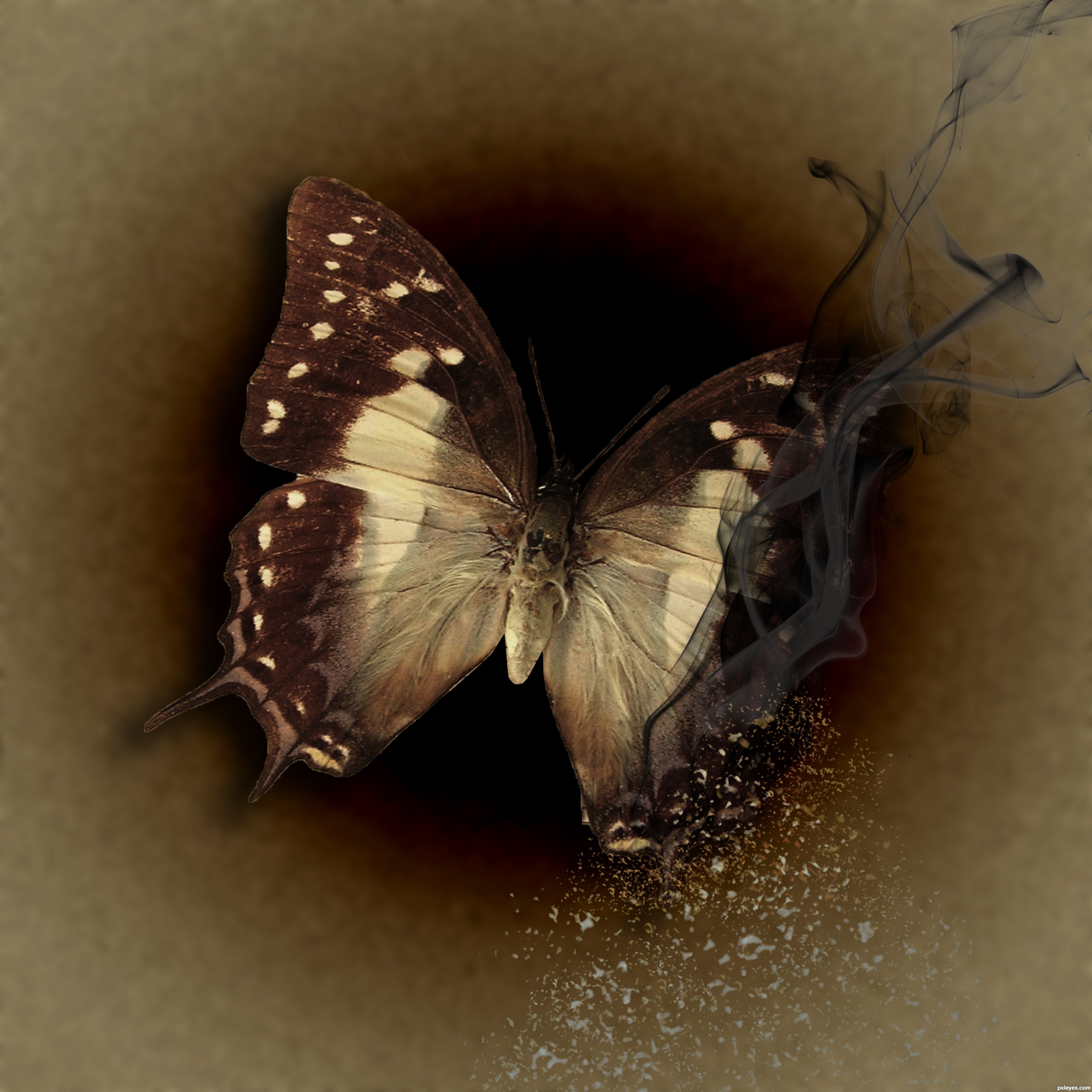
I edited this three times in ACR and then layered each edit on top of each other in the PSE 9 work space. Then I used layer masks to keep the parts of each edit that I wanted, and discard the rest. (5 years and 3132 days ago)
Overall it's a nice edit although I think you misinterpreted the goals of these contests. They are looking for manipulations not edits.
Oh, I see. Thank you. Can you tell me how to delete it?
Looks like a manipulation to me, author. I'd leave it in the contest, you've done a nice job, the color manipulations are well done!
Thanks MossyB!
rich colors...however you will not have any 'focus-point'.. everything seems important
Very nice, good luck!

Howdie stranger!
If you want to rate this picture or participate in this contest, just:
LOGIN HERE or REGISTER FOR FREE

IMPACT FONT
I created a very generic concept for the t-shirt, figuring the lighting and the travel time would add to the shirts appearance as it travels (5 years and 3153 days ago)
It is simple but beautiful at the same time! best of luck author!
Simplicity can be good, and this would look great on a white T-shirt. The URL on the bottom provides a bit of explanation along with advertising (you can't get ahead without marketing!). I might consider making the URL dark blue to separate it from the "ON TOUR," however.
Great and simple, I like it!
Maybe you can turn it into a portrait so the design can be bigger on the shirt? And maybe also add "www." in front of the URL?
got it robvdn (do people still use www. ?)
I think it would look cool on a tee shirt, plenty of room for autographs. 
This is a great logo. Nice and simple. Good luck!
very effective...
Simple yet very effective. The looks also very attractive. Best of luck my friend.  Also a fav here.
Less is more! Love this! Very effective! would love to wear a shirt with this on it! Good luck author
Howdie stranger!
If you want to rate this picture or participate in this contest, just:
LOGIN HERE or REGISTER FOR FREE

(5 years and 3156 days ago)
interesting author..
Nice design. I'd just make the web address larger, so that people could more easily read it (and check it out) if it was printed on a shirt.
Most of the design is distracting from the focus of the t-shirt.
thanks Mehul, MossyB and cmyk46...
nice work...
thanks passionboy..
Howdie stranger!
If you want to rate this picture or participate in this contest, just:
LOGIN HERE or REGISTER FOR FREE
(5 years and 3181 days ago)
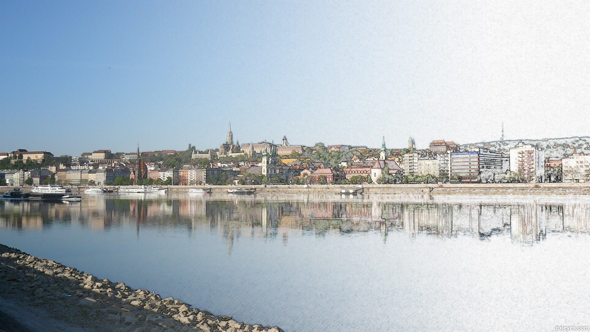
nice effect with the transition from image to painting
Smooth blending. Nice work!
Appealing panorama. The foreground element doesn't add anything for me, however. More saturation to the background might make the panorama less blah.
very simple and very well done
Well done effect! It isn't quite what I had in mind when I suggested the theme but it is interesting to see where people are taking it.
Nice sketch effect and blend. 
Howdie stranger!
If you want to rate this picture or participate in this contest, just:
LOGIN HERE or REGISTER FOR FREE
Photography and photoshop contests
We are a community of people with
a passion for photography, graphics and art in general.
Every day new photoshop
and photography contests are posted to compete in. We also have one weekly drawing contest
and one weekly 3D contest!
Participation is 100% free!
Just
register and get
started!
Good luck!
© 2015 Pxleyes.com. All rights reserved.


nice
Howdie stranger!
If you want to rate this picture or participate in this contest, just:
LOGIN HERE or REGISTER FOR FREE