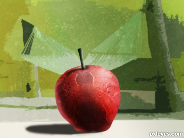
Modern art is: " I can do that myself! "
My objective was to create something simple and appealing. It wasn't that simple and you decide if it's appealing. (5 years and 3196 days ago)
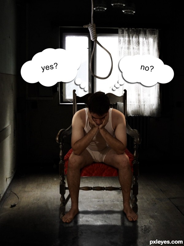
(5 years and 3231 days ago)
very nice concept and mood!
Nicely composed... but if the answer is "Yes" the rope needs adjusting... lol... Very Nice Entry!
hehe tnx  @nanaris and woodztockr
well prepared
like it gl author
tnx 
That's awesome 
Howdie stranger!
If you want to rate this picture or participate in this contest, just:
LOGIN HERE or REGISTER FOR FREE
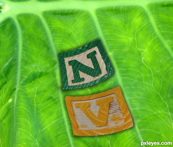
Thanks to jesuino for the green leaf and Jaymarr for the letter block V and N (Notified)
Leaf was enlarged by about 60% for use as the background
Just masked the tops of the blocks out and warped into shape with a bit of a drop shadow and a brightness and contrast adjustments (5 years and 3256 days ago)
Green of envy? 
Good luck!
with
Interesting. I kind of wish the brightness/saturation of the "V" element matched that of the "N" element. I'm also not sure why both letters need to be in the same leaf trough.
super cool work...GL
Green with N V --- Green with envy
Congrats!!
Congrats
Howdie stranger!
If you want to rate this picture or participate in this contest, just:
LOGIN HERE or REGISTER FOR FREE
(5 years and 3313 days ago)
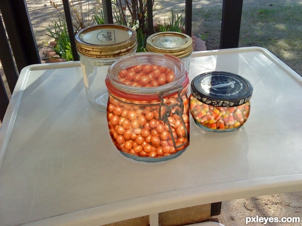
The contents of the jars are too bright, and the one with the clear glass lid doesn't show any peanuts  through the lid...
Thanks MossyB I've been away from computer couple days under the weather... I just did a fix any better ?
Looks nice... also a good idea to fill the jars with candy! Gl....
Howdie stranger!
If you want to rate this picture or participate in this contest, just:
LOGIN HERE or REGISTER FOR FREE
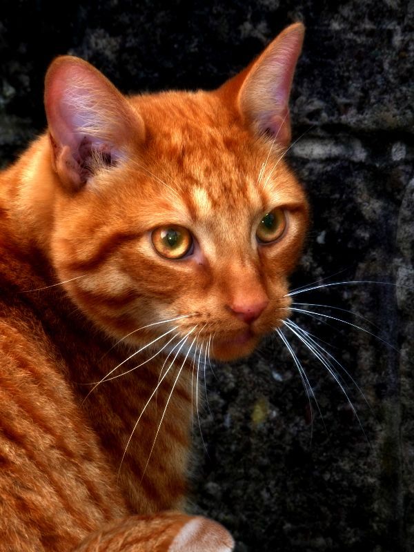
(5 years and 3339 days ago)
The background doesn't convince me but the cat looks really pretty.
convince? im not sure what that applies to?
So you just changed the contrast and maybe some gradient? That's kind of not enough even though you've made the original look much better..gl..
im sick of people commenting negative on my simple entries, yet others who post ridiculous entries dont get criticized at all. smh
It does look way better than the original.
People are not hate-commenting on your entries, they see your potential and want you to show them more, because it seems you have the skills to do it.
This is the reason why some "ridiculous entries" don't get criticized, cause the commenters don't know what to expect or ask from the author, and explaining him how to improve & grasp. fundamentals, might take too long.
People here also vote on creativity, imagination wow-effect, and by force of habit they expect more complex work.
Your entry looks gorgeous, as i said .If, for example, you would make it a portrait in a hands of a girl you would find as stock, voters could also appreciate your blending skills, your composition, your patience to search & find the right source & stuff like that.
I'm Not trying to tell you what to do, or make you modify anything, I'm just explaining how things work around, in my opinion.
In short, you`ve made an adjustment...not a manipulation. A nice adjustment though 
This is sweet. Nice job! A definite enhancement!
i also added a paw
Great job
Nice enhancement, that is so true, you did a great job there.. I have to agree with the people who expect more then "just" an enhancement, as I am one of them! Totally agree with @Greymval. I wish you the best of luck author!
Sometimes simple works and this is one of those times IMO!
Howdie stranger!
If you want to rate this picture or participate in this contest, just:
LOGIN HERE or REGISTER FOR FREE
It looks like more than "appealing," it looks like the whole apple... !
!
Nice job!
Much more appealing than the source pic.
Very creative and imaginative! Good work author and good luck...
Very creative author, GL!
beautiful and very effective work author...GL
Howdie stranger!
If you want to rate this picture or participate in this contest, just:
LOGIN HERE or REGISTER FOR FREE