(5 years and 3098 days ago)
Credits:
http://muttstock.deviantart.com
http://resurgere.deviantart.com
http://dawnallynnstock.deviantart.com
Caro Lander
bas3ssen
night_fate
lousyrats (5 years and 3212 days ago)
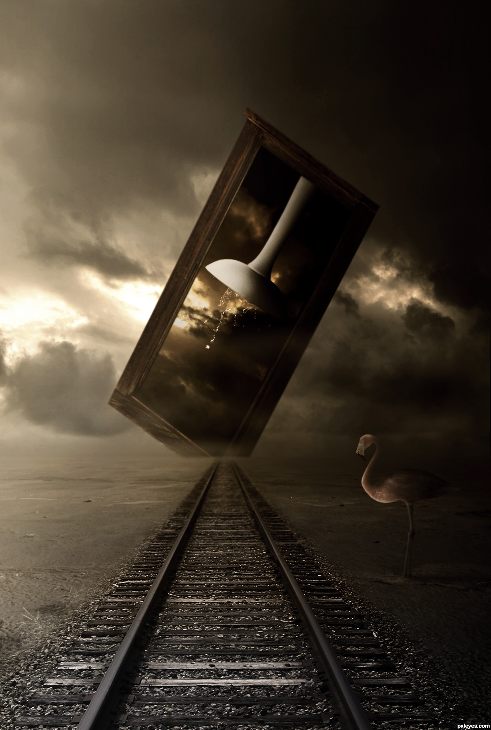
Intriguing with the odd elements, very constrained color palette, and dramatic brightness difference between the left and right sides, but in the end I just don't get it. While I see a 'path' (the railroad tracks, I assume), the 'sink(ing)' element seems disconnected from those tracks. The window thing encompassing the sink seems nearer than the far end of the tracks so I would expect some shadow from that window onto the tracks. The cut off corner on the window is weird.
Maybe shortening the title to just "Sinking" and making the window/sink element vertical and complete plus positioning it a bit more towards the left side of the image with a ground shadow would be a dramatic contrast against the left-side background and have a surrealistic appeal overall.
Makes me sit on the edge of my seat to see what Lundy comes up with... giggle snort.. great job author.. on a very difficult subject
this is amazing author
good luck
high vote and fav

Congrats for 3rd, nice one
Howdie stranger!
If you want to rate this picture or participate in this contest, just:
LOGIN HERE or REGISTER FOR FREE
(5 years and 3615 days ago)
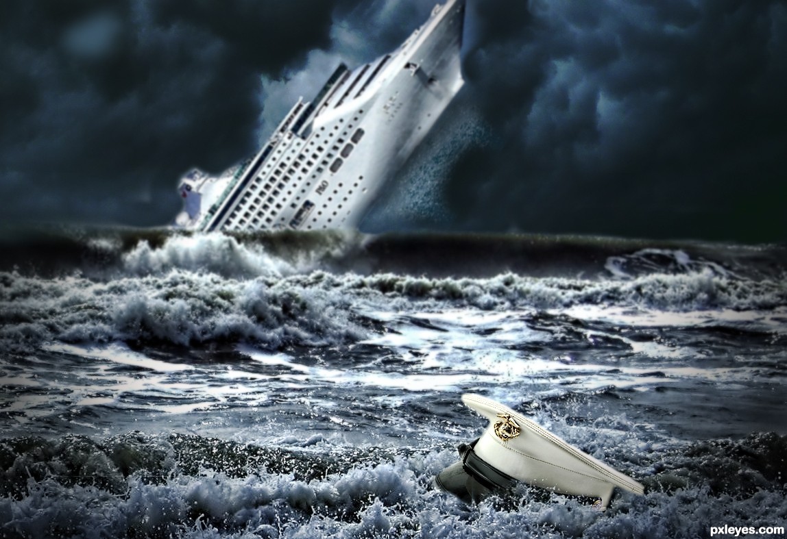
very nice idea...i have few nit picks,hat is to close to ship to be big like this,with sky like this u cannot have lighting on ship and on sea like yours...try to fix that author because your work have potential...i will hold my vote...good luck
nice..
Yes, the ship should be farther away and smaller, but good idea. 
i like it ! g l
At this point the ship is run aground; it must be added behind the last wave, resized smaller and got some blur for DOF. Idea is good, just needs these adjusts.
Thanks all for your comments and advice. Changes made..
nooo it's too blurry now! and the vignette is too strong.
Thanks elficho I wasn't sure about that. Think it looks right now.
Funny...this used to be alot better! You still have time author...change it back a few steps. Everything is still too blurry and the hat used to be alot sharper.
Howdie stranger!
If you want to rate this picture or participate in this contest, just:
LOGIN HERE or REGISTER FOR FREE
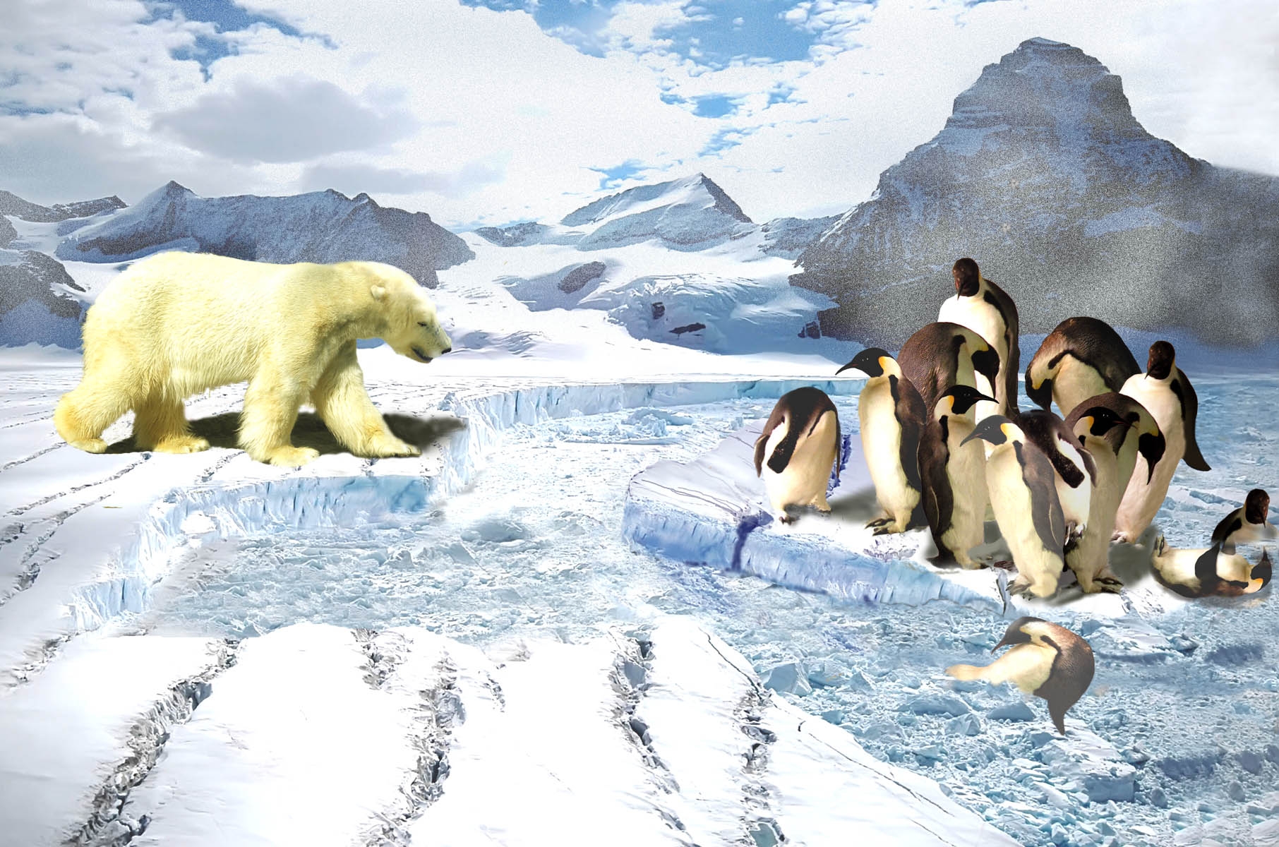
A piece of the glacier let go and took some unlucky penguins with it. Let's hope that polar bear stays where he is! Thanks to aeryith at morguefile for the bear body-I changed the head for one from my photo. Thanks also to jconnor at morguefile for the penguin photo. (5 years and 3895 days ago)
Foreground penguins are too desaturated, and there's a gray glob between the fet of the 2 center penguins. The polar bear blend is good...shadow could be lighter. Ice floe effect is nicely done...GL.
Thanks, CMYK. Just checked my files, and had corrected the spot by their feet and also brought up the darks. Guess I uploaded the wrong one and it's too late now.I kept the bear's shadow as it was in the original photo, but think I will change it on my copy anyway and see if I like it better. Thanks for you input. There are so many fabulous entries in this category, I almost didn't submit at all.
very nice
Howdie stranger!
If you want to rate this picture or participate in this contest, just:
LOGIN HERE or REGISTER FOR FREE
Photography and photoshop contests
We are a community of people with
a passion for photography, graphics and art in general.
Every day new photoshop
and photography contests are posted to compete in. We also have one weekly drawing contest
and one weekly 3D contest!
Participation is 100% free!
Just
register and get
started!
Good luck!
© 2015 Pxleyes.com. All rights reserved.


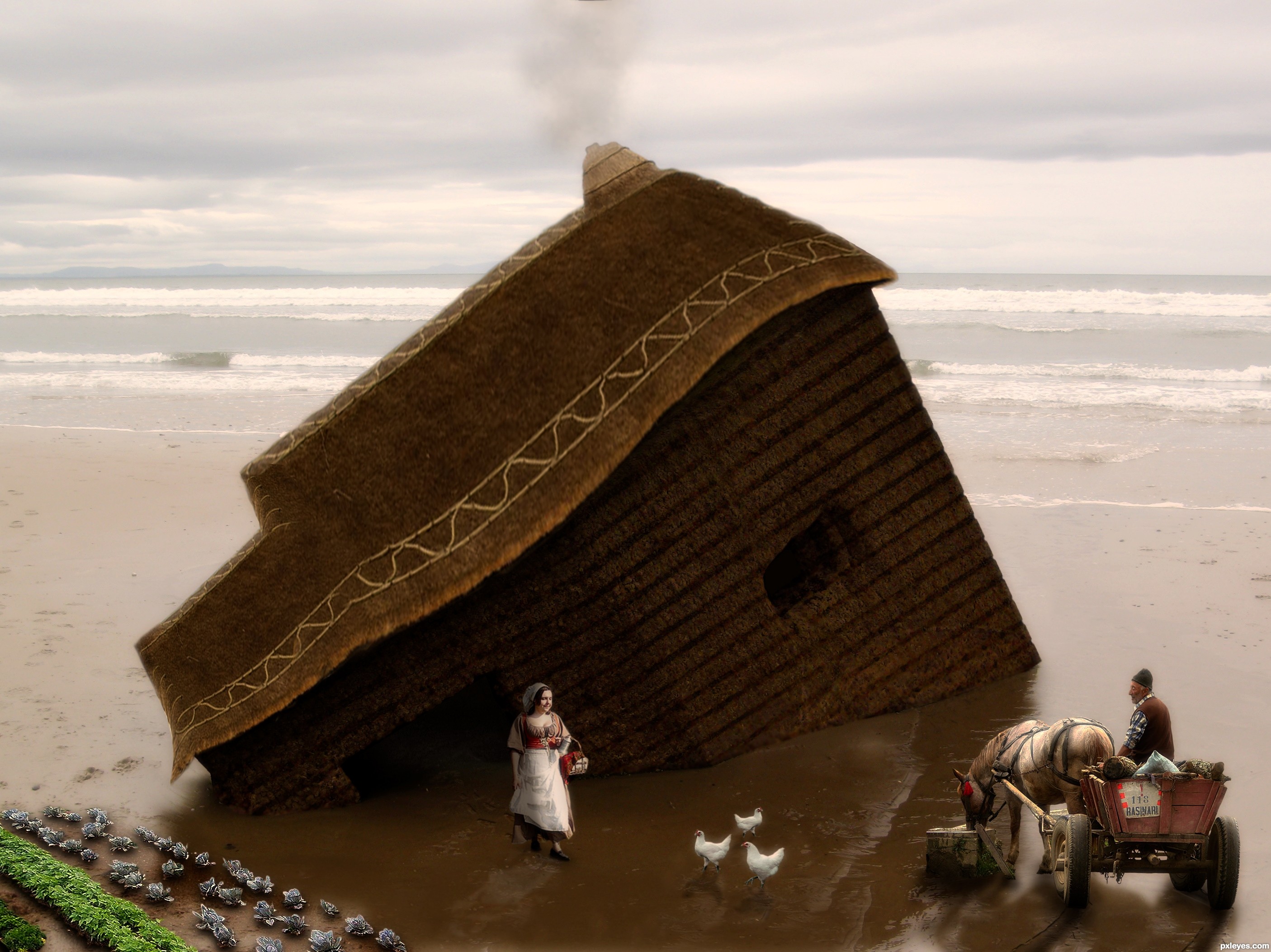
I like your reflections.
Howdie stranger!
If you want to rate this picture or participate in this contest, just:
LOGIN HERE or REGISTER FOR FREE