(5 years and 2885 days ago)
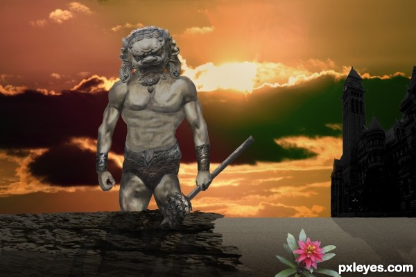
the warrior is completely made from parts of the statue
puppet wrap
All pictures (other than source) used are my own photographs (5 years and 3294 days ago)
All the pictures are my own and I listed them under the SBS
His pectoral chest muscles are a bit odd. The breast on the RH side is somewhat larger and misshapen when compared to the one on the LH side.
The anatomy of his arms is perfect, that's why I don't get how come his chest muscles are asymmetrical, his right pectoral being smaller than his left.
It's almost like the torso was semi profile, like this picture of me :http://cdn.picapp.com/ftp/Images/0066/0f6f596f-f177-487d-ac53-d2c8b5f5e1c4.jpg and you tried to warp it for a front.
The light on him comes from the front while the sun in setting in the back, etc, etc..
Dude, there are too many mistakes to point them out here, without discouraging you ( i will if you insist) - so i suggest you try something simpler first:
for example, making a man with that statue's head, by using stock and blending. If you succeed you add a simple background first, then some additional element and so on.
thank you ..I have no problem with your critique, it is the way I can learn. I will get better.
Howdie stranger!
If you want to rate this picture or participate in this contest, just:
LOGIN HERE or REGISTER FOR FREE
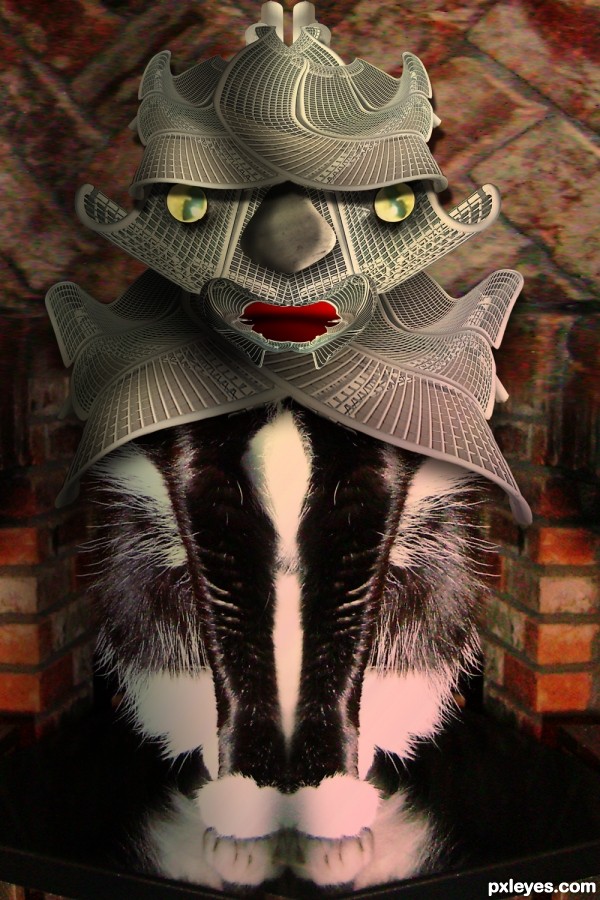
My Photos combined with the source
Polar Coordinates to bench (5 years and 3355 days ago)
Fantastic warping author...its fantastic how u achieve form of the source with all that warping...i would like to know how to do that...best of luck
before I had warp, I used to use Polar Coordinates all the time (the trick is to place the MASKED item at different points on the field before you apply the polar filter (if it's centered you always get the predictable circle, but if you move it to the side or to the base you get many fascinating shapes, but I have to admit, the warp tool really spoils me, much more control, the puppet warp is great because you can move items below and above itself without a lot of distortion, (the old days I would cut and paste til my fingers bled) thank you very much for your kind words 
I agree. You do such amazing things with sources. Great job again!! GL
Great work and I agree with erathion, how'd you do it!!! Seriously though, well done and an unusual image!
Nice work on the helmet.., good job
*smiling* Love the 'helmet' and the rest of the armor, so creative. I hope no kitties were harmed in the making of this entry! LOL, a true 'tuxedo' cat, sweet baby. 
oh she's a tuxedo alright, not a sweet baby, got her just before 9-11, and she's been a pain in the butt ever since, all she does is eat, sleep and poop, sigh, and I don't think I could make it through the day without her
You did a good job making this a kind of Samurai.... cool, I hope you make it to the best seven. Good luck...
WHERE WERE YOU EARLIER GEORGE55!?!?!?!?!,, omg.. I never saw the samurai, now I DO.. dammit.. I could have added a shield and a sword.. gosh darnit!!! great thinking 
Congrats on 4th but it's a shame what you put your cat through! Bloating her eyes and stuf!! 
Howdie stranger!
If you want to rate this picture or participate in this contest, just:
LOGIN HERE or REGISTER FOR FREE
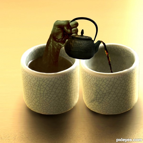
A mildly successful attempt at creating a liquid hand. :) (5 years and 3639 days ago)
haha..  great idea author! Best of luck
nice idea -- the liquid coming over the spout looks a bit off but a nice job otherwise
Cool idea, what alan says, good luck 
Creative idea. The liquid hand looks fairly good. Some brighter-white highlights (like at the left edge of the tea in the cup) might make it appear more convincing. The teapot doesn't seem tilted enough for tea to be able to escape. The perspective is also off; I would expect to see as much of the top of the teapot as I see of the top of the cups.
@dan: I agree with you, however, for the sake of argument, the teapot could be rotated along the x axis into the z plane, which would allow for the perspective to be correct and the tea would be able to flow from the pot
Looks realistic  Nicely done
Agree about the highlights, and since the hand is liquid it should be more translucent, but good idea.
I agree with CMYK about the transparency of tea hand; and for a green tea, the liquid that enter in the other cup is a bit dark, like black tea... But it's really a creative idea! 
The z-plane argument is technically correct and indeed explains the apparent lack of arc in the exiting tea (it's flowing away from the viewer). Maybe changing the title to "More sideways tea, sir?" would alert the viewer that a non-traditional interpretation is required. And I just realized that the teapot isn't casting any shadow (which might provide some insight into its orientation)!
A really creative effort. GL
Great idea, you did wonderful work with this. Good Luck to you!!
nice job
Howdie stranger!
If you want to rate this picture or participate in this contest, just:
LOGIN HERE or REGISTER FOR FREE
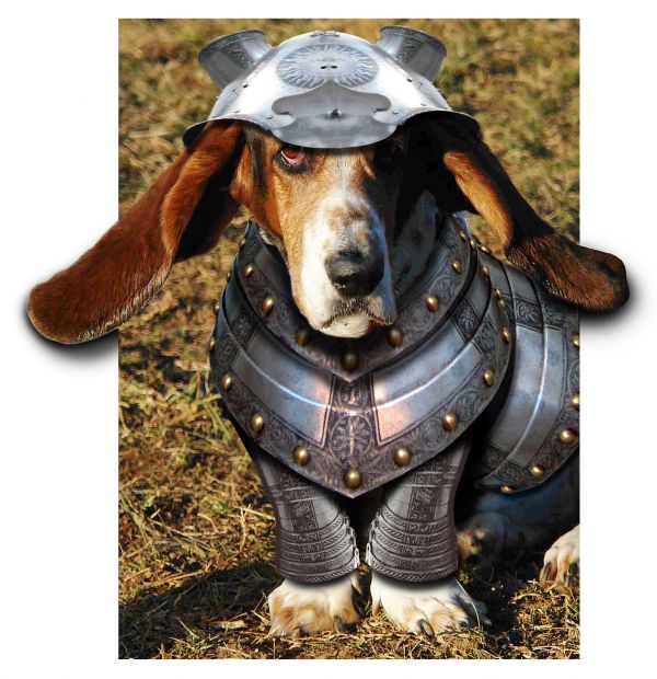
Hope this one's ok... my 1st ever entry got removed as I wasn't fully aware of how to upload sbs!!(eyes like blue lagoon) ... So let's try again, hope it's up to par, comments greatly appreciated Thanks. (5 years and 3685 days ago)
Nice job, except dog's shadow is opposite light source on his head, and you seem to be missing a link for the feet and/or background.
shadow on ground to left not dog's? ... the feet belong to the dog and he's sitting on the background ... all in dog source
He looks pretty intimidating 
Nice work...good luck
If the feet in your entry belong to the dog in your source link, where does the grass come from? Look again at the light source on the dog head. Light is from left. Shadow on ground next to dog is opposite.
sorry... i'll rectify the link as soon as i can find it !! 

Nice try....Shadow is a problem otherwise a nice work,.....
i think it will be more good if you get rid of the white space... and fill it with grass background... and fix the shadow too.. Nice work, good luck..!
CMYK is right.
helmet need to a little more round... agree with 'CMYK' and hereisanoop about the shadows and the white background.. But this one looks very nice... good luck to you.
Nice blend.....Good one... 
OK ...sorry folks, posted wrong link ... I think if you look at it you will see that the shadow is NOT the dog's (If i get a chance i'll clone it out, but given the original shadowing on his face i didn't think i needed to).... as for the shape of the helmet: the shape of a basset's head, isn't 'round as such, plus i wanted the helmet to cover the join of his ears too
Cute (in spite of not liking this race of dog...) 
very adorable
this is pretty. good luck to you.
Nice work, Love the dog.......Good Luck
This is on a hilarious level of awesomeness. The armor looks like it was made for the little guy, fits perfect.
Howdie stranger!
If you want to rate this picture or participate in this contest, just:
LOGIN HERE or REGISTER FOR FREE
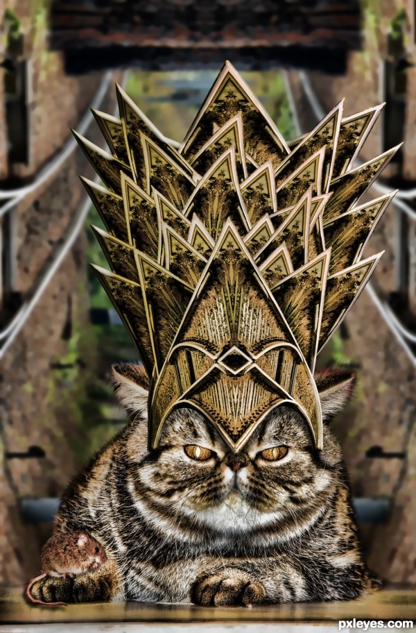
Hilarious, author! This just makes me chuckle. Very kitty-worthy crown.
serious and funny
Funny entry author. What I would really liked to have seen would be a realistic version on this. It looks like a filter has been applied over the final image in order to blend it a little better. It would have been very very cool as an ultra realistic entry.
I understand... but flickr resolution is always a gamble LOL THANKS!!!
Howdie stranger!
If you want to rate this picture or participate in this contest, just:
LOGIN HERE or REGISTER FOR FREE