explanation in SBS (5 years and 3609 days ago)
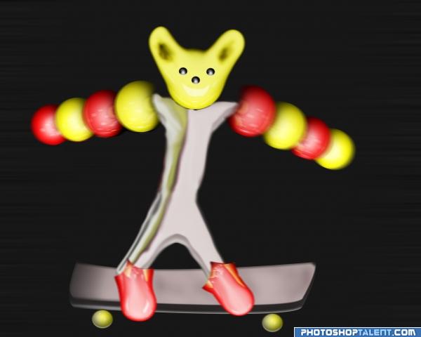
- 1: the skater

no outside source used. Add
Motion blur (5 years and 3966 days ago)

Not enough refinement on this piece.. I can see the skateboarder, but I don't feel the motion or the perspective. You've got the shape down, now work on making it more refined.. good luck
thnaks for your comments. I will do the changes.
good work
nice job 
I think motion blur should be used more and on the entire pic - otherwise the scateboard looks stationary
Good Luck
good job ...good luck you need it..
Howdie stranger!
If you want to rate this picture or participate in this contest, just:
LOGIN HERE or REGISTER FOR FREE
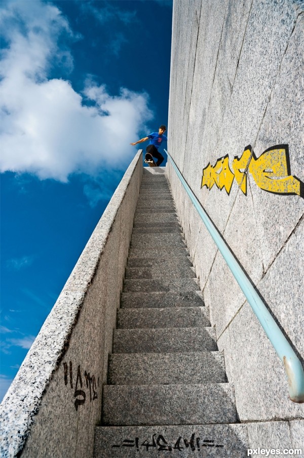
Cool idea, and distressing the left-side railing edge is a nice touch. But the shadow created by the skateboarder is not consistent with that created by the right-side hand rail. I like the graffiti, but it doesn't feel as if it's 'on' the wall [too intense], especially at the grout line between the blocks. I think more, and maybe more colorful, graffiti would add a lot -- and might even be a more compelling focus, relegating the skateboarder to a secondary role.
Apart from what Dan says, I think there's something phyisically not completely ok. The way I see the source image, the skater is on the top of a wall (and not on the stairs itself). The arm from the skater however is already at the front of the right wall, while his arm is behind the body. I guess that arm wouldnt be visible from that angle. Just that . Good luck!
nice one but i'd have to agree about the shadows....goodluck
I have made a little adjustments according to your comments. Thank you.
all the best to u author ........... nice idea .............
much better!..
Fantastic job author...simple but great...best of luck
best of luck
Wow, very nice idea!
Howdie stranger!
If you want to rate this picture or participate in this contest, just:
LOGIN HERE or REGISTER FOR FREE