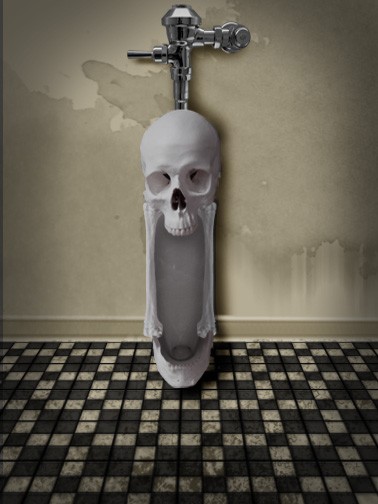
(5 years and 3765 days ago)
- 1: flush
- 2: urinal
- 3: grunge brushes
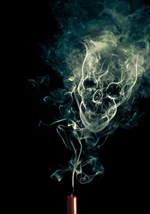
(5 years and 3765 days ago)
very nice!
very nice use of image
i seen that effect in a online tut. the only difference was the smoke was coming form a lit cigaret.
Thanks for reminding me i forgot to post that link but yeah that is where i got my insperation http://psd.tutsplus.com/tutorials/photo-effects-tutorials/manipulate-smoke-to-create-hyper-real-images/
Nice work! I might have liquified the chin to make it bleed into the smoke stream more, but it's a good job. 
Nice work.
@cmyk thanks for the advice i see what you're sayin
nice work
perfect...
Ahhh tutorial! I love that tutorial.
Its look great but its too much turorial no personal mark at all...but still very good finall result...
great final image.
cool!
Congrats for your first place, Deltron!
congrats! for 1st place.
Congrats! Well deserved.
congrats! for 1st place.
thanks everyone 
Congrats!!
I'm glad you won! Congratz Man! much better than my own lol
Howdie stranger!
If you want to rate this picture or participate in this contest, just:
LOGIN HERE or REGISTER FOR FREE
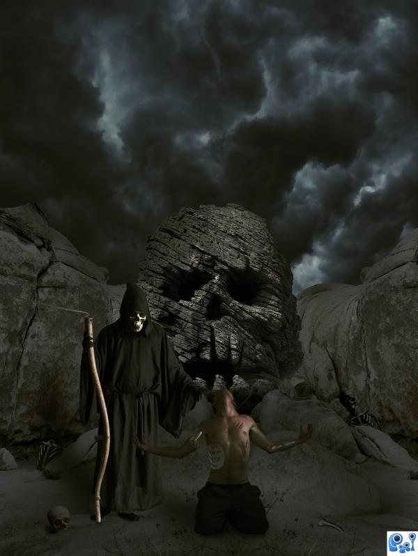
Dimitri Castrique-http://www.sxc.hu/profile/dimitri_c
xdilemmas stock -http://so-hood-stock.deviantart.com/
insert something clever here-http://phoeebstock.deviantart.com/
Marcus J. Ranum-http://mjranum-stock.deviantart.com/
dmitry-http://dmitry-stock.deviantart.com/
Stock Gallery-http://nitch-stock.deviantart.com/
Thanks guys for the great images that i used for this project... (5 years and 3768 days ago)
uuuuu spookie... nice work
You need to darken the skeletons in the background. There's no light source to shine on them like that.
Thanks guys,i made some corection's....
Yeah, much better. ONLY thing is the skull on the reaper seems a bit bright, considering he's wearing a hood. For what it's worth this is still one of best entries I've seen so far. 
Great blend of lots of different sources... good luck!
nice creativity
love the sky, great blend.. fantastic finished image.
Beautiful........Good Luck Author.
Howdie stranger!
If you want to rate this picture or participate in this contest, just:
LOGIN HERE or REGISTER FOR FREE
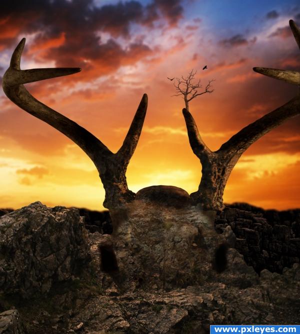
sources used:
"Deer Skull 1" by ~markopolio-stock at deviantart.com: http://markopolio-stock.deviantart.com/art/Deer-Skull-1-57236738
"Landscape stock 66 mountains" by ~Finsternis-stock at deviantart.com: http://finsternis-stock.deviantart.com/art/Landscape-stock-66-mountains-63681341
"Desert Sunset" by jonobate on Flickr.com: http://www.flickr.com/photos/prophet_of_rage/2884717470/
"RockJagged0016 (Texture: #25545)" from cgtextures.com: http://www.cgtextures.com/texview.php?id=25545&PHPSESSID=c8f51e2c554e697378d54c9130d10131
"They Stand Alone" tree brushes by *midnightstouch at deviantart.com: http://midnightstouch.deviantart.com/art/They-Stand-Alone-41729596
"Flying Bird Brushes" by Osidian Dawn at osidiandawn.com (5 years and 3794 days ago)
Very nice, i like tehe addition of the tree on the antler.
lovely
the tree is a useful touch, i don't think i'd notice the proportion changes 
yeah...i was going to build a city/town around it...but i didn't have enough time to work on the project (had to come to my mom's and paint her apt)
Nice job. I really like how the skull blends into rock.
I see the antlers but not the skull....
great job 
Howdie stranger!
If you want to rate this picture or participate in this contest, just:
LOGIN HERE or REGISTER FOR FREE
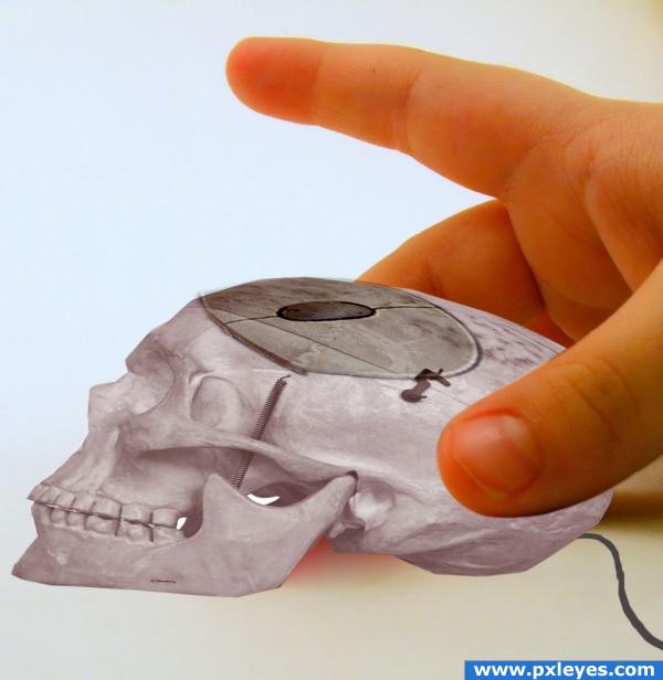
THANKS TO STOCKVAULT AND AARINFREEPHOTO FOR THEIR PICS... (5 years and 3806 days ago)
the skull is a bit flat
nice idea but the perspective is wrong.gl
great idea. but with some shadows would it look more realistic.
Correct shadows, please...and source link 3 is wrong.
nice ...but I think like he said make skull a little fuller not so wide and flat it would look better good luck
thanks all for the input, i´ll work on that....
Howdie stranger!
If you want to rate this picture or participate in this contest, just:
LOGIN HERE or REGISTER FOR FREE
This is really good! Where's the source link for the room?
it looks very very nice, perhaps you could upload a high resolution version. Good luck
i made the room CMYK46
Sorry, didn't see the whole SBS before commenting...now I think this is even better!
(But post the sources for the grunge brushes).
Cool I like the idea. But probably sitting a bit low for a urinal. But I do like it.
Nah, I've seen monster urinals like this that go all the way to the floor in older places, although the scale is a bit off. Good luck, author.
so typical that men get cool toilets lol
Very nice use of source. Its it safe to use this urinal Keep it up author..not the urinal just your work
  one small thing, can you blend the tap and the top of the skull a little more.
The tap probably attaches in the back/bottom so that it does not need to blend into the top. Didn't Col. Jessup in A Few Good Men say that he was going to "...rip the eyeballs out of your (Lt. Kaffee) head and p*ss in your dead skull!" That's what this reminds me of.
Why no high res. I want to see the details of your chop. I've seen urinals run this low too.
looks great! goodluck author
LMAO!! This is great!!
so large and yet guys still miss.... sorry author could not resist... Heeee.. great image.. wonderful work creating the room .
Howdie stranger!
If you want to rate this picture or participate in this contest, just:
LOGIN HERE or REGISTER FOR FREE