(5 years and 3834 days ago)

OMG!!!! This took me hours to make... i applaud people that make it look easy to remove things from an image lol
I couldn't really think of anything to do with this image, so I thought I would just get rid of things i didn't like in it :)
Then I though hmmm this could make a wallpaper of some kind...
Hope you like :)
Only source image and a texture added to background afterwards. (5 years and 3868 days ago)
I like the grungey feel, and i really like some of the choices that you've made here, good luck, and high marks from me! 
cool
Howdie stranger!
If you want to rate this picture or participate in this contest, just:
LOGIN HERE or REGISTER FOR FREE

Some people are willing to pay almost anything to look beautiful. (5 years and 3869 days ago)
If he kept his head turned to the right I'd be more than willing to.... Oh, wait. This is family friendly? Uh, in that case, nice job. High points for Doc McDreamy.
Maybe rotate the blade so the cutting side is facing downwards?? Maybe feather the opacity around the skull into the face some more? Looks just a bit sudden.. GL.
yeah, i thought of the blade after i did it. 
I think u can better integrate the skull with his face; now it seems a little to the side; it should be in the direction of the man's features (nose, eye, mouth) so I would move it more to the right and lower it and rotate to the right; sexy man by the way
This is really good and has a lot of meaning to it. The skull seems to come out a little too far by his eye but I could be wrong.
setting is good but scull on the head need some more work ,out of face and need some wrap.good luck
It's a good idea, but the skull doesn;t quite match up with the doctor. Good luck, though!
Thank you Hisks for the scapel picture. I put a link from your page the other day to here  http://www.sxc.hu/photo/992504
Howdie stranger!
If you want to rate this picture or participate in this contest, just:
LOGIN HERE or REGISTER FOR FREE

(5 years and 3872 days ago)
Good idea, nice image!
This is a cool image; however, the moss should overlap the skull a little more on the edges, particularly the lower left, upper left ,and upper edges similar to how it is done on the right edge, but not quite to that extent.
good idea but the skull is too blurry compared to the sharpness of the background image.
Howdie stranger!
If you want to rate this picture or participate in this contest, just:
LOGIN HERE or REGISTER FOR FREE
(5 years and 3875 days ago)
Nice!
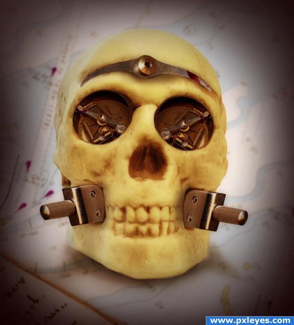
head band is a kicker LOL.. good luck
cute.
Howdie stranger!
If you want to rate this picture or participate in this contest, just:
LOGIN HERE or REGISTER FOR FREE
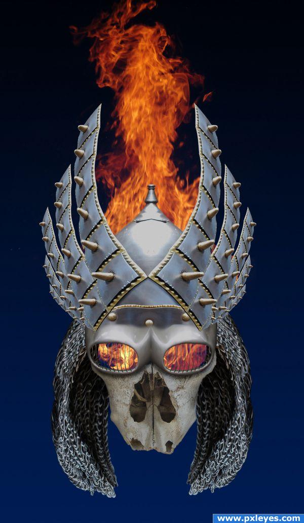
Very nice job - like the various sources and the way the flame is used
I like it. My only suggestion is to make the back of the hair alot darker. The light source indicates that the light comes from the top, so that area would be deep in shadow. Besides, I think it will make the skull pop up a little and give the hair a little depth.
@ thefinalcut: Thanks for the suggestion...shadows added, looks better!
Looks really cool! I do think the bone of the face needs some shading on the sides and more darkness inside the nose since the least light reaches there. Also the top of the flame has a straight edge where the image ended, simple clean up there. These are minor tweaks but I think they would really enhance an already good image IMHO.
Reminds me of my ex-mother-in-law!
@ Spaceranger: Good eye...tweaks made!
Nicely done...
nice job
nice perspective great entry Author
Amazing work!
And also congrats for your third place!
Congratulations for 3rd too
congrats
Congrats
Congrats!!
Howdie stranger!
If you want to rate this picture or participate in this contest, just:
LOGIN HERE or REGISTER FOR FREE