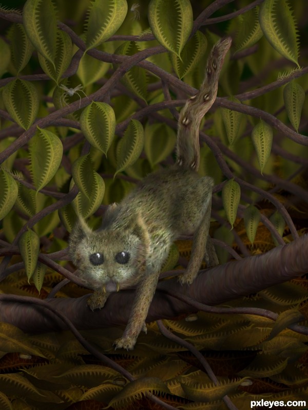
Journal entry date 11.27.2311 This new species, which we fondly call the skunk cat (feteo beatitas Holdenii), was discovered quite unintentionally by our colleague Dr. Farnic Holden. As he relates to us (from a fair distance), he was gathering specimens from a fly trap thicket when the skunk cat suddenly emerged. Being startled, the skunk cat immediately rolled into a ball, leaving just its tail protruding. As Dr. Holden approached, the skunk cat flicked its tail with some force, causing several short streams of a noxious liquid to emerge from the glans in the tail and land on Dr. Holden's skin and clothing. The odor from this liquid was so strong, it caused Dr. Holden to leave the area immediately, eyes tearing and stomach churning. We have yet to find a neutralizing agent for the liquid and so, Dr. Holden continues to be...umm...unacceptable company. (5 years and 3070 days ago)


 ] BTW the green URL at the bottom appears to have a misspelling.
 good luck
 Probably too much text, but great !


Excellent use of source, really well done! Great creativity!
while the creature is GREAT the leaves are out of this world
very nice work! high score
wow, a lot of work in this composition, very inteligent use of colors, good luck!
different and spooky. gl
VERY good job with this - I love that you actually DID something with the spider other than just place it somewhere. Extra critters and leaves are cool, too. Great story.
Yep. Had a thought it might be you! Nice work, author! Creepy and creative at the same time. Love this style!
Congrats for the 1st place, did a great job!
Nice work!..Congrats!!!
Thank you for your votes and comments!
Congrats!
congrats ,and yet another winner for you.
Congratulations IDt8r
Congrats IDt8r!
Congrats Cheryl ugly critter, great story
Congrats Cheryl, wonderful work!!
Congrats..... nice job!
congratulations............ for first.
Howdie stranger!
If you want to rate this picture or participate in this contest, just:
LOGIN HERE or REGISTER FOR FREE