Photoshop Pictures: Sky (page 15)


results 71 - 75 of 132

First Star to the Right - created by TwilightMuse


First Star to the Right
Favs: 0SBS: 5Hi-resRank: 16/17Score: 50.8% (0)14976 views

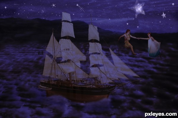
First star to the right, straight on till morning...
-This is an different entry than the original because the original was really blurry.
-The starfish was used in the sky. I wanted to do a night sky with the source and did my best to manipulate the starfish in a way they'd blend naturally yet still maintain a sureal quality.
The pirate ship I credit to Konishkichen
Peter Pan is from Mithgariel-stock
The pirate flag is by Dollieflesh
and the star light is by Sed-rah. I did get written permission which is included in the animated SBS
The starfish image provided by pxleyes.
The sky image, mountains and Wendy are my stock. (5 years and 3302 days ago)

4 Sources:

author says:

I was working on an animated SBS but it was too large I will upload it in a couple hours.

avatar CMYK46
CMYK46 says:

The ship wouldn't be transparent.

author says:

This isn't meant to be super realistic. Only the sails are transparent.

Howdie stranger!
If you want to rate this picture or participate in this contest, just:

LOGIN HERE or REGISTER FOR FREE


Angel of Light - created by Robart523


Angel of Light
Favs: 1SBS: 5Hi-resRank: 8/17Score: 53.8% (0)20763 views

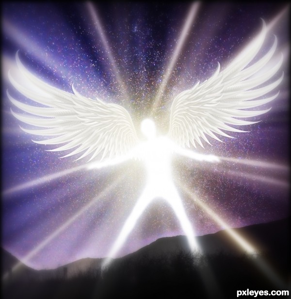
I spent forever making the wings, then got to busy throughout the week to do what I had hoped with them. But I liked the wings so much I had to do something. So I crammed this together last minute, hope everyone likes it :)

For some reason I can't get it to upload any more steps to the step by step, but I managed to upload the making of the wing, the rest is pretty self explanatory. (5 years and 3302 days ago)

3 Sources:

avatar jawshoewhah
jawshoewhah [banned] says:

It's a great entry but you really CBR'd the source, meaning (Chopped Beyond recognition. There's no sign of the original source in your image. I had to go to the SBS just to see where you used it. I think you should have put more of the original source back into it

avatar creativefreedom

AWESOME!

avatar pingenvy
pingenvy says:

I agree with jawshoewhah, but it is still a beautiful piece of art.

author says:

Yeah I actually agree with you guys now that you mention it. I really did want to take the time to make armor for him out of the source, but didn't have the time
Is there a way to take down your own entries?

avatar EmiK
EmiK says:

Oh this is great and I think you can do whatever you like as long as you have the SBS to show your work. I like this a lot, and sorry jaws, I just think you should be able to do whatever your heart desires with the starting image.

avatar jawshoewhah
jawshoewhah [banned] says:

Look, CBRing isn't against the rules but a lot of people give lower scores for it. And I'm sorry I disagree with you Emik. IMO, if you didn't need the source to make the image you really didn't use it. It defeats the purpose of a source image contest.

avatar George55
George55 says:

Author. Do not take your entry away, you used part of the source image to make your entry. You had the idea, although some times it is better working with the whole image. I think you did a good job, and spent a lot of time pulling your brains out of your head, just to make this beautiful image. I have seen worst CBR entries. I wish you good luck!

avatar erathion
erathion says:

Author,wings creation is fantastic,final product is very good,but usage of the source image is to minimal...this could be made with any image...When i saw your SBS i had that wow thing...wings are perfectly...U could made some flying creature with that and put it on top of containers or to construct something else with source image...In that case u could have another amazing entry...Any how this is very cool final product and i wish u best of luck

avatar cabldawg71

got my vote very nice Author

author says:

Hey everyone I really apreciate all the comments. Glad you like it dispite the lack of lots of source. I was wondering how much I am still aloud to edit? Is it ok if I spend time adding more source image in? Or is it to late to make any major changes? Like I keep saying i totally agree, I intended for pretty much th entire body to be source image but got to busy with work to spend more time on it.

Howdie stranger!
If you want to rate this picture or participate in this contest, just:

LOGIN HERE or REGISTER FOR FREE


The Resurrection - created by petersheep


The Resurrection
Favs: 11SBS: 8Hi-resRank: 1/17Score: 63.2% (35)28214 views

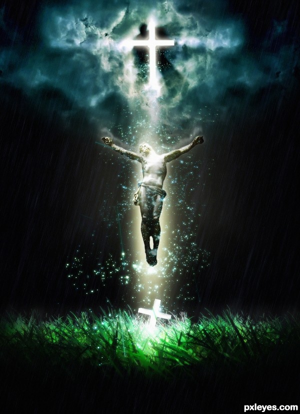
Although I am an atheist, I believe that religion is a great way to express art. So I made this in honor of handling the story of Christ's resurrection. I hope you enjoy. (5 years and 3305 days ago)

2 Sources:

avatar spaceranger

Beautiful image and a good use of the source!

avatar Androla
Androla says:

this is nice!

avatar greymval
greymval says:

That's it! You know that theory that when we manipulate a photo we're trying to make it look like it should have been from the start? That's it, this is how it should have looked.

avatar ponti55
ponti55 says:

An absolutely BRILLIANT use of a terrible source. Fantastic work, author

avatar CMYK46
CMYK46 says:

IMO the bottom cross is redundant and distracting, however, you've made a great image here nevertheless. GL author!

avatar ibmaxed
ibmaxed says:

Great job..GL

avatar artgirl1935

Wonderful image. GL

avatar yoguy108
yoguy108 says:

brilliant work

avatar shaiju1974

Nice work!!!

avatar layerstack

Fantastic,,,GL

avatar Farasa
Farasa says:

author says:

thx guys for coment and critic

avatar erikuri
erikuri says:

Very very awesome! It's neat and beautiful...

avatar creativefreedom

INEDIBLE! BRILLIANT!! BRAVO!!

avatar Momof4boyoboys

Wow..well done author!

avatar jawshoewhah
jawshoewhah [banned] says:


~*()()==|% W*I*C*K*E*D~*~C*O*O*L %|==()()*~

GL!

avatar jawshoewhah
jawshoewhah [banned] says:


~*()()==|% W*I*C*K*E*D~*~C*O*O*L %|==()()*~

GL!

avatar swordfish
swordfish says:

Great job ..... congrats on 1st

avatar artgirl1935

Congratulations!!!! Beautiful piece of work!

avatar shaiju1974

Congrats for the first place!!

avatar derdevil
derdevil says:

Congrats !! Beautiful image

avatar madamemonty

Congrats, lovely work

avatar erathion
erathion says:

Congrats...gl

avatar RichieMB
RichieMB says:

Congrats for 1st

avatar locxoul
locxoul says:

congratulations...

author says:

Thx for votes, coments and fav guys!!!

avatar erikuri
erikuri says:

A wonderful work deserved the top place! Congratulations!

Howdie stranger!
If you want to rate this picture or participate in this contest, just:

LOGIN HERE or REGISTER FOR FREE


where is my sky - created by nanaris


where is my sky
Favs: 3SBS: n/aHi-resRank: 2/17Score: 60.1% (47)20965 views

I know the shadow is not ok, so any help is welcome. (5 years and 3306 days ago)

3 Sources:

avatar itsdesign
itsdesign says:

great use of source

avatar layerstack

cool idea GL

avatar dekwid
dekwid says:

I just wonder about the model,....dont you think that she should be bit smaller or that flying thing in a higher position or ......aarggh.....maybe it is just my eyes that are wrong to see the compo,.......but one thing for sure it is great work,.....

author says:

I didnt think of that, the model, but yes I will try to make different adjustments this week on this, thanks dek !

avatar Drivenslush

looks A LOT like a book illustration!!! Kudos!!! author.. good luck

avatar CMYK46
CMYK46 says:

Good image. The tentacle behind the figure makes it very hard to judge the shadows but for sure the dark comma shaped shadow to the right of the figure on the ground needs to go. You're on your own for the rest.

avatar greymval
greymval says:

Hey author, great work, my gf loves it.
Tentacles' shadow should be united with the main shadow which should be a perfect elipse. Because of the angle of the light you won't see the projection of the upper side.
Imo, it would add a great effect to make a shadow of the bubble as well, use this as reference:
http://farm3.static.flickr.com/2530/3676289691_7fd9418923_o.jpg

author says:

thanks guys,and greymval thanks for the advice!

avatar Androla
Androla says:

interesting!

avatar greymval
greymval says:

It definitely looks better, good job!
I don't wanna be pushy, but you should know that the shadow for a suspended object equals the length of an object when light source is above.
So the dark elipse should be same length as the ufo, and the light elipse same length as the diameter of the bubble ( which is an energy shield, right? ).

author says:

ooo,,,
you are right againnn I spend a lot just for these shadow

avatar ponti55
ponti55 says:

I love it. I love the concept, i love the execution and i love the title. Really well done author

avatar jawshoewhah
jawshoewhah [banned] says:

Wild! GL!

avatar erikuri
erikuri says:

Very cool surrealistic image!

avatar CMYK46
CMYK46 says:

Author, here's a good link on casting shadows.
http://www.photoshop-pack.com/details/Casting_Realistic_Shadows/11041
I know there are others, but I can't find 'em right now. Good luck!

avatar DanLundberg

Love the illustration look. I personally don't get the title.

Shadows continue to be a problem. The figure's shadow seems to be cast in a different direction than the UFO's. A line drawn from the center of the UFO's shadow through the center of the UFO itself doesn't continue on through the center of the light source. The tentacle shadows don't blend that smoothly into the UFO body's shadow.

With the strong back-light source, the front lighting of the UFO (and especially its underside and the tentacle connections) and the side/slightly-front lighting of the figure seem unnatural.

author says:

cmyk: thank you for the link , it was usefull !
dan: the title cames from buble , if you look at source 3, the sky is in the buble but I blend it at hard light mode and I losee the shape of the clouds, I think I will change this too
for the shadow you are right, but I know now what the problem was
the proble is the shadow of the girl in originaly source , I manipulate the photo ....but I didnt manipulate the shadow og the girl!
I think that if I wash out a little the shadow of the girl and with the right perspective for the other shadows that will be much better!I will try.
Thank you again all, I learn a lot from this entry and this is good!

avatar erathion
erathion says:

Very very nice work author...i did not saw previous edition,but this one look very good...best of luck

avatar derdevil
derdevil says:

Congrats on second !!

avatar erathion
erathion says:

Congrats...so cool work...

avatar RichieMB
RichieMB says:

Congrats for 2nd, nice

author says:

thank you!

avatar erikuri
erikuri says:

Congrats!

Howdie stranger!
If you want to rate this picture or participate in this contest, just:

LOGIN HERE or REGISTER FOR FREE


The Sky is Crying - created by spaceranger


The Sky is Crying
Favs: 7SBS: 4Hi-resRank: 4/17Score: 58.5% (24)15691 views

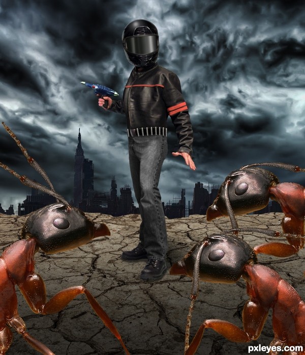
Earths first hyper sleep voyagers have returned to their home world only to find it devastated by a series of ecological disasters. Mutant insects appear to have taken over the surface world. Wearing re-breather helmets and armed with plasma guns they each set out alone to find any humans who may have survived... (5 years and 3311 days ago)

7 Sources:

avatar phen
phen says:

cool!

avatar ponti55
ponti55 says:

Great work! Very 'clean' Shadows and lights are perfect! Good luck

avatar erathion
erathion says:

very very neat work author...great mood too...best of luck

avatar Drivenslush

AWESOME!!!

avatar erikuri
erikuri says:

Amazing! I'm getting scared!...

no avatar
Keiley22 says:

love the sky in the background it awsome
well put together author

avatar MnMCarta
MnMCarta says:

Looks like it could be a poster for a movie!! Great job.

avatar CMYK46
CMYK46 says:

avatar Nickk
Nickk says:

Pretty cool !!
Only thing you should mind is that the lightning on the person comes from the front and the lightning on the ground comes from the back..

Didnt noticed it at once but still
GL

author says:

Thanks all for the comments, always appreciated. @ MnMCarta the B movie poster look is just what I was going for thanks! @ Nickk basic rule of aerial perspective, foreground is darker, plus there is a slight incline to the ground enhanced by the shading and adding drama to the lighting.

avatar arca
arca says:

Stunning work and great story ... my fav for sure!

avatar George55
George55 says:

good work.... love the idea..... gl author.

avatar pearlie
pearlie says:

Yep, guessed it was you, author. Very nice work on the outfit and helmet, and you know I LOVE that raygun!!

avatar George55
George55 says:

Fourth places deserve a Congrats too...... You did a good job!

Howdie stranger!
If you want to rate this picture or participate in this contest, just:

LOGIN HERE or REGISTER FOR FREE