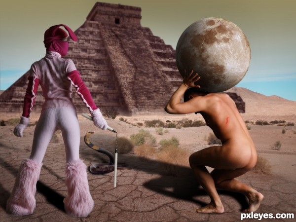
Thanks to mjranum, absurdwordpreferred, night-fate-stock, vio-stock & FrankWolfePhotograph for the stock images (5 years and 2918 days ago)
- 1: Cracked soil
- 2: Desert mountain
- 3: Pyramid
- 4: moon
- 5: Snake
- 6: Bunny girl
- 7: Slave

Thanks to mjranum, absurdwordpreferred, night-fate-stock, vio-stock & FrankWolfePhotograph for the stock images (5 years and 2918 days ago)
Authors will be notified via "note".
Thanks to:
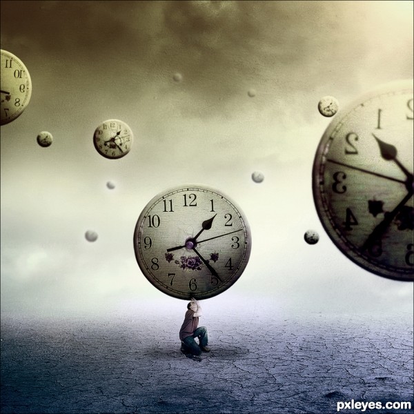
Helly7307 stock: http://helly7307-stock.deviantart.com/
Night Fate stock: http://night-fate-stock.deviantart.com/
Korridan: http://korridan-stock.deviantart.com/
Simon Murray: http://goodtextures.deviantart.com/ (5 years and 3178 days ago)
ah.... I like this 
suggestions:
1) lower the opacity (varying) for those clocks floating further away
2) darken the drop-shadow alittle
another 'photo-stock' idea 
very nice concept
Nice Blending
Thank you guys!!!
Thanks for the tip Aheman.
Unfortunately I did not find a man like I wish.
Actually I found a men with suit and tie in the same position that I used, but could not use because have to pay ... So this was the only one who did it! 
But I hope that now is a little better, I did what you suggested. Thanks!
Like it, like it, like it!! Good luck author

beautiful job... welldone
congrats! cool concept!
Congrats! 
Congrats!
Congrats Daniela...... nice image.
very nice 
Howdie stranger!
If you want to rate this picture or participate in this contest, just:
LOGIN HERE or REGISTER FOR FREE
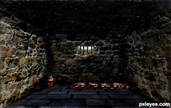
After watching an episode of Spartacus I decided to try and recreate a Roman slave cell. I made it dark and bleak with little comfort. The sunlight on the left wall and the olive plantation seen from the window are both a reminder of what is lost and hope for what might be had once again.
**The bars on the window and the blanket were created** (5 years and 3332 days ago)
Wow, amazed by the number of views..
The blanket looks funny
I agree. I thought about taking it out all together, but since it was up I didn't want to change it.
Howdie stranger!
If you want to rate this picture or participate in this contest, just:
LOGIN HERE or REGISTER FOR FREE
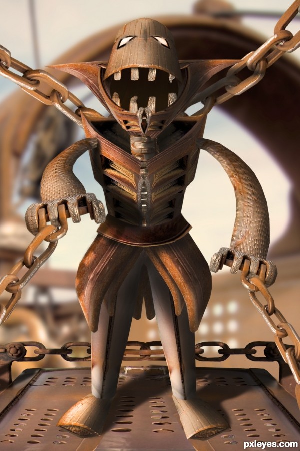
The rusty slave is waiting... hungry... his freedom...
Made only with the provided pic :) (5 years and 3419 days ago)
Good image! The only change I'd make would be to make the teeth from the teeth on the bucket.
Haha! Brilliant.. it looks great 
Cool image, especially the bucket head 
You did a good use of the source image. Good imagination. GL.
Wonderful work. Your use of shadows makes the whole image pop ... very creative and well put together... bravo!
Great work author...u used source image fabulously...well done
Oh wow, this is really good! Almost 3D like. Great job, author!
Congrats for your third place, Zakfuego!
Congrats!
Congrats man...
Congrats!! Nice work!
Howdie stranger!
If you want to rate this picture or participate in this contest, just:
LOGIN HERE or REGISTER FOR FREE
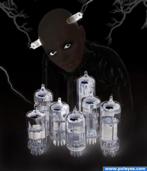
Weird Chick just playin around with this and here is the results. Girl pic purchased from http://www.stockxpert.com
Ok so maybe not goth too much so I have changed the name from Goth to Weird fits better now lol (5 years and 3914 days ago)
oh my, my body shudders of gothics, they are disgusting, great job though, love the way you made the eyes glow
Edit: @xtro, because they are abnormal..........i'm sure you do not want to make this entry a square for debating
i love gothic images... to me this is let down by the foreground.... and she doesnt really look so gothic at the moment either... ive never seen a goth with such a dark tan lmao....
orientallad, exactly why are goths disgusting?
okay author..this is a super duper teeny tiny nit pic.. but it's driving me nuts.. the tube running through her head is off by about 5 DEGREES.. I placed the image in PS and drew parallel lines through the face in line with the sides of the tubes in her head and the one closer to the view is off.. I know it's stupid and petty, but visually it won't let go of my eye.. (and I can't see too well so I KNOW it has to be the image LOL) Like I said.. it's a teeny tiny nit pic.. but it does force the eye (at least my eye) to jump to it constantly (but only in HIGH RES)  ... other than that... EXCELLENT IMAGE
He he he... I had an idea like that similar but yet different... Now I have to let it go... Nice image though, but I think it can be done better... Oh well that is my own view, if you think it's good, then it's good... Well doesn't look that goth to me, looks like an cyborg... Well I love both goth and cyborg, and most of all I love weird stuff lol... So  ... And lol @ GolemAura you measured the freaking angle lol...
Agree with notion that the 'tubes' in negative don't really help this image. If you must have them in there, try giving each some dramatic lighting or each have their own glow of a sort. Like the tubes on either side of face though! 
nice!

Simple but really nice effect. Compliments.
Very nice work, really good effect..Good luck!
very nice 
Howdie stranger!
If you want to rate this picture or participate in this contest, just:
LOGIN HERE or REGISTER FOR FREE
Kind of weird seeing a Yucatan pyramid in the desert LOL interesting hehehe good luck
This is mixed media brother... lol. Thanks
hahaha....lol its completely weird but still a nice manipulation ! GL
Howdie stranger!
If you want to rate this picture or participate in this contest, just:
LOGIN HERE or REGISTER FOR FREE