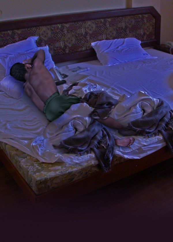
thanks to hworks for "Pondicherry escapade 2" image (5 years and 3736 days ago)
- 1: source1
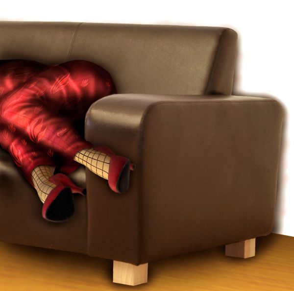
(5 years and 3751 days ago)
Very nice entry, i suggest maybe blurring the shadows that the feet are casting on the sofa a bit more and maybe reducing the opacity. Good luck 
thx for the tip ponti, i hope it's better now 
wow this is great...high marks from me for this entry and good luck author
nice 
Congrats for your third place, you sweet Lady of the penguins!
Congrats Oana,this entry was my favorite...
Congratulations on 3rd place ... 
Congrats 
Howdie stranger!
If you want to rate this picture or participate in this contest, just:
LOGIN HERE or REGISTER FOR FREE
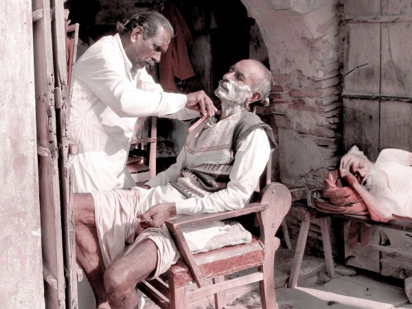
(5 years and 3769 days ago)
You missed some hair at the back of the head, and the edge of his shoulder is blurry...
Agrees with CMYK but the image being so close should be more in focus like the barber and customer, since they are so close to distance. I understand good source is sometimes hard to find but maybe this wasn't your best choice for outside source. There are way to sharpen soft images like this and perhaps someone else can suggest a method to improve the sharpness, but it will be minimal improvment.
CMYK: Thanks....Have made changes....
Howdie stranger!
If you want to rate this picture or participate in this contest, just:
LOGIN HERE or REGISTER FOR FREE
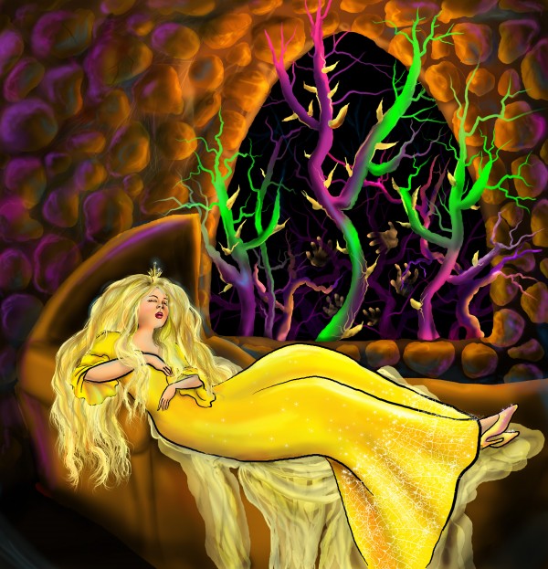
And she touches the spindle and falls to sleep for a 100 years. All the poor guys that tried to get to her died among the thorns of the bushes.
I created the whole image in photoshop without using any external sources. (5 years and 3782 days ago)
very nice work IMO u must remove the stroke/outline of the girl
Howdie stranger!
If you want to rate this picture or participate in this contest, just:
LOGIN HERE or REGISTER FOR FREE
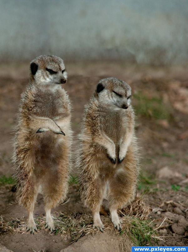
Sleeping on the job....guess he's gonna wake up soon... (5 years and 3818 days ago)
nice 
Howdie stranger!
If you want to rate this picture or participate in this contest, just:
LOGIN HERE or REGISTER FOR FREE
Great take on the source for a change...good luck!

thanks alot
One of the best ideas so far. The lightning and shadows/colouring is a bit unrealistic, but it goes for the whole picture really.. so it's not that bad. I like it..
Nice image GL
thank ,i will try to fix that ,thanks alot
That's a nice ideal. I thought it was a crime scene at first glance. The lighting is a bit weird.
Good job, perhaps if you give the man a subtle blue overlay so he better matches the lighting in the room it will help him blend in better (oh and darken the foot a little too). But a really nice job!
finally someone that isnt flying ;p like the image, its creative, only thing that gets my attention is the brightness of the foot at the base of bed... its very eyecatching.
thanks to all ,the comments was very helpful ,,and good luck for all
Great work...The foot coming outside is a nice work. Nice creativity....
great idea, and nicely done.
thanks alot
Good work! I would put a pillow between that bent arm there GL
GL
Great idea and use of source, good luck!!
the only other thing that could have been improved is the position of the right arm, it is in mid air!!.it soesn't look like it is resting on the pillow.
very nice work! I like the lightning !
thanks guys
Nice work and great feel. His thumb nail seems a touch bright.....but apart from that, great work!
Congrats for your first place, Basem!
thanks alot Lelaina
Congrats!
Congratulations for 1st
Congratulations!!! I knew tis would win! excellent excellent!!!!
Congrats!
thanks everybody .its very kind of u ,wish u all the best
oh wow, so real!
congrats.. great work..
thanks everyody
Howdie stranger!
If you want to rate this picture or participate in this contest, just:
LOGIN HERE or REGISTER FOR FREE