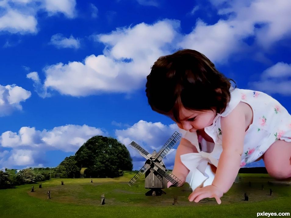
Small World for some of us (5 years and 877 days ago)
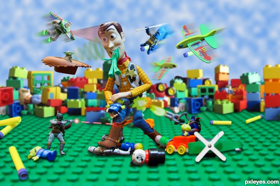
Tall vs Small (5 years and 2551 days ago)
Fun work here, author. A real massacre! One thing maybe, if you culd have made the clouds more like the Toy Story wallpaper from Andy's room, would fit more in theme. Good luck!
I didn't get it changed in time for the deadline but the movie wallpaper-like version worked well and I will keep it that way. I ended up drawing the clouds and then extruding to 3D, then rasterizing back to 2D before cloning. Pretty cool look. Thanks!
Congrats!!
Thanks!
Congrats Randy!!
Thanks!
congrats
Thanks!
Howdie stranger!
If you want to rate this picture or participate in this contest, just:
LOGIN HERE or REGISTER FOR FREE
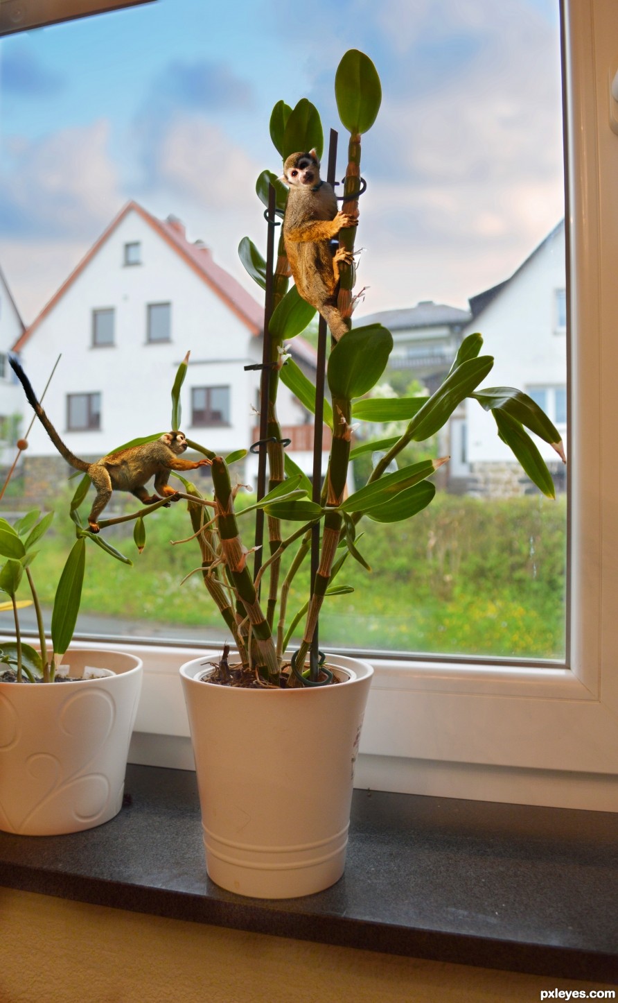
Thanks to Lies Meirlaen for the monkey picture.
The plant is my my personal picture and it is on SBS. (5 years and 2613 days ago)
The monkeys look pretty well masked like they belong in the plant, convincing result. You might have made the masking for the roofs somewhat softer and there's a little white spot from the plant image (near the upper monkey's back paw) that should have the softer white from your added sky. Details though, overall result is nice. Good luck!
Thanks for the comment. I know the masking of the sky is not the best. I was about to run out of time.  I had an other picture almost ready for this contest but the file got somehow damaged and I can't open it anymore.
Still, IMO it's the best of the bunch. GL author. 
Thank you. I appreciate to hear it from you 
Congrats!!
Congrats! 
Howdie stranger!
If you want to rate this picture or participate in this contest, just:
LOGIN HERE or REGISTER FOR FREE
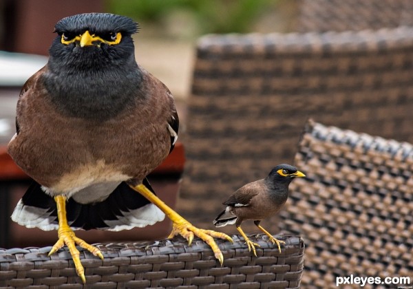
(5 years and 2852 days ago)
This is a good practice for rebuilding the background but you have to be more carefully.At the front backseat the texture is decaled and at the one behind it the texture seems "hurt". The dof makes difficult to modify them but pacience should solve it.Always try to fix errors zooming in more so when zoomed out they can't be seen. I wish you good luck and happy photoshoping 
True, good job with the background rebuilding. But, a hint for your big bird...when transforming, hold down shift so it transforms proportionately. He looks a little squashed.
Good luck!
Howdie stranger!
If you want to rate this picture or participate in this contest, just:
LOGIN HERE or REGISTER FOR FREE
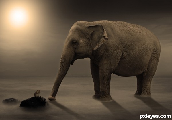
(5 years and 2932 days ago)
Maybe too small, IMO the mouse is scarcely recognizable.
thx for the comment but i think if i make the mouse bigger,it would be out of proportion
very suggestive atmosphere, the last on earth? bravo
Couldn't tell it was a mouse there until viewing the SBS, and the shadows are a bit off. Here's a tip: On a separate layer, draw lines from the center of the light source through the areas to be shadowed, and work accordingly. Also, your shadow gradients are reversed. A shadow is always darkest when closest to the object, and fades with distance. I like your idea...GL author! 
thx for the tip, im not that good with shadows lol, but i tried to make it look better, and also took another image for the mouse 
Now the mouse is ok! Good luck author
love the whole scene ,, great colour work .GL
Congrats!!
Congratulations!
Howdie stranger!
If you want to rate this picture or participate in this contest, just:
LOGIN HERE or REGISTER FOR FREE
the child looks stuck on and the focus on her is fuzzy but the idea is so wonderful and creative.
Howdie stranger!
If you want to rate this picture or participate in this contest, just:
LOGIN HERE or REGISTER FOR FREE