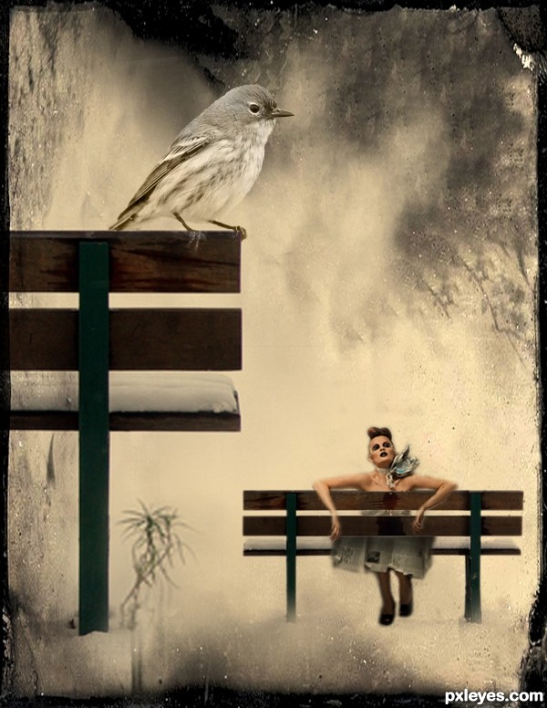
A tiny girl tired of her long journey rested at the bench beside a human-sized bench (5 years and 3367 days ago)
- 1: back
- 2: source bench
- 3: model
- 4: bird

Safety is a big consideration here, watch out! (5 years and 3440 days ago)
Nicely Done!
Great colors......very nice.
It really seems a sphere, I like it.
Well done, looks futuristic 
this is very very nice work author...GL
Howdie stranger!
If you want to rate this picture or participate in this contest, just:
LOGIN HERE or REGISTER FOR FREE
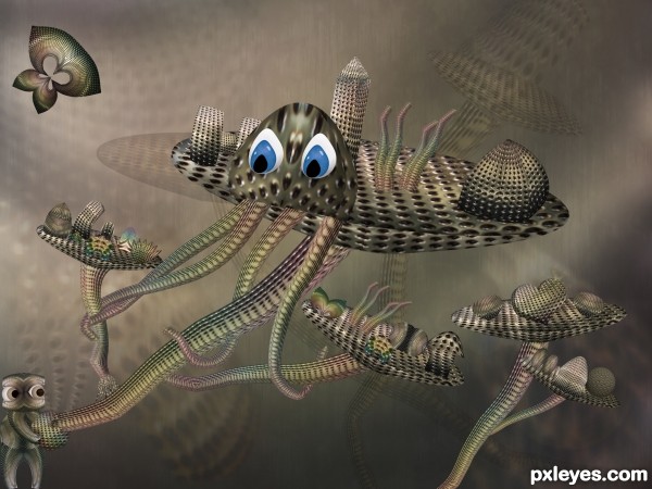
just source (5 years and 3529 days ago)
 !!!
!!!
hahahhaahahahaah very cool
very cute...gl author
Very cute and creative! A mix of sea, sky, earth and space... 
Nice Creation . Good Luck
good chop, shading will increase the depth, good luck
I thought it was a floating city at first; creative both work and title
Howdie stranger!
If you want to rate this picture or participate in this contest, just:
LOGIN HERE or REGISTER FOR FREE

Thanks to krayker for the gator.
Transform by scale was not used at any time in this work to make the gator smaller Legs and head are still the original size
CS3 & Tablet (5 years and 3559 days ago)
Pretty good, just fix the shadow to match the source pic.
Adjusted the shadow
Howdie stranger!
If you want to rate this picture or participate in this contest, just:
LOGIN HERE or REGISTER FOR FREE
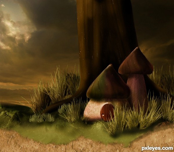
sky from night fate stock
Edit link of the source image fixed (5 years and 3644 days ago)
so pudgy and cute 
nice mood! the green mossy land seems to be hanging 'round the brown ground
Beautiful picture
ricky is right.. you should decrease the opacity of green mossy lands shadow.. and I love the lighting.. 
Wonderful image, reminds me of the smurfs. Top job 
work is very wonderful and your image mood is very nice
image been edit , hop it look better now
A fairy tale image!... Very cute... 
The tone is perfect 
nice work  Author
excellent ... Gl
Love it...very well done author...good luck
Beautiful troll's huts 
Very creative!
Howdie stranger!
If you want to rate this picture or participate in this contest, just:
LOGIN HERE or REGISTER FOR FREE
Try to say that 10 times fast - Bench by the bench, lol. Nice work = )
I decided to enlarge the girl a little bit...
Bird seems to be the hero of creation. Perspective needs attention!!!
cool work author...nice usage of the texture...gl
Composition suffers since viewers 1st stop point is the shadow cast on the bench - which has no relevance imo. , and you'll transfor it to a portrait-mode, which is more dynamic than a landscape orientation.
A good idea is to Crop your image so that we can only see a part of the Big bench on which the bird is sitting, and the entire small one. Crop it from the right side of the pic to a few cm after the first bench leg.
You don't need 3 parts of your image
@greymval... thanks for the suggestion... i will try to consider that...
I hope this gives justice to the tiny girl as the main subject...
Howdie stranger!
If you want to rate this picture or participate in this contest, just:
LOGIN HERE or REGISTER FOR FREE