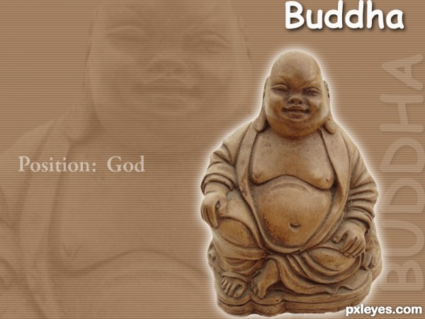
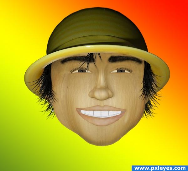
Everything done in photoshop with filters (5 years and 3504 days ago)
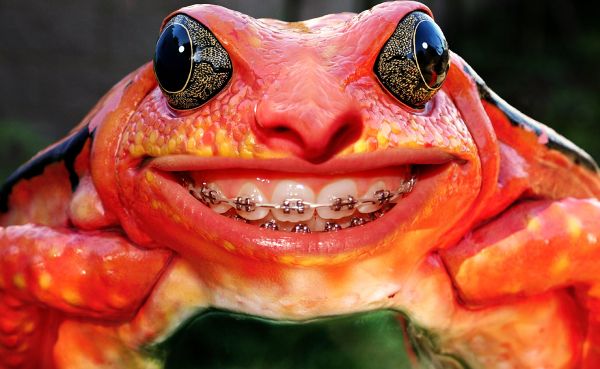
Someone had to do it.
Thanks to Zawezome from Flickr for the girl source. (5 years and 3674 days ago)
awesome
ha!, teeth look great :P
great idea....
Great work...very well done author
nice and funny very welldone!
perfect blend
not really perfect, the nose needs more work, but that's really funny  )
)
this is really cool 
is it bad that I actually know people who look like this?? LOL good job Author ... GL :0
Hahahaha!... 
nice blending and a unique idea
haha just funny
very cool

this made me smile!
nicely done -- great blending
 GL!
GL!
Charming froggie! 
oh wow, I am still pretty ! 
Howdie stranger!
If you want to rate this picture or participate in this contest, just:
LOGIN HERE or REGISTER FOR FREE
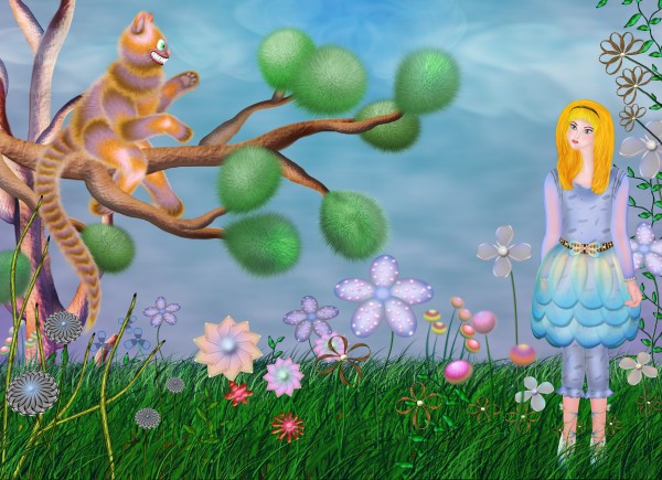
All is created with Photoshop. (5 years and 3764 days ago)
great work author. love the cat.
lol great to see this cat  he is just so funny
nice!
Nicely done.
Thanks to all for the nice comments and favs 
congrats! 
Congratulations!
Howdie stranger!
If you want to rate this picture or participate in this contest, just:
LOGIN HERE or REGISTER FOR FREE
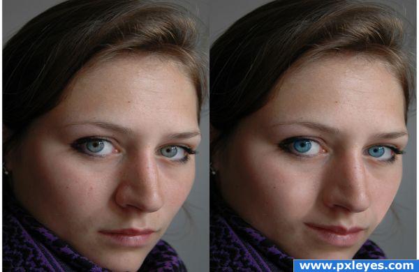
Just a few touches on her lips and cheek. (5 years and 3832 days ago)
Compare to source pic...head is distorted...
Awesome!
Howdie stranger!
If you want to rate this picture or participate in this contest, just:
LOGIN HERE or REGISTER FOR FREE
Source only.
(bowl->hat, right garlic->head, nose, ears, "pink/white-thing-on-middle"->mouth and teeth, hair->grass brushes. The rest with brush, burn, dodge, blur, clone, healing tools)
Please comment for advice
(edit: I made him more... "garlic-ish"???? :D trying to follow some suggestions. I give up! I hope he looks fine) (5 years and 3915 days ago)
Please comment... Any suggestion would be valuable, since I'm an amateur
it looks a little unrelistic try brightness and contrast
Author..,as well done as this is.. You may want to incorporate the source more so it can be seen..IMHO.. just because I watch the comments here and most peeps want to see the source.. I can see it in the bowl/hat but not much of anywhere else..(Not a bad thing at all, and you did great work) I'm just pointing it out because it does influence the voting (You could make the background out go the garlic.. just an Idea.. good Luck)
@GolemAura: All the other main parts (head, nose, ears) are from the right garlic. They are just warped, liquified, blured and colorised. The mouth is from the "pink/white-thing" (?!) in the center of the bowl. In the sbs guide I tried to show it... 
I'll try to think something about your suggestion GolemAura... Thank you for the advice. Thank you Tuckinator too! I'll follow your advice too
Funny face  , but Golem has a point, yes. Maybe another idea is that you also make the eyes and teeth from garlicparts (such part almost has the same shape as an eye). Check if the original textures from the garlic would fit with the face (I can imagine it would give a cool effect). Good luck!
good work
nice job
greate sir good work !!!
nice
i think it also would look better with a darker background and a neck. The bright colours separate the face. you cant really concentrate on what happens in the face. Some lines around the eyes would be good also. good job, needs to improve, but you on best site to do that  keep up and good luck.
Thank you Solaris for the suggestion! Unfortunately I didn't manage to improve him, by adding expression-lines etc, because it's my 1rst time drawing a face and I wasn't sure what to do :/ . I'll try harder by experimenting "out-of-contest".  (Thank U all for the nice comments)
why so happy? young and free? 
cool.... good luck
Howdie stranger!
If you want to rate this picture or participate in this contest, just:
LOGIN HERE or REGISTER FOR FREE
Of course it's just my opinion, but IF you really want to use typography in an entry then I'd strongly recommend you to use another font than the Comic sans that you chose. Unless there's an extremely good reason that you want it. But then again, that's just my idea. Good luck!
thanks for your comments wazowski, but i dont have commercial fonts.
Try 1001freefonts.com. They have alot of great fonts and they're all free. If you see one for sale, it's not from the site, though. They have a tendancy to be aggressive with advertising when you click certain things.
Howdie stranger!
If you want to rate this picture or participate in this contest, just:
LOGIN HERE or REGISTER FOR FREE