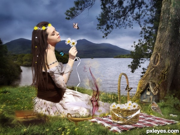
I hope you enjoy of this work.
So I used this resources:
IMPORTANT: I've the permission of autor for use RESOURCE 4 out of DA. (View SBS)
http://www.pxleyes.com/images/contests/marguerite-daisy/fullsize/sourceimage.jpg
Thanks to:selenart-stock
http://browse.deviantart.com/?qh=§ion=&q=ribbon+brush#/d12g6hv
Thanks to beckeez
http://beckeez.deviantart.com/art/Flower-Brush-One-97565615?q=boost%3Apopular%20flower%20brush&qo=72
Thanks to lunanyxstock
http://lunanyxstock.deviantart.com/art/The-basket-pack-35417163?q=boost%3Apopular%20in%3Aresources%20basket&qo=5
Thanks to aliira
http://aliira.deviantart.com/art/ribbons-brushes-58281554?q=boost%3Apopular%20ribbon%20brush&qo=22
Thanks to /miss69-stock
http://miss69-stock.deviantart.com/art/Bracelet-Brushes-27965812?q=boost%3Apopular%20in%3Aresources%20bracelet&qo=15
Thanks to nightgraue
http://nightgraue.deviantart.com/art/Old-Book-Image-Pack-32269854?q=boost%3Apopular%20in%3Aresources%20book&qo=38
Thanks to jjd-BUTTERFLY1
http://jjd.deviantart.com/gallery/2779242#/d1c3rtf
Thanks to elevit-stock-BUTTERFLY2
http://elevit-stock.deviantart.com/art/E-S-Butterfly-IX-145468168?q=boost%3Apopular%20in%3Aresources%20buterfly&qo=59.png
Thanks to elevit-stock-BUTTERFLY3
http://elevit-stock.deviantart.com/art/E-S-Butterfly-V-145029345?q=boost%3Apopular%20in%3Aresources%20buterfly&qo=57.png (5 years and 2980 days ago)







I like the idea for the image, and i think you have accomplished it quite well. Only a few things to point out as far as inserted objects go. The blue butterfly could use some better masking, very hard lines around it. also the bird added in near the tree is translucent, i can see the flowers be hand it, through it's body... also some of the added items to the girl, look very flat. I believe this is due to the lack of proper shadows from the objects in relation to her body. Great work over all! Feel free to PM me if you would like a few tips on seamlessly blending objects.
First, sorry for my English.
I appreciate your comments, I'll send a private message
You're missing a lot of shadows and lightings, most objects in your scene have intensely light with no shadows. Plus the background lgiht sources comes from behind.
Thank you very much for your feedback Akassa. Criticism of this kind help me to improve. I will try to improve the drawing.
I made some changes in light and shadow. Personally I like it better now. Thank you very much for your advice.
some definite improvements. keep practicing!
Howdie stranger!
If you want to rate this picture or participate in this contest, just:
LOGIN HERE or REGISTER FOR FREE