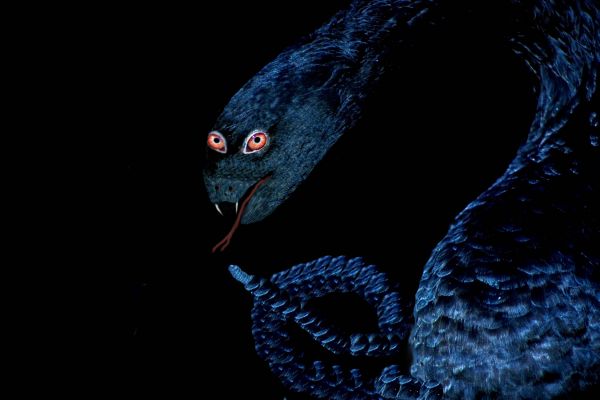
used only the source picture (5 years and 3681 days ago)
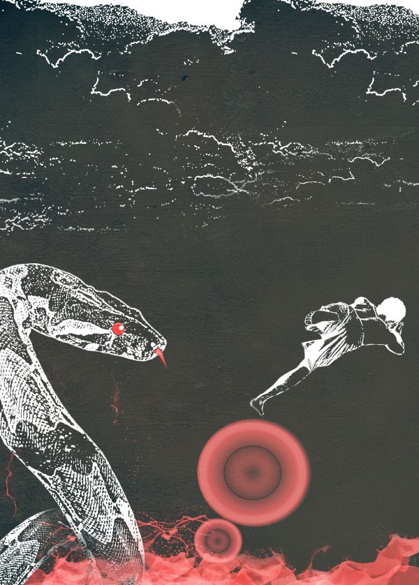
Apply some stamp(filter) on the stock picture(snake,boy,sky)
and in the circle , Its a small radial gradient.and last I apply some texture , to make it cool.
The sea is just bunch of splatter then I just adjust some hue/saturation on it.
(5 years and 3709 days ago)
Not bad 
wow thanks Clinge..first comment I have..new here btw
nice image,gl
Nice idea for a poster. Some work with the general contrast and colours maybe, but very good..
Its a perfect material for a print advertisement...
wow thanks... I just wanted to use 3 colors to make it more interesting and different from others.
Very different  GL
GL
Author, I hate it when people ask me to vote for their entry. Keep in mind, just because you get votes, doesn't mean they are going to be high votes. Just let the contest run it's course.
ok sorry jawshoewhah . thanks for correcting me
Howdie stranger!
If you want to rate this picture or participate in this contest, just:
LOGIN HERE or REGISTER FOR FREE
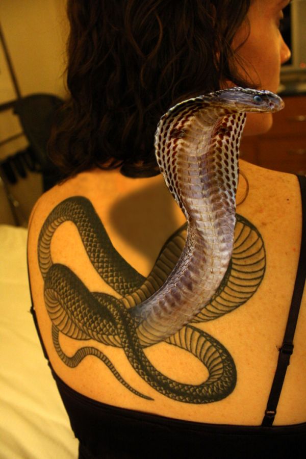
Created in PS7.0. (5 years and 3711 days ago)
Looks real to me...  GL
GL
Nice job...
Very cool! GL
great,gl
Would make very nice if you could fix the skin under the head shadow/hair .. very cool idea.
Wow, someone finally noticed that. I'll work on it.
EDIT: worked on the skin tone on the back. I think it looks better. 
Fantastic likeness to the tattoo 
It seems so real...superb work.....
sweet
Like Scary movie))) Good job
Oh Yeah, this is a fine job alright. You Done Good 
Thanks for everyone's comments and improvement suggestions. Lets hope they pay off 
Congrats for your second place, Joshua!
Congrats!
Congratulations for 2nd
Congrats for 2nd place 
Congrats! 
Howdie stranger!
If you want to rate this picture or participate in this contest, just:
LOGIN HERE or REGISTER FOR FREE
(5 years and 3717 days ago)
Looks a bit simple to me. Good luck!
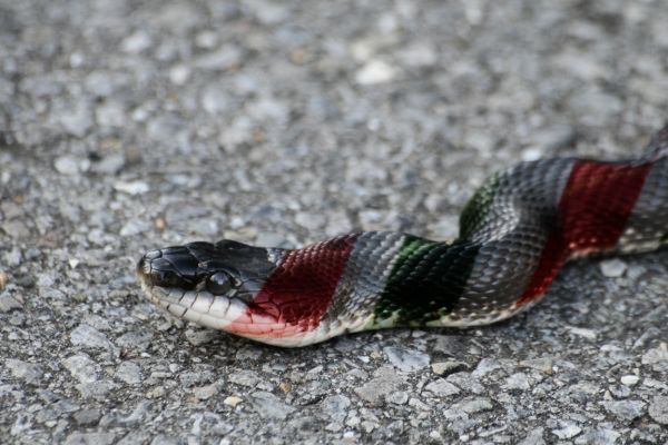
instead of jus using the colours of the candy on the snake u cud have made use of the cane properly for example like cud have transformed the cane itself into a snake
Is it "red and yellow kills a fellow?" Simple but you did a good job blending the colors with the snake.
very simple, no?
Howdie stranger!
If you want to rate this picture or participate in this contest, just:
LOGIN HERE or REGISTER FOR FREE

Only supplied image used. (5 years and 3750 days ago)
Pretty wicked!  Your background is interesting too.
Fix the thickness of the neck at the bottom...add an eye and a real tongue instead of just a straight line...
BRAVO!
Howdie stranger!
If you want to rate this picture or participate in this contest, just:
LOGIN HERE or REGISTER FOR FREE
Howdie stranger!
If you want to rate this picture or participate in this contest, just:
LOGIN HERE or REGISTER FOR FREE