Photoshop Pictures: Snakes


results 1 - 5 of 7

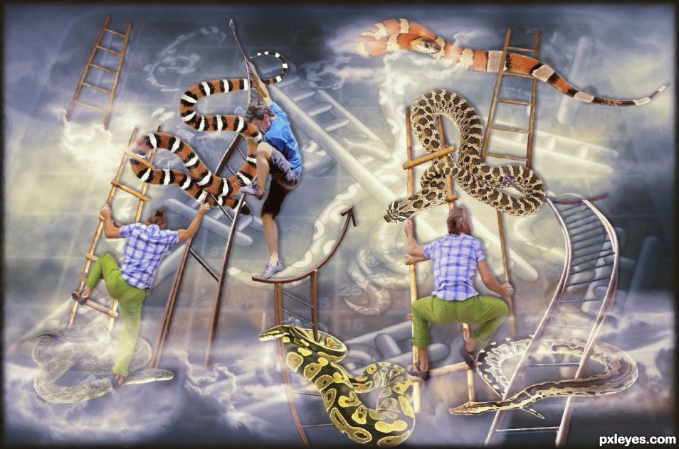
Climb to the Top - created by skyangel


Climb to the Top
Favs: 0SBS: 1Hi-resRank: 6/7Score: 55.8% (0)7483 views

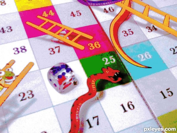
Life is a bit like snakes and ladders. Everyone is dreaming of climbing the ladders of success and avoid being bitten by snakes along the way.
This is reinvented version of the board game with the childrens board game reflected as a memory in the clouds.
Play the game to the best of your ability. May the dice of fate fall in your favour.
Extra sources: The game board is my own photo. A copy is in the SBS.
Snakes:
https://pixabay.com/en/king-snake-snake-banded-red-black-502263/
https://pixabay.com/en/snake-terrarium-bastards-animals-1519996/
Cloud brushes:
https://www.brusheezy.com/brushes/2187-24-clouds (5 years and 1045 days ago)

10 Sources:

avatar still26
still26 says:

10 layers...gulp...you are a genius. Love it.

author says:

It's really not hard working on many layers. You get used to it. As long as you label them you can keep track of what's what.

(5 years and 1042 days ago)


still26 says:

Your encouragement is so appreciated. I think your kids and grand kids are lucky to have you to guide their creativity!

(5 years and 1041 days ago)


Howdie stranger!
If you want to rate this picture or participate in this contest, just:

LOGIN HERE or REGISTER FOR FREE


pagan power - created by detractor


pagan power
Favs: 1SBS: n/aHi-resRank: 3/7Score: 63.3% (25)27220 views

New snake
its a png not a 3d render
(5 years and 2463 days ago)

3 Sources:

no avatar
Keiley22 says:

the snakes are a 3d render, i don't think we are allowed to use them unless we make them ourselves

author says:

i should read better hehe

(5 years and 2463 days ago)


Keiley22 says:

nice quick change, good stuff author

(5 years and 2462 days ago)


avatar CMYK46
CMYK46 says:

3D renders are a no-no...I'm sure you can find some snake photos to use.

author says:

Yes im going to take rid off the snakes. thanks

(5 years and 2463 days ago)


avatar minnie
minnie says:

I would have left the original colors in the background, but it's a good work anyway

author says:

hehe thanks for comment the original colors were ok but it looks warm and i didnt wanted like that.

(5 years and 2457 days ago)


avatar robvdn
robvdn says:

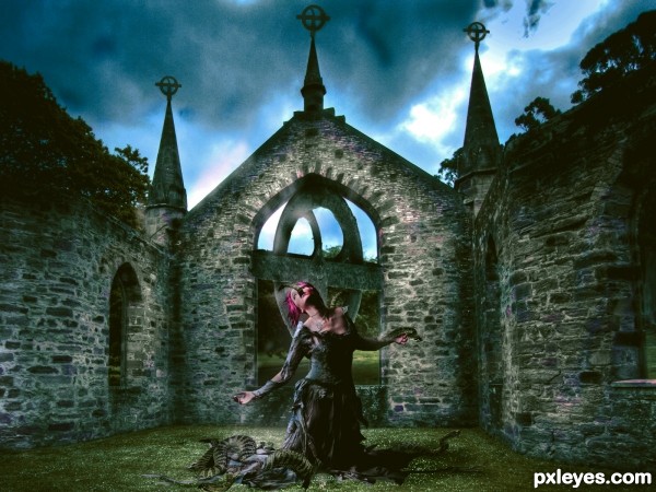
I like the imagination you put in this entry, however the sky is oversaturated and does not fit the mood IMHO. The bottom part is a dark horror style, the sky should reflect that and not, like here, give a hint of hope.

author says:

Thanks for comment but i disagree i exactly knew what i was doing. Its a pagan image as the catholics not a horro scene and it reflects what i exactly wanted.

(5 years and 2457 days ago)


Howdie stranger!
If you want to rate this picture or participate in this contest, just:

LOGIN HERE or REGISTER FOR FREE


Snakes - created by Deki


Snakes
Favs: 0SBS: 3Hi-resRank: 7/7Score: 58.9% (0)8144 views

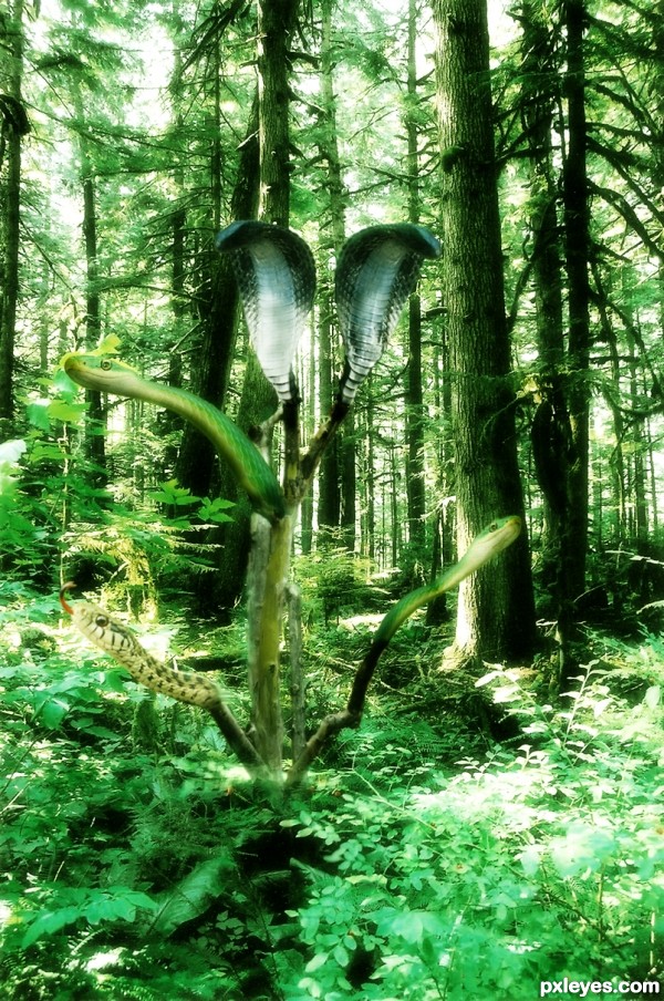
Used quick selection tool, liquify, adjustment layers to blend and create forest like ambiance.... (5 years and 3013 days ago)

5 Sources:

avatar MossyB
MossyB says:

Not a tree I'd want to get close to! Great job!

avatar CMYK46
CMYK46 says:

Please fix the snake links & provide a link for the forest background.

author says:

got that done, forgot ...tx

avatar CMYK46
CMYK46 says:

Links don't work.

author says:

got it....technical issues.....

avatar CMYK46
CMYK46 says:

OK, working now. GL author.

avatar CMYK46
CMYK46 says:

OK...now that the link stuff is out of the way...why is everything the same green hues? There's no sense of depth.

Howdie stranger!
If you want to rate this picture or participate in this contest, just:

LOGIN HERE or REGISTER FOR FREE


Snakes & Ladders - created by MadGuyyy


Snakes & Ladders
Favs: 0SBS: 2Hi-resRank: 7/7Score: 56.8% (0)13683 views

Index Mode. 15 colors (5 years and 3050 days ago)

avatar MossyB
MossyB says:

This came out pretty well, except for the dice. The colors have blurred and now over dominate the shape, so that the pips are hard to make out.

Perhaps make a selection of just the dice, and then "fade" the color depth effect of the section (Edit>Fade effect IMMEDIATELY after making the change), to better allow the dice to look more natural.

avatar ibmaxed
ibmaxed says:

Great

author says:

Thanx MossyB I'll keep that in mind next time.

Howdie stranger!
If you want to rate this picture or participate in this contest, just:

LOGIN HERE or REGISTER FOR FREE


Snakes - created by filantrop


Snakes
Favs: 0SBS: n/aHi-resRank: 7/7Score: 56.8% (0)13996 views

Thanks JPott, Deadlyforc ,zenobia_joy ,stylesr1 (5 years and 3580 days ago)

4 Sources:

avatar jawshoewhah
jawshoewhah [banned] says:

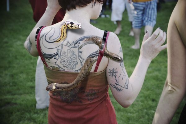
the yellow snake is a bit bright. You should take the brightness down on it or maybe burn the head a little. The snake on the right is transparent through the dress strap and the bottom snake.. it doesn't seem to have a body. Personally I'd crop this down because of all the distraction going on around the main subject. IMO, I think removing the bottom snake and just keeping the two would look more realistic.

avatar loopyluv
loopyluv says:

Good work!

avatar Govindrathod

The red strap on the right side of the image has a feeling of protrusion...Well it adds to the effect but also distracts a bit as the two brown snakes are tough to distinguish.

avatar sebykxxx
sebykxxx says:

great job.gl

Howdie stranger!
If you want to rate this picture or participate in this contest, just:

LOGIN HERE or REGISTER FOR FREE