I used only two auxiliary images.
thanks to dudealan2001 and andionline (5 years and 2982 days ago)
2 Sources:
(5 years and 2987 days ago)
author, to improve your entry, you might want to add some sort of blur/noise to the mask to match the noise of the original photo.. right now it is extremely cut and paste (cloning out the logo on the mask would be helpful as well) all IMHO
good luck 
thanks; I am still green as to how to achieve a more realistic look but I tried some filters and it looks a bit better
This is much improved, just keep practicing, (Dodge and Burn brushes are great for making shapes (they add SHADOWS and can enhance HIGHLIGHTS and Detail)
Good luck and much improved
Howdie stranger!
If you want to rate this picture or participate in this contest, just:
LOGIN HERE or REGISTER FOR FREE
Thanks to: tazzmanian(sxc), inkpenofdeath & anyman82.
motion blur used to give the effect of wind. (5 years and 2987 days ago)
A good marks for the wind effect & wonderful mood you gave
Thanks Sukh!
I agree with my friend Sukh!! Nice mood.
Thanks Daniela!
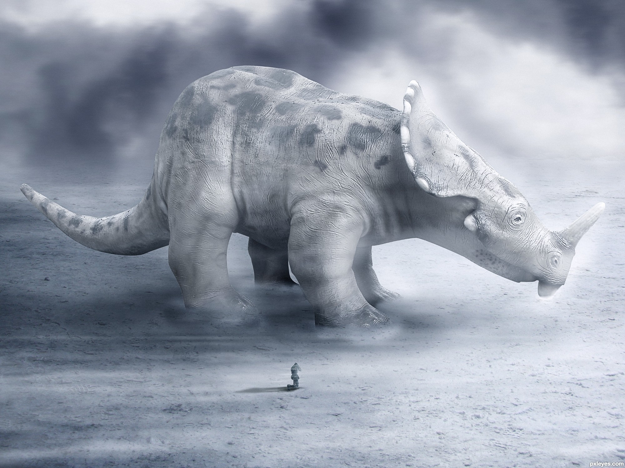
i think the leg from the back is to far from the other legs to far or to thin
it look good i like it and hope you had add SBS it would be nice to see how fine you work .keep it up good luck
It looks like those old cartoons they showed in grade school to talk about dinosaurs going extinct
Congrats for your third place, Rafaelll!
Congratulations brother, it's a amazing work! 
Congrats!!
Nice Congrats
Howdie stranger!
If you want to rate this picture or participate in this contest, just:
LOGIN HERE or REGISTER FOR FREE
(5 years and 3083 days ago)
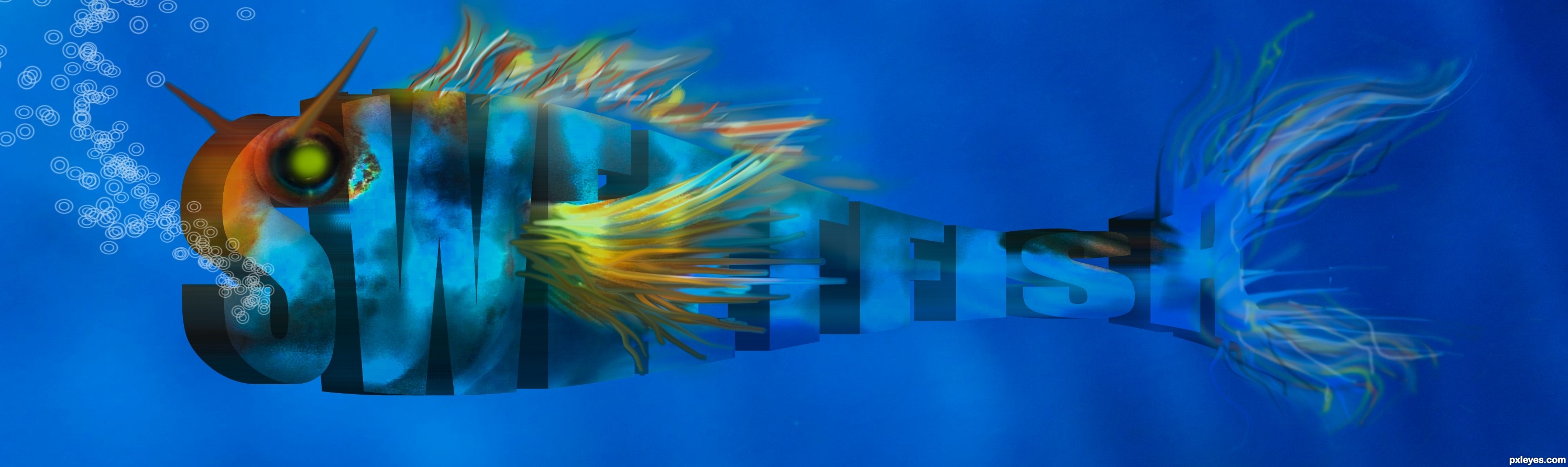
I like the fish you have created a lot, wish it had a little more space though, but the water and snow dont appeal to me so much. Im holding off my vote cause Im also hoping you goign to upload a step by step, Im really curious how you created the fish letters
In your first 2 images, the letters don't form the actual objects. The fish does, and is very well done.
Eladine : you can vote now heheh
CMYK46 - thank you, fist 2 images deleted..
still wish your fish had more space he looks so cramped in that lil square thnx for the step by step it sure helped understanding and learning how to create something like this.
Creative, first sight i could easely see its a fish. Second i went reading what it said, could read it. So thats all positive points.
Good job, and good luck.
Wow that's amazing, love the "face" part.
hahah..i like it
Your image is perfect for use of the text warp fish style. Strange bubbles, but I like how you used the fins of the real fish and the colors. 
sweetfish
Howdie stranger!
If you want to rate this picture or participate in this contest, just:
LOGIN HERE or REGISTER FOR FREE
(5 years and 3110 days ago)
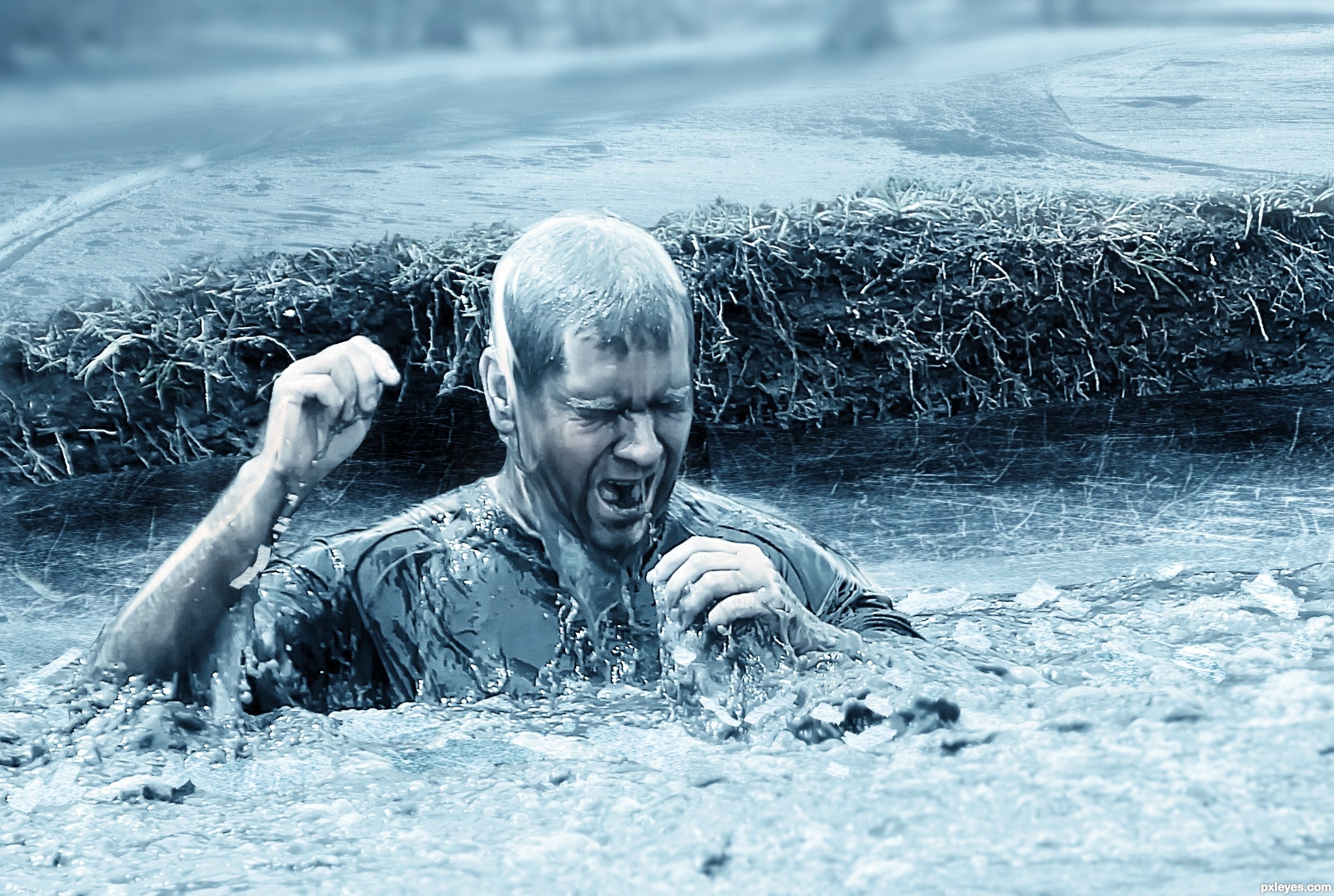
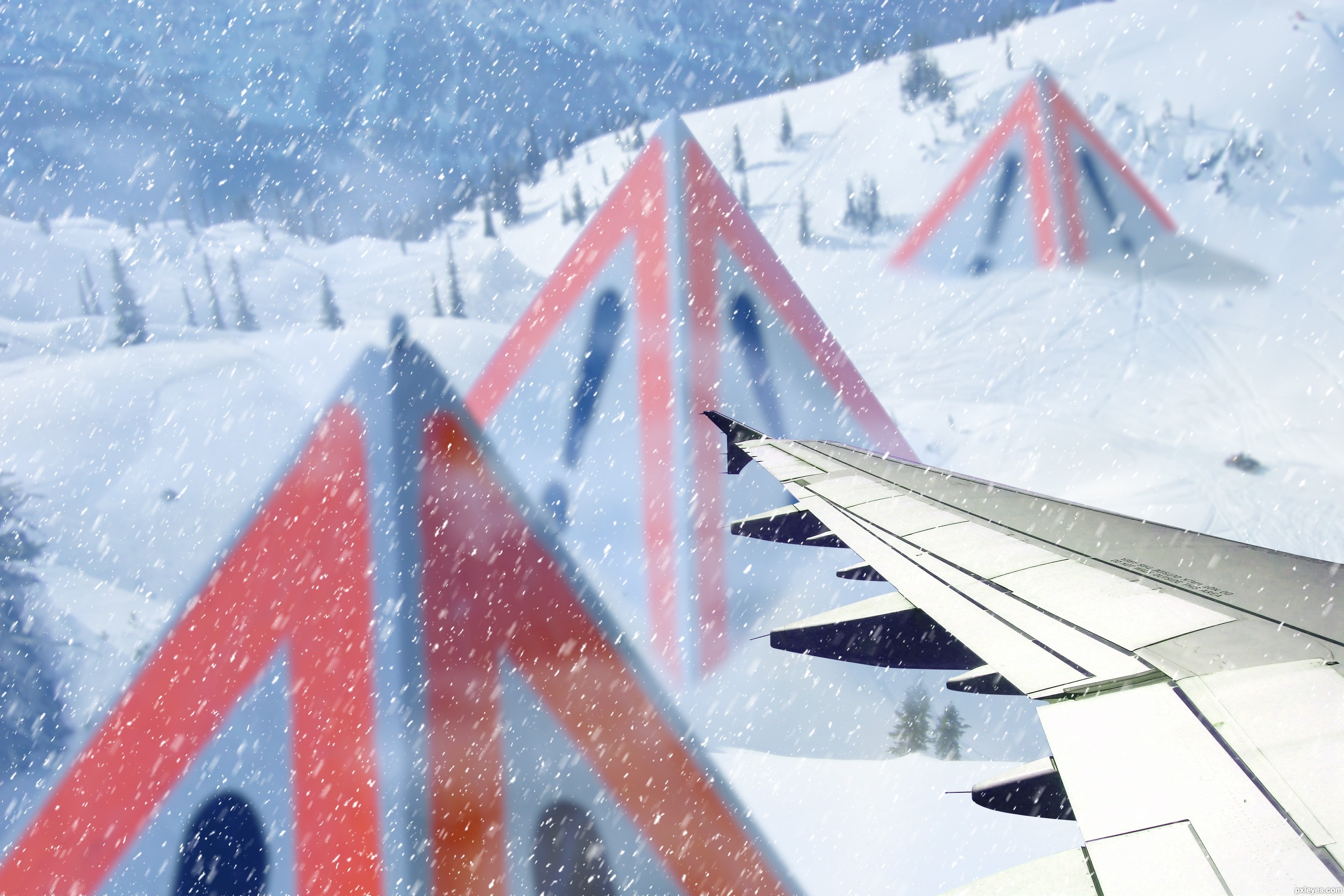
good idea...only one suggestion - if the plane is flying, the snow should have opposite direction of the planes trajectory . good luck
@gornats you're right, wrong angle. Now I've changed the snow, thank you!
Nice mood on the background..
great image..GL author.
good job author well done
Successful well work, luck
One of the better ones in my opinion.
The contrast of the plane wing is too sharp and high contrast relative to the rest of the image, which is very well done. It looks somewhat "tacked on at the last minute," rather than an integral part of it.
Thank you for your comment @MossyB. The sharp wing is because is very near to the subject; the rest of the picture is not so clear, this increases the feeling of an atmosphere of snow.
Howdie stranger!
If you want to rate this picture or participate in this contest, just:
LOGIN HERE or REGISTER FOR FREE
Photography and photoshop contests
We are a community of people with
a passion for photography, graphics and art in general.
Every day new photoshop
and photography contests are posted to compete in. We also have one weekly drawing contest
and one weekly 3D contest!
Participation is 100% free!
Just
register and get
started!
Good luck!
© 2015 Pxleyes.com. All rights reserved.


Howdie stranger!
If you want to rate this picture or participate in this contest, just:
LOGIN HERE or REGISTER FOR FREE